
I’m old, so I made my kids help me rank this year’s NBA City Edition jerseys

 credits: NBA
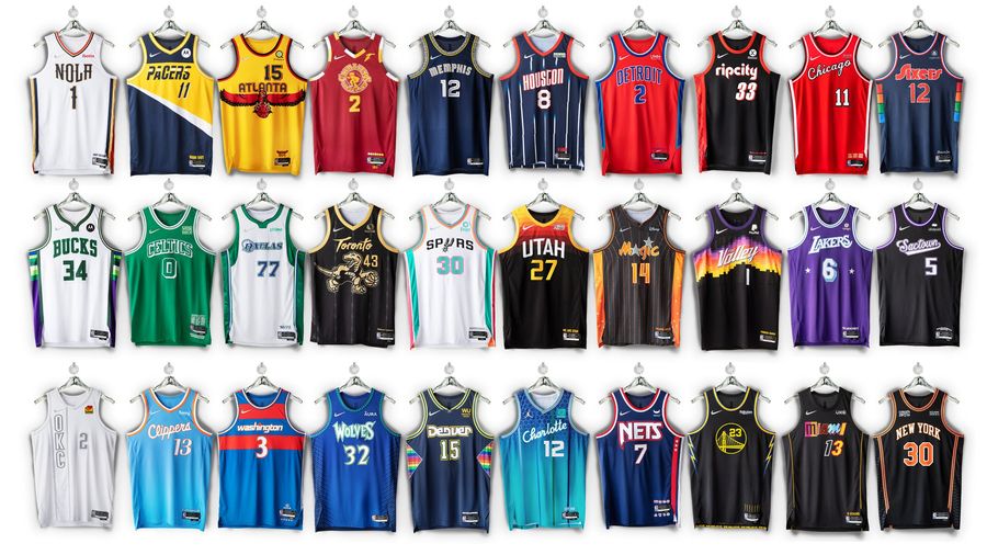
 The new NBA City Edition jerseys are out, with 28 new looks heading to the hardwood while the Jazz and Suns run it back with last season’s getups. Last year, Deadspin ranked Utah’s at No. 8 among the City Editions, and Phoenix at No. 23. Maybe it was the run to the NBA Finals, but those Suns “Valley” jerseys really grew on me the more I got to see them.
At least, looking at this year’s City Editions, the Suns are one of the more enjoyable ones. But I’m not going to rank them again. Instead, this time around, I’m enlisting some help, and changing the format of the City Edition review, because it’s not just about what I think. These jerseys should have broader appeal than some 40-year-old dude in New York who’s not going to wear any of them.
So, we’re bringing in the kids. Alice is 8, Sean is 6, and together with their 40-year-old dad, we’ve drafted the best… and worst of the 2021-22 City Edition jerseys.
As the youngest, Sean gets first pick.
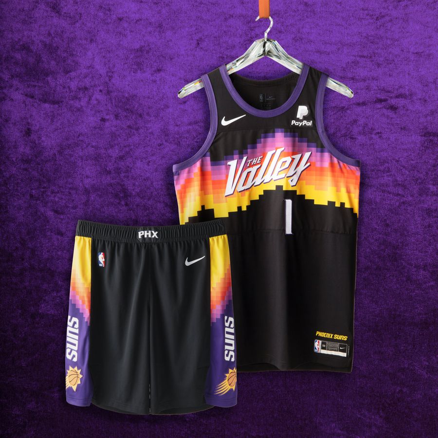
The Best - 1. Sean: Phoenix Suns
 credits: NBA
 I like the sunset on it. I really like how they wrote the lettering on the sunset. I give it a five-star review!
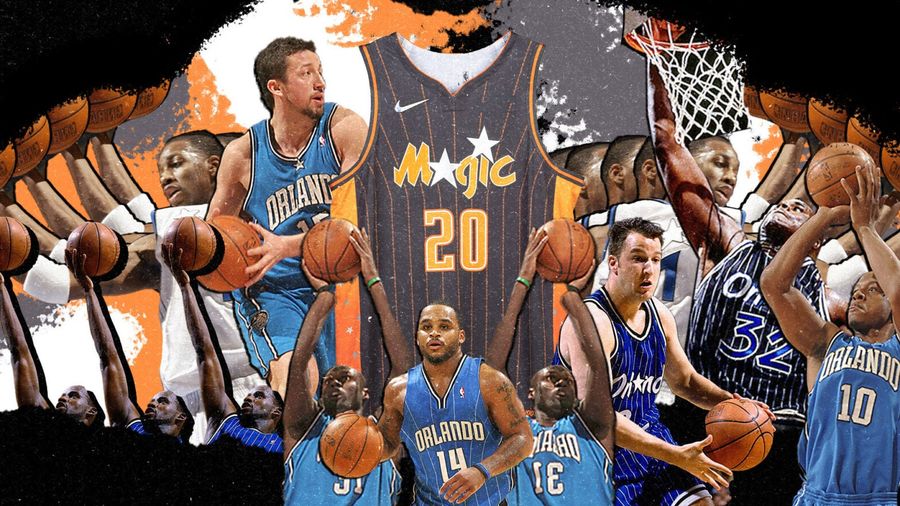
2. Alice: Orlando Magic
 credits: NBA
 It looks like there are fireworks on it, and the lettering has those stars.
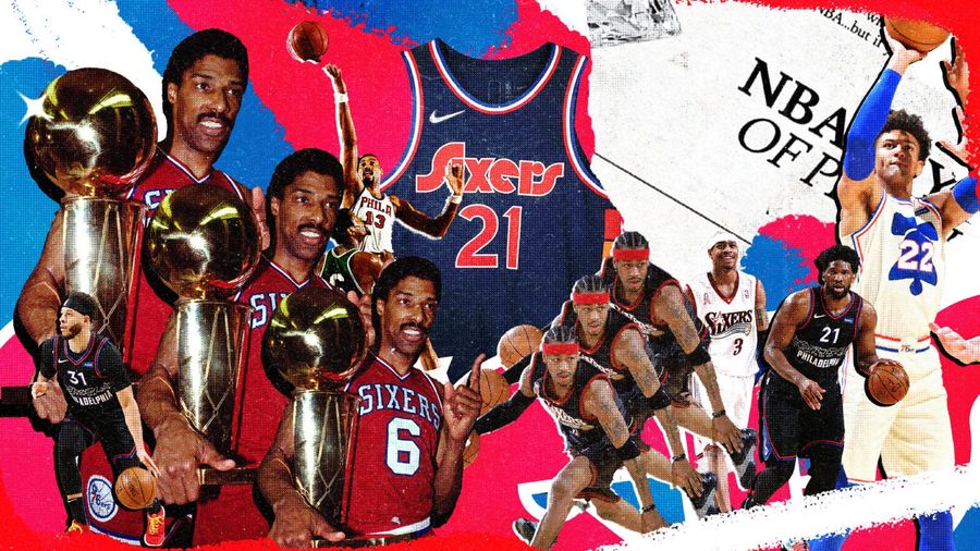
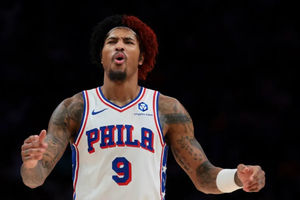
3. Jesse: Philadelphia 76ers
 credits: NBA
 Growing up, the Spectrum’s center court was my favorite one to see on TV, although most memorably for a college game — Duke-Kentucky and the Laettner Game. I love the homage here.
4. Sean: Utah Jazz
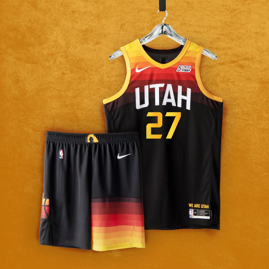 credits: NBA
 It has a very pretty sunset like the other one, the Suns.
5. Alice: Charlotte Hornets
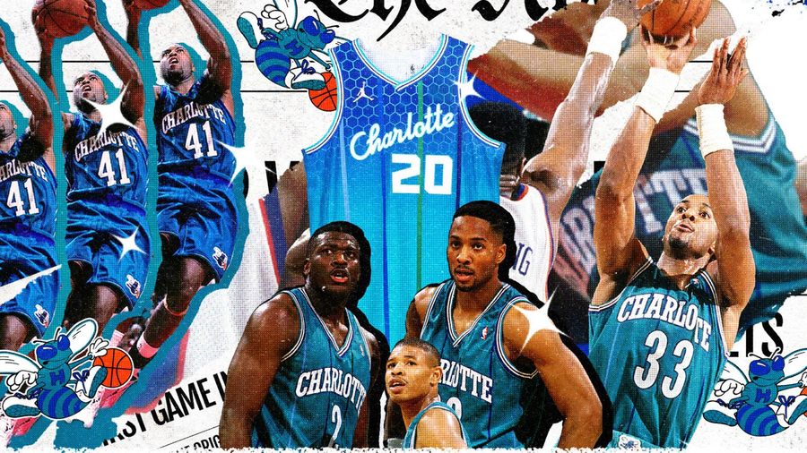 credits: NBA
 The jersey looks like it’s gently fading. I like the pattern at the top.
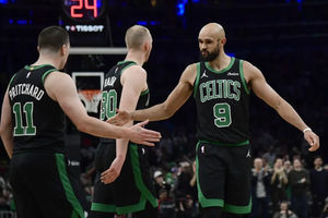
6. Jesse: Boston Celtics
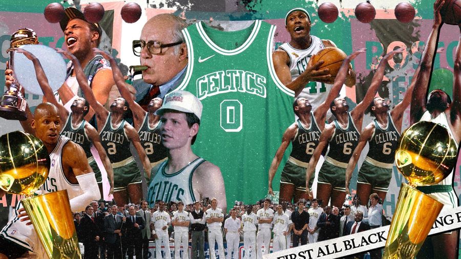 credits: NBA
 It looks like a lot of Celtics jerseys, which it should, but with a throwback vibe, and the use of white to make the drop shadow is excellent.
7. Sean: San Antonio Spurs
 credits: NBA
 I like how their colors look like the Dolphins.
8. Alice: Los Angeles Lakers
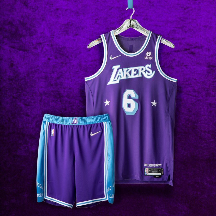 credits: NBA
 I like the purplieness. The number is sort of 3D.
9. Jesse: Toronto Raptors
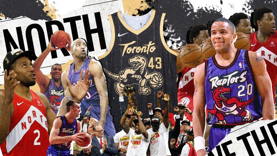 credits: NBA
 I can’t believe I’m getting this over the dinosaur lovers, but Alice thinks it should be a brachiosaurus instead of a raptor, even though they’re not the Toronto Brachiosauruses. “Brachiosauruses are always better,” she says.
10. Sean: Atlanta Hawks
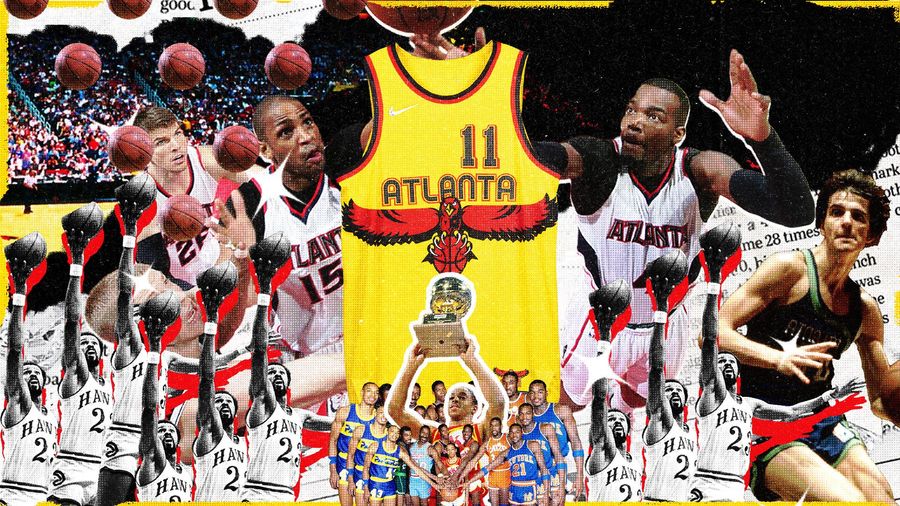 credits: NBA
 I like how those stripes look like flames and the hawk is carrying a basketball and how it changes over the hawk and under the hawk.
11. Alice: Miami Heat
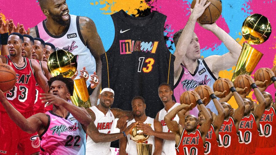 credits: NBA
 The lettering looks cool. It’s kind of 3D and they’re all different colors.
12. Jesse: Denver Nuggets
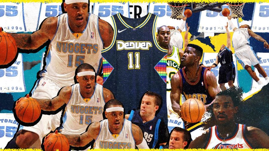 credits: NBA
 Maybe I just like rainbows? Well, I love the old rainbow Nuggets jerseys, and this is worlds better than last year’s Jazz knockoffs, plus the classic Nuggets font is so much better than their usual.
13. Sean: Milwaukee Bucks
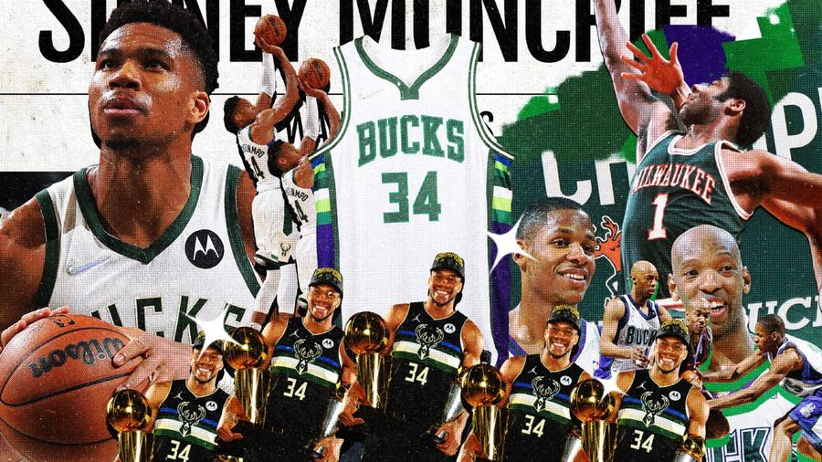 credits: NBA
 I like the streak on the side. I did not think this would end up in mine. I thought Alice would take it for the purple. I like the Bucks.
14. Alice: Los Angeles Clippers
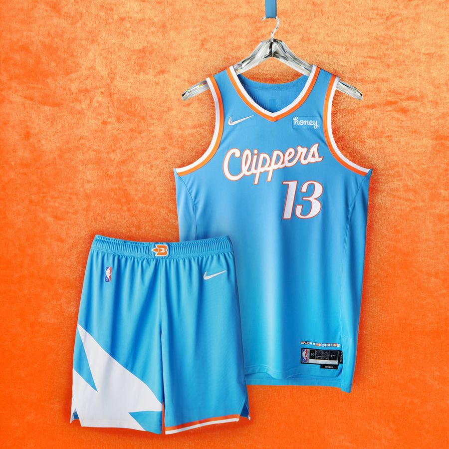 credits: NBA
 I very much like the color scheme.
15. Jesse: Brooklyn Nets
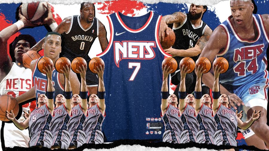 credits: NBA
 As much as I liked last year’s sky blues, these are a step forward, with the inclusion of the red stripe and stars as an homage to the excellent old-school New Jersey uniforms, while keeping the latter-day Nets font.
Moving on to the worst of the bunch...
The Worst - 1. Alice: Oklahoma City Thunder
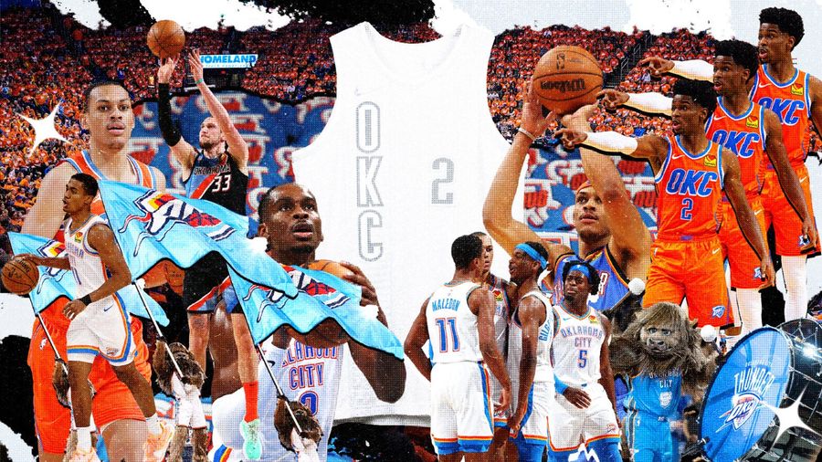 credits: NBA
 It’s just plain white. They should’ve put rainbow on it. And lightning bolts. And seven unicorns. Or anything.
2. Sean: New Orleans Pelicans
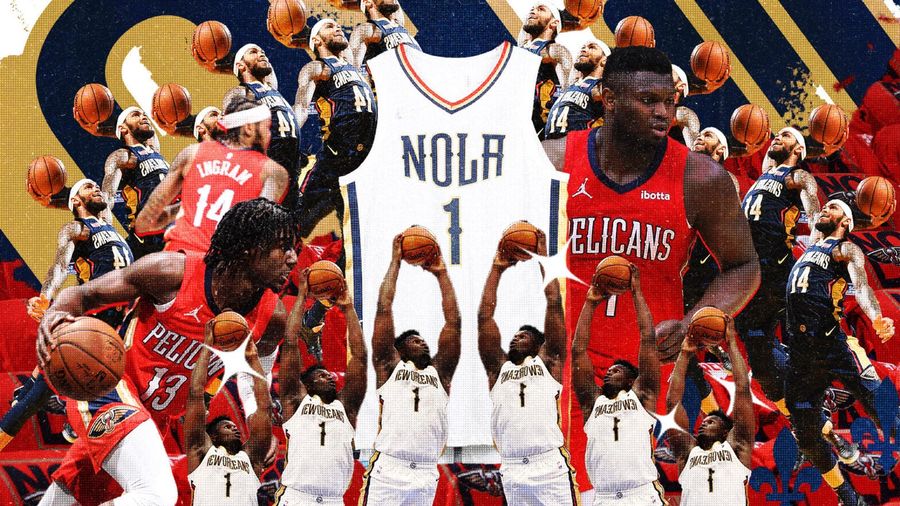 credits: NBA
 It’s too white. Meh.
3. Jesse: Chicago Bulls
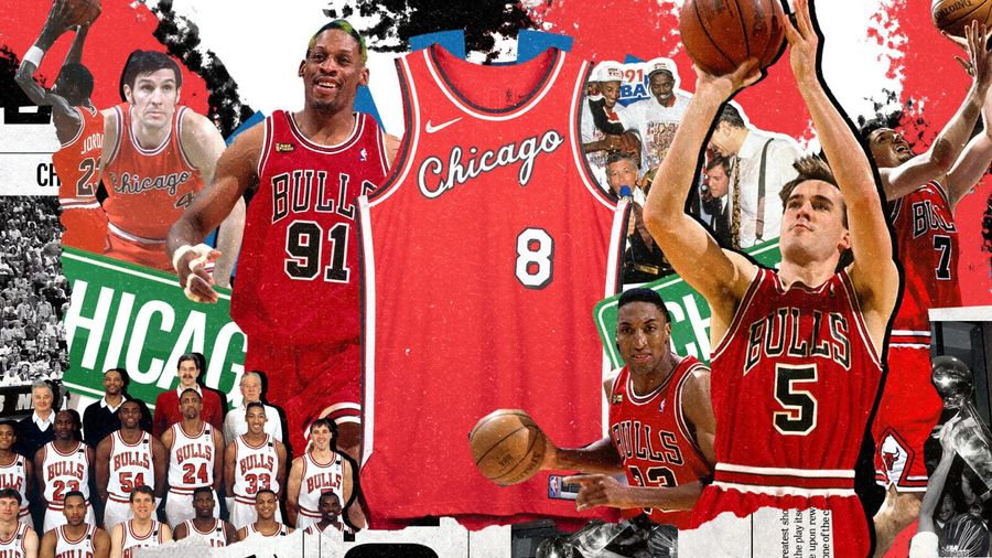 credits: NBA
 Yes, they evoke Michael Jordan’s rookie year uniform. The thing about those is, they always looked like they came from the back of a truck on Madison Street, and this follows in that tradition, right down to the awful spacing between the too-small script and the number.
4. Alice: Washington Wizards
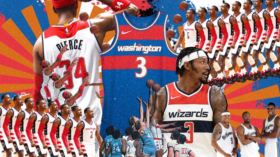 credits: NBA
 I don’t think red and blue go well together. It would’ve been better with bubbling cauldrons, for the Wizards. This, for the Wizards? Whee.
5. Sean: Sacramento Kings
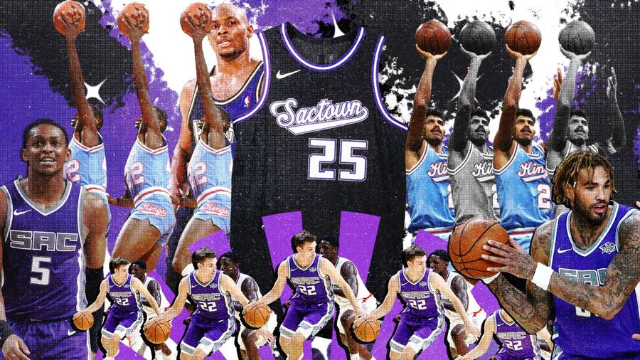 credits: NBA
 It’s too much black. Otherwise, it’s just a regular professional basketball jersey.
6. Jesse: Indiana Pacers
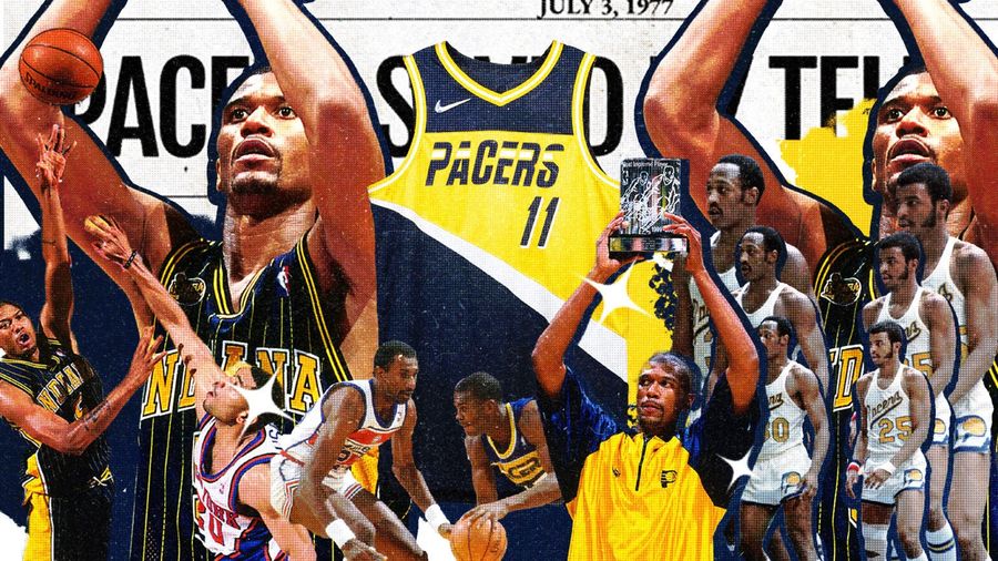 credits: NBA
 I get what they’re going for here with the throwback font and the pattern evoking a racetrack, but it comes off looking very mid-1990s Cleveland Cavaliers.
7. Alice: Golden State Warriors
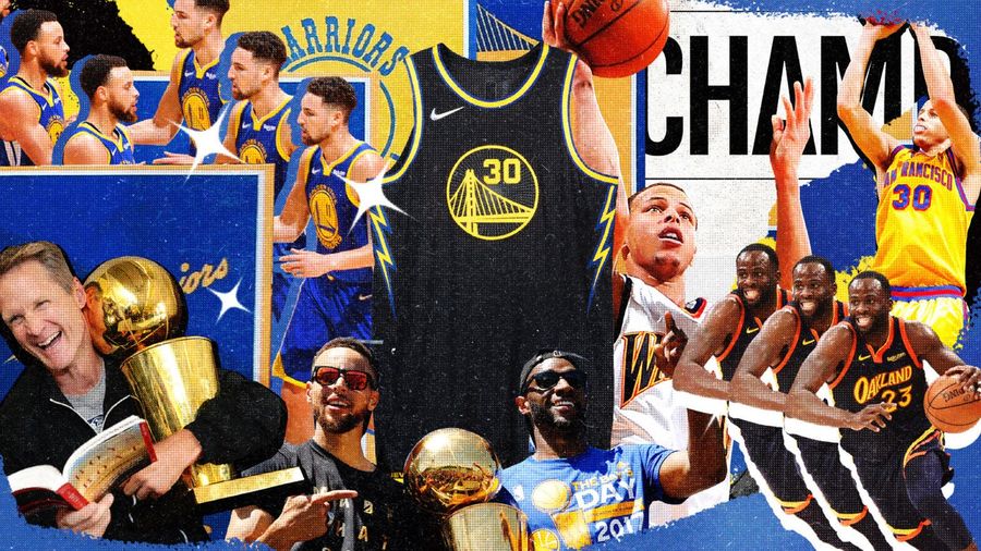 credits: NBA
 Super boring. I’m like, “This? For fighting? Couldn’t you put more Warriors kind of stuff on it?”
8. Sean: New York Knicks
 credits: NBA
 Again, too much black!
9. Jesse: Cleveland Cavaliers
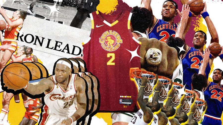 credits: NBA
 That logo is way too intricate to be on a jersey. Logos don’t really look great on basketball jerseys to begin with. Put it on a hoodie.
10. Alice: Minnesota Timberwolves
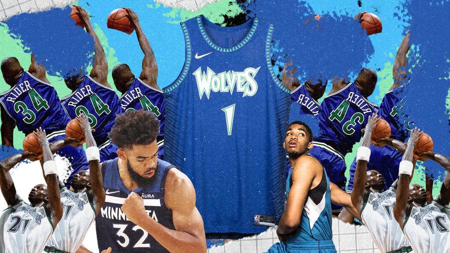 credits: NBA
 There should be a wolf howling there. Or a wolf chasing down a rabbit.
11. Sean: Memphis Grizzlies
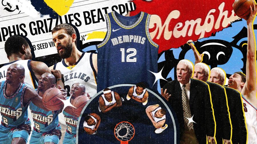 credits: NBA
 Too much navy blue and nothing else. It’s boring.
12. Jesse: Portland Trail Blazers
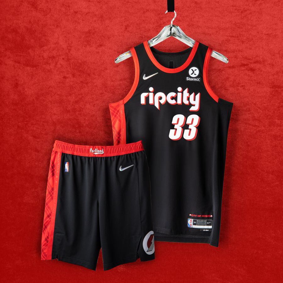 credits: NBA
 Do we really need to try to make Rip City happen so often on these jerseys? The clash between the old school font and the more modern numbering doesn’t work.
13. Alice: Houston Rockets
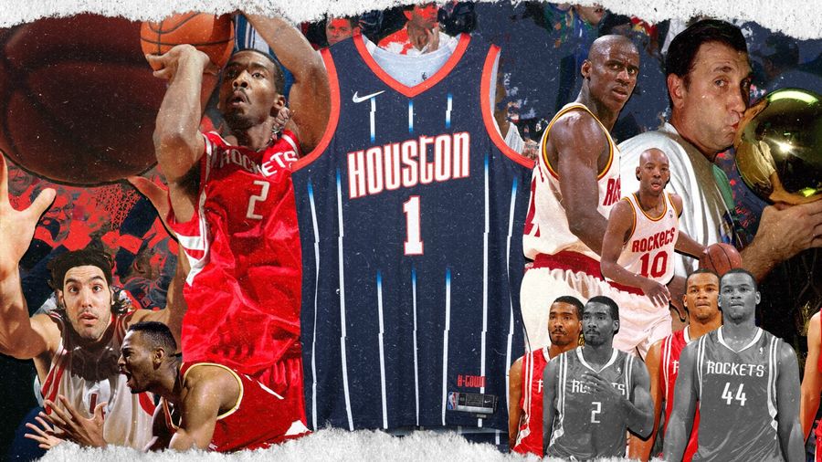 credits: NBA
 I don’t like stripes.
14. Sean: Dallas Mavericks
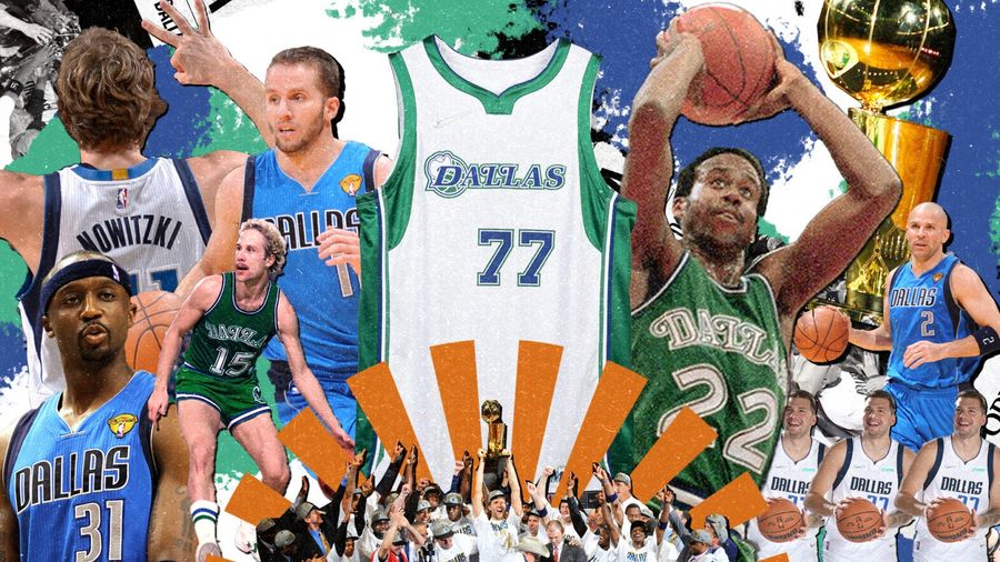 credits: NBA
 Too much white.
15. Jesse: Detroit Pistons
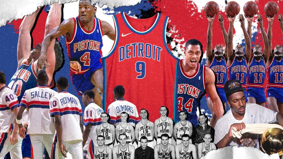 credits: NBA
 This feels like it makes sense as the last pick because it’s not terrible, and not good. It’s a pretty normal jersey, just a color flip from the Pistons as we normally know them. It’s fine.
Related
- Best NBA Betting Picks Today: Friday April 3rd Expert Predictions
- MLB Pitcher Props Today: Best Baseball Bets for April 3rd
- MLB Picks Today: Brewers vs Rays and Reds vs Pirates Predictions
- NBA Picks Today: Celtics vs Heat, Hawks vs Magic, Nuggets vs Jazz Bets
- MLB Best Bet Today: Los Angeles Angels vs Chicago Cubs Betting Pick
- NBA Best Bets Today: Top Betting Picks for Monday March 30th
- Michigan vs Tennessee Prediction: Why Wolverines Are the Elite 8 Best Bet
