Maryland's Football Helmets Are Awesome, And They Didn't Rip Off A Bunch Of Roller Derby Girls
Nobody—OK, maybe Craggs—is more skeptical and mistrustful of the University of Maryland/Under Armour marketing-and-football partnership than I am. I'm on the record predicting shame and ruin for the athletic department in its pursuit of buzz and glory.
And my taste in uniforms is almost entirely reactionary. The old uniform is always better than the new uniform, unless the new uniform is a callback to an older uniform. I wrote off Penn State when they wrecked their jerseys with a Nike swoosh.
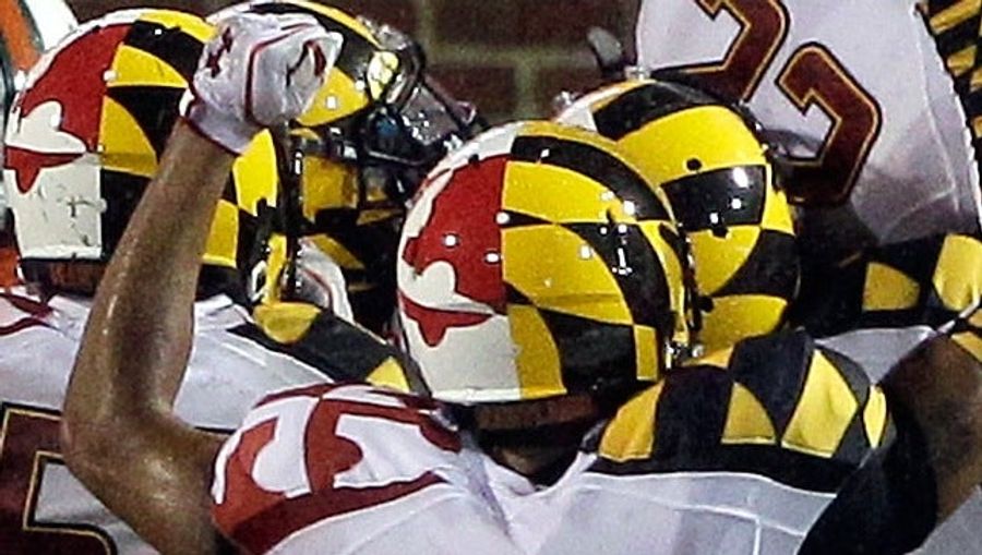
So I was expecting to hate whatever ridiculous helmets Maryland ended up wearing this year. But despite Under Armour's Happy Meal fashion-show fakeout, the Terps showed up for the Miami game looking great.
Unlike Nike's various steel-and-radioactive-yellow atrocities for the University of Oregon, the loudness of the Maryland helmets is traditional and justified. It's the pattern of the state flag—the flag of Lord Baltimore, black and gold for the Calvert family and red and white for the Crossland family. Don't like it? Blame the flashy 17th century.
If anything, Under Armour was a little too restrained. The shoulders of the jersey are wrongly matchy-matchy—for the full Maryland flag effect, they should flip them around, so the black-and-gold shoulder goes with the red-and-white half of the helmet, and vice versa.
That the uniform was a successful marketing provocation—hey, there was Nike pitchman LeBron James calling attention to Under Armour's design!—almost doesn't matter. Except the marketing provocation has brought complainers out of the woodwork.
Now there's a roller-derby team getting some attention because it says it did the flag helmet first. Stuff it, Charm City Roller Girls. The roller-derby design is divided lengthwise and crosswise, into four quarters, exactly like the flag. The football helmet has hemispheres. They only look alike from one angle, which is oddly enough the angle that the Baltimore Sun used for blogging about the roller-derby claim. It's nonsense.
(The Charm City Roller Girls shouldn't be using the red-and-white part anyway. They represent Baltimore, and the Baltimore city flag is strictly Calvert black and gold.)
The helmets resemble each other because the Terps' helmet design is actually straightforward. It's the obvious solution to "Helmet" + "Maryland." I suspect I doodled a version of it on a book cover in middle school. Here's a firefighting helmet that does the same, if the roller-derby folks want to complain about someone else.
Related
Three MLB Contenders That Need Answers Before It’s Too Late
Why Scottie Scheffler Is the Play on Sunday at The Masters
Why NFL's Proposed 18-Game Schedule Doesn't Make Sense
MLB Playoff Teams Off to Shocking Slow Starts in 2026
- Top MLB Betting Picks: Why Pirates and Twins Offer Value Today
- NBA Picks Today: Best Bets, Odds & Predictions for Friday’s Full Slate
- The Masters Odds and Predictions: Top Picks for Augusta National
- Wednesday April 8th MLB Pitcher Props: Dylan Cease and Kyle Bradish Bet Picks
- MLB Picks Today: Best Bets for Diamondbacks vs Mets and Athletics vs Yankees
- Masters Betting Picks 2026: Best Value Bets Beyond Scottie Scheffler
- Best NBA Betting Picks and Predictions for Monday April 6th


