
Roy Halladay's Hats, Ranked

 credits: Getty
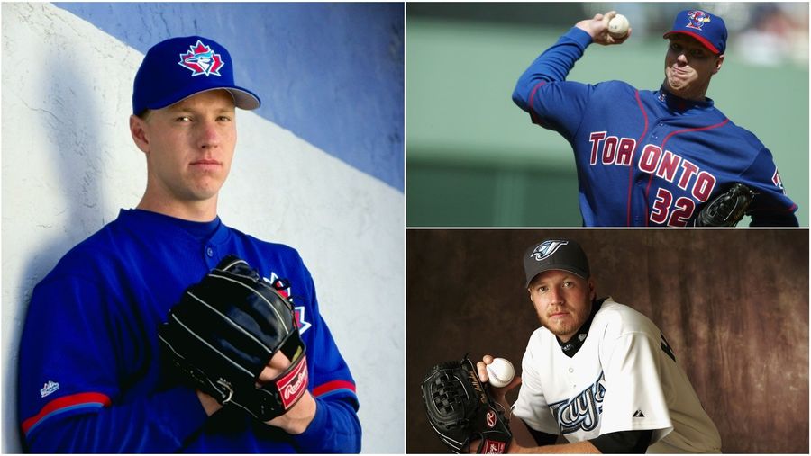
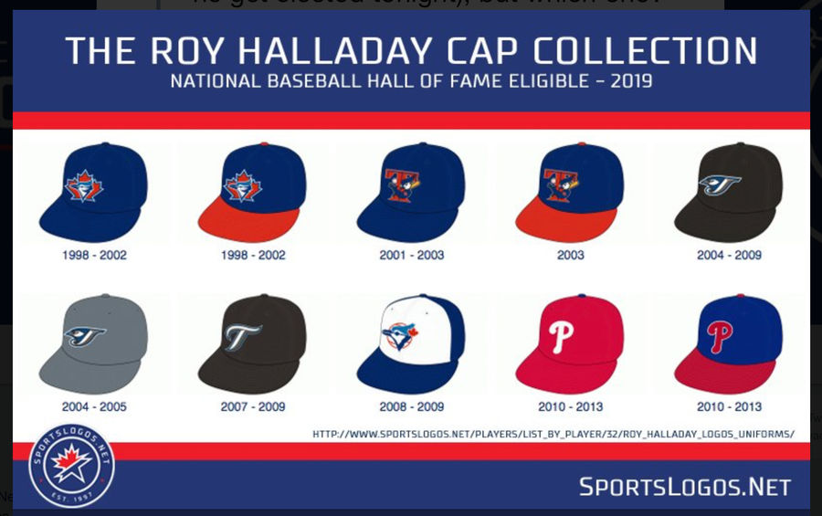
 The late Roy Halladay earned a well-deserved first-ballot nod from the BBWAA on Tuesday, with 85.4 percent of voters enshrining him in the Baseball Hall of Fame. The two-time Cy Young winner Halladay enters Cooperstown with 203 career wins, 2,117 strikeouts, 64.3 WAR, and a whole lotta hats worn, as shown off by sportslogos.net’s Chris Creamer:
 credits: [object Object]
 Halladay will obviously go into the Hall as a Blue Jay, but Creamer asks a fascinating question: Which hat should go on his plaque? Here they are, ranked:
1998-2002: This hat is so Canadian I’m surprised it doesn’t ooze maple syrup, and I love it. The maple leaf is proud and in your face, not letting you forget that this is the true team of the north, while the Blue Jay is cute yet also dignified. It doesn’t matter on the plaque, but a slight edge goes to the one with the red bill, just because I always kind of like it when baseball caps have two colors like that.
2008-2009: This is a throwback to a legendary Blue Jays era that ended a few years before Halladay entered the league, so it’s not something you particularly associate with Doc. But still, it’s easily the best logo of the bunch, a timeless classic with a tastefully subtle leaf and an eye-catching jay. That light blue on white is absolutely gorgeous, too.
2004-2009: For many, this is probably the hat they most identify with Halladay, and so it gets a boost in the rankings even though it represents a gritty reboot of the Toronto Blue Jays, which is the worst kind of reboot there is. Where is the color? Where is the cute? Why does that jay look so pissed off?
2001-2003: This one is just a jay inexplicably equipped with human arms leaning seductively around a big T while holding a bat and ball, inviting you with his eyes to come join him in the dugout, if you catch my drift. The logo from this era is a hilarious abomination that should not be permitted in the hallowed halls of Cooperstown.
2010-2013: Nothing wrong with the Phillies hat—the classic one at least, not the garish blue one—and it does still represent arguably Halladay’s two best seasons. But Halladay is undeniably a Blue Jay first, and so this hat’s mainly an afterthought.
2004-2005: When a room full of sports uniform designers have the world of color to choose, and they settle on grey, someone needs to be fired. This washed-out uncreative nonsense is downright offensive, even it would functionally be no different on a plaque than the black version with the same logo.
2007-2009: What is this, the Texas Rangers? Get the hell out of here and don’t come back without a bird.
Related
Five WWE Superstars in the Spotlight Ahead of Wrestlemania
Best NBA Betting Picks and Predictions for Monday April 6th
Five Early 2026 MLB Takes That Might Already Be True
- NBA Betting Picks April 4th: Three Best Bets for Saturday's Slate
- Michigan vs. Arizona Bets: Wolverines Hold Edge in Final Four Showdown
- Best NBA Betting Picks Today: Friday April 3rd Expert Predictions
- MLB Pitcher Props Today: Best Baseball Bets for April 3rd
- MLB Picks Today: Brewers vs Rays and Reds vs Pirates Predictions
- NBA Picks Today: Celtics vs Heat, Hawks vs Magic, Nuggets vs Jazz Bets
- MLB Best Bet Today: Los Angeles Angels vs Chicago Cubs Betting Pick
