
The Marlins Have A New Logo And New Uniforms, Again

 source: [object Object]
 The 25 years of the Marlins’ existence has been a demonstration of a team that doesn’t know what it is or wants to be. So it’ll try again, with its third rebrand in a quarter of a century, including new colors, a new logo, and four new uniforms.
The franchise launched in 1993 with teal, very South Florida but also very 1990s. Perhaps it’s because the franchise’s glory days came in teal, but that uniform and color scheme has quietly become, in retrospect, borderline iconic. (We can acknowledge that while also realizing the look was very of-its-time, and probably would not be so warmly thought-of if it were still around.) In 2011 the team rebranded as the Miami Marlins, and a new color scheme that featured orange and black as dominant colors. Those uniforms were every bit as anonymous and forgettable as the vast majority of the teams wearing them.
So minority owner Derek Jeter was speaking not merely of the fashion when he declared, “there’s a lot of history here with this organization—some good, some bad.” The Marlins need a rebranding like no other franchise, though the uniforms are but a tiny part of what needs to be done. It’s a start, though.
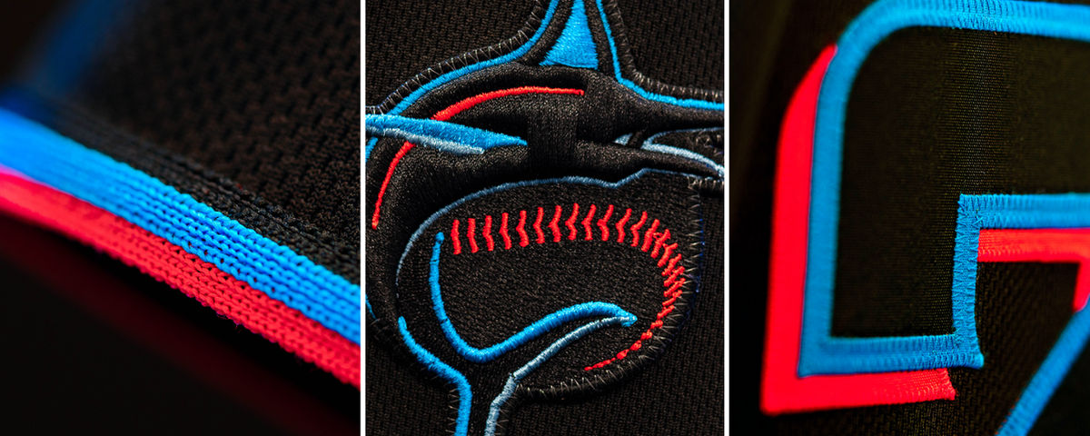
The team partially revealed the new look and new colors (“Caliente Red, Miami Blue, Midnight Black, Slate Grey”), but, inevitably, the first full glimpse of the jerseys came in MLB’s shop. Here they are, compiled by SportsLogos.net, which has an informative post on the sartorial evolution of the Marlins:
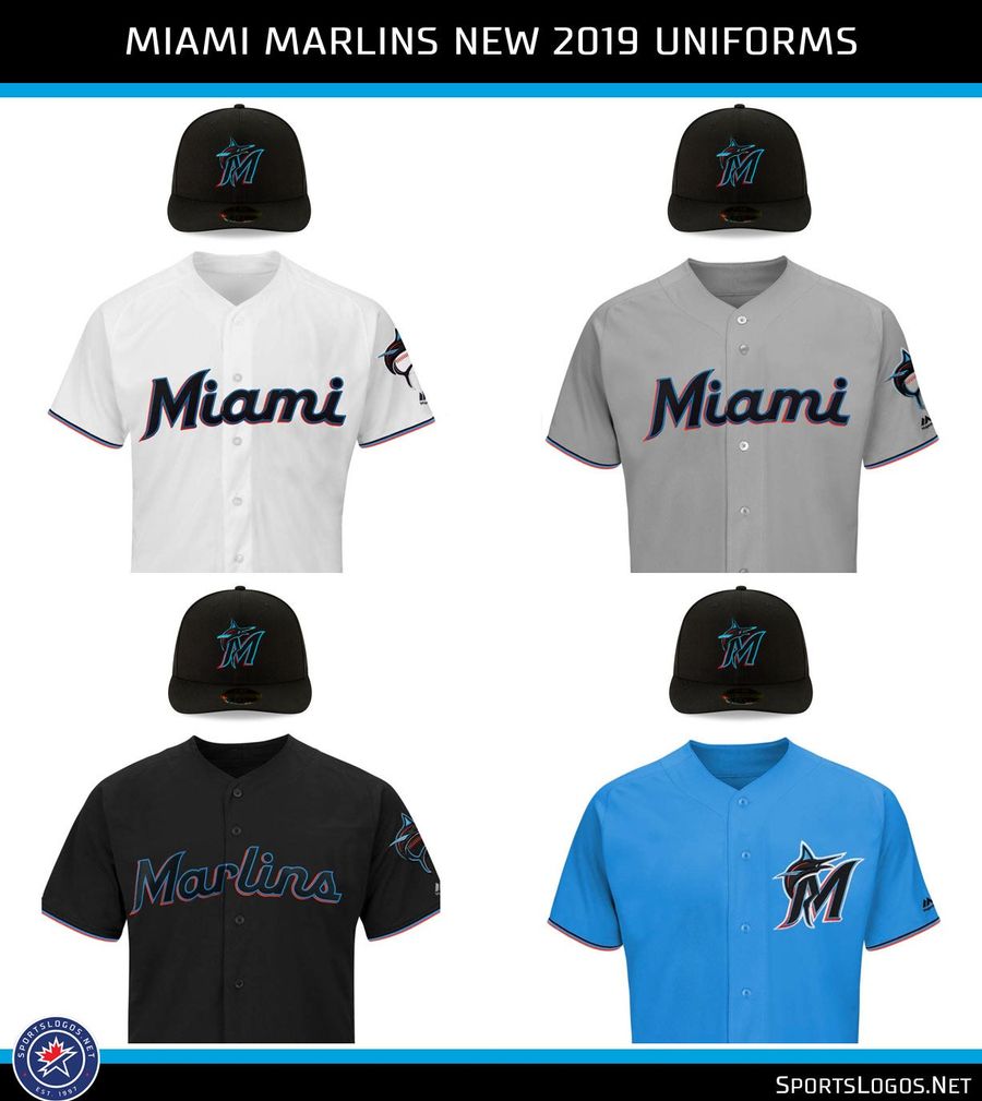
Uniform-wise, I’m not in love, especially with the home whites and road grays. Like with the jerseys they’ve been using for the past seven seasons, they’re dangerously generic, though I think I may come to really like the font. I enjoy the two alternate jerseys much more. The wordmark on the black jersey has the same slick DayGlo-without-garishness of the new logo, while the blue—a lighter blue than the team has been using—is just really pleasant to look at. Marlins Park’s outfield walls will be painted the same shade of blue.
It’s worth taking a closer look at the logo, because it’s pretty damn cool. Again via SportsLogos.net:
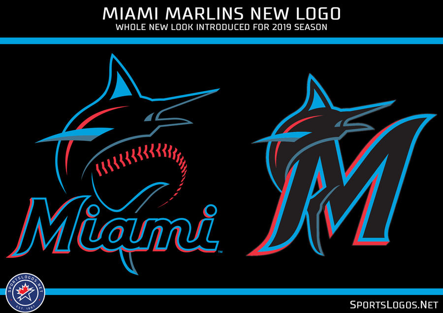
A like that a lot. We’ll have to wait to see how it appears on the field, but from here the logo is somehow electric yet soothing, neon without being bush-league. If I have a quarrel, it’s that this logo fails the ultimate logo test of being simple enough to doodle in your school notebook. But the colors really do pop against a black background in a way they don’t against white, so the Marlins’ new caps look like real winners, in a way their new jerseys don’t quite yet.
Marlins Man shared his thoughts on the team’s new look, but no one cares what he thinks.
What do you think?

The SEC Dynasty Is Over and the Big Ten Proved It
MLB Betting Picks for Wednesday: Two Totals for May 27 Slate
- Knicks vs Cavaliers Picks Today: Best Bets for Game 4 of the ECF
- Best MLB Bets Today: Top Picks for May 24 Featuring Shohei Ohtani and Ketel Marte
- Thunder vs. Spurs Game 4 Picks: Best Bets for WCF Sunday
- Three MLB Futures Worth Betting Before the Odds Disappear
- MLB Best Bets Today: Guardians Value Play and White Sox-Giants Total
- MLB Best Bets Today: Blue Jays, Diamondbacks and Athletics Picks for Thursday
- MLB Pitcher Props Today: Best Bets for Cam Schlittler, Aaron Nola and More
