
There Is Now An App For Triple Crown Ratio Lines On Bad Tweets, And It Rules

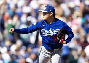
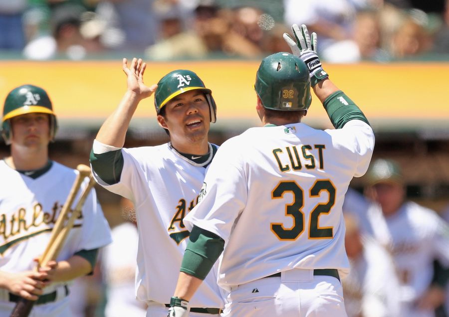 Requisite Jack Cust Imagery. (Ezra Shaw/Getty Images)
 You are familiar, at this point, with how this all goes. Some verified foof on Twitter gets something grandly, gratingly wrong and then it gets...noticed. We are far enough along in the online part of our endless civilizational deadfall that we even have a name for this, now: that Bad Tweet and its author are going to be ratio-ed. Some people will retweet or like the Bad Tweet, because Twitter is full of crummy people who like bad things, but if the Bad Tweet is bad enough and (uh) lucky enough, an exponentially greater number of people will respond to it with helpful messages like “wow, this is a bad tweet” or “you should absolutely live inside a toilet forever.” Again, if you are on Twitter, you know how this all works.
It would be nice if people got to choose what they would be remembered for, but that—that is not how it works, online or anywhere else. When the book is closed on me, I know very well that, if I am to be remembered at all, it will be not for the ambitious work I did or tried to do, but for a questionably punctuated tweet that dared to ask the question How Would A Cable Sports Blowhard Act In An Upscale Chain Eatery and maybe also for having noticed that, sometimes, a ratio’ed tweet looks like a baseball player’s stat line in the traditional triple crown categories.
It’s not a profound or remarkable or, lord knows, important thing to notice, but it is the sort of thing that you tend to keep noticing once you know to look for it.
Anyway that’s what I’ve done with my life.
Last month, I discussed this particular achievement/“achievement” on Slate’s Hang Up And Listen podcast; co-host Stefan Fatsis mentioned that there should be an app that matches Triple Crown ratios on Twitter to their analogues in baseball history. Tony Petrangelo, a 38-year-old Minneapolis resident who listened to the podcast, decided to take this important work/“important work” a step further. Where previously aficionados of the Triple Crown Ratio had to guess at a baseball player comparison, Petrangelo wrote five lines of what he swears is very simple Python code, and changed the game forever. The result can be found at thetwitterratio.com, and it is remarkable—what gunpowder or astronomy or higher mathematics has done for civilization, Petrangelo’s code has done for the Triple Crown Ratio.
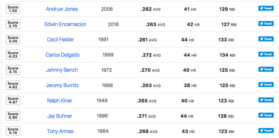
Or, anyway: He made a site where you can plug in a bad tweet, manually enter the number of responses it has received. (The reason why that part must be done manually is complicated, but Petrangelo writes that “I did some cursory Googling and while there seem to be some methods to approximate the number of replies via [Twitter’s application programming interface] none of them would be accurate and all would be fairly convoluted.”) And then you push a button and get a complete and comprehensive list of comparisons from throughout baseball history, with information sourced through Fangraphs and ranked in terms of most to least similar according to the Euclidean Distance Function.
“To be honest,” he told me, “there wasn’t any one thing that was more challenging than the rest, and I don’t mean that as a humblebrag. It’s just that there are so many tools out there these days for developing things like this that the most challenging part was probably finding the free time to do it.” He is definitely being modest, and I am certainly an idiot, but as with any sufficiently advanced technological achievement, the result is effectively indistinguishable from magic.
Here’s an example. We begin with this bad tweet from CNN’s resident horserace chowderhead Chris Cillizza. This was his response on Twitter after President Donald Trump issued a pissy official statement in response to some pissy quotes from Steve Bannon, a former White House strategist who first achieved fame as one of The Booger Guys in Mucinex’s television advertising.
A typically dim and morally null sentiment, but admittedly the ratio on that is pretty tasty. I took it to Petrangelo’s application, dropped it in, left the plate appearances field open, and pushed that Get Comparables button.
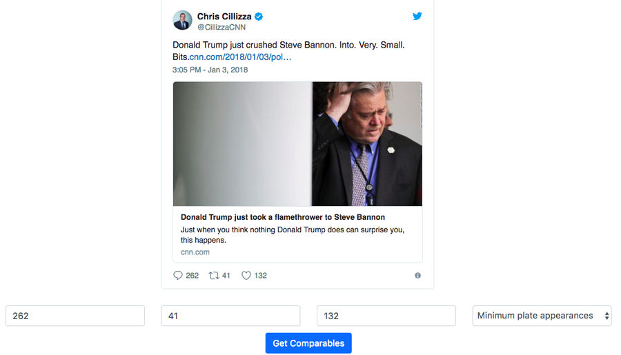 Figure one, Bannon enlarged for scale.
 And the results were astonishing. I’ve done a decent number of test-tweets on Petrangelo’s application, for uh reasons that have nothing to do with my aforementioned idiocy, and after a lot of tweets whose results kind of looked like Dan Uggla or Rob Deer seasons—“Deer has come up quite a bit in my testing,” Petrangelo admitted—it was shocking to see the similarity scores on Cillizza’s tweet. It was just that bad, and also the 2006 version of Andruw Jones was just that good.
 Jeromy spoke in class today.
 None of this is perfect, of course. Tweets that are too bad, or just get ratio’ed too dramatically, quickly wind up with stratospheric numbers that, while generally apt representations of the tweet’s shittiness, generally don’t look at all like baseball stat lines; the best Triple Crown ratios represent moments in time, and it’s the rare tweet like Cillizza’s that somehow tops out at exactly the right ratio. Tweets mostly either fall short because they’re insufficiently enraging or stupid or widely seen, or rocket towards ratios that are pure psychedelia. There is only so much that even the most elegant lines of code can do to capture the pure idiot churn of Twitter.
As with most things having to do with this maddening social media platform, Petrangelo’s work was born of a combination of mis-prioritized brilliance and idleness; he applied the knowledge of Twitter’s API that he’d picked up on another project to this infinitely less important one. He works for an audio/video integration company in Minneapolis and stays home with his 15-month-old a couple days a week; this is something he did for fun, and because he could do it. “I enjoy the satisfaction of making things work,” he told me when I asked why he did it. “For example, when I finally got the table of most similar players showing up on the screen I did a little fist shake thing.”
While he was splashing around in Twitter’s scenic garbage bogs and fine-tuning his code, Petrangelo developed a more refined appreciation for the accidental art that adheres to these lousy tweets, and for the patterns that somehow blunder up through all this noise. “The thing I noticed is the life of a bad tweet in some ways mirrors the evolution of baseball,” he said. “At the beginning of a bad tweet’s life the players that tend to be most similar are those from the very early days of baseball. As the bad tweet matures, you start to see more players from the ‘60s, ‘70s, and ‘80s, [and] then the three-true-outcome players of the modern era.”
All of this, or at least the parts of it that don’t have to do with Petrangelo’s deft coding, can probably be filed under Happy Accidents. There is nothing really beautiful or funny or cool in the raw material of these tweets; we are, at some point, just talking about Chris Cillizza burping as much of the alphabet as he can. And yet somehow something graceful, or at least goofily amusing, emerges and appends itself; the tweets themselves are so undignified that they somehow boomerang back and distinguish themselves by accident. Petrangelo’s observation on the ripening process of a bad tweet and its attendant similarity scores feels especially right, here. It’s hard to say that any of it looks or feels like progress, but also there it goes, marching stupidly into the future.
Related

NBA Picks for March 27: Best Bets for Friday Night Slate
Why St. John's Can Cover Sweet 16 Spread Against Duke
MLB Best Betting Picks for Friday March 27th Slate
NBA Betting Picks: Best Bets for Thursday’s Slate
- Three Sweet 16 Teams To Avoid Betting in March Madness This Weekend
- NBA Betting Picks: Best Bets for Thursday’s Slate
- Why the Nebraska Cornhuskers Have the Edge Against Iowa in Sweet 16
- Ranking the Remaining No. 1 Seeds in March Madness Before Sweet 16
- Best NBA Bets Today: Wednesday Predictions and Player Props
- How MLB Is Getting Opening Day Wrong in a Crucial 2026 Season
- MLB Opening Day Wednesday Pick: Yankees vs. Giants Best Bets
