
data-visualization - Sports News, Headlines & Highlights

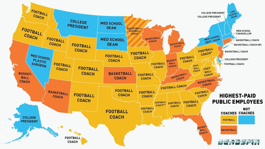
Infographic: Is Your State's Highest-Paid Employee A Coach? (Probably)You may have heard that the highest-paid employee in each state is usually the football coach at the largest state school. This is actually a gross mischaracterization: Sometimes it is the basketball coach....
Infographic: Where Do NFL Draft Picks Come From?Tonight, we get to watch the first round of one of the saddest NFL drafts in recent memory, with teams tripping over each other trying to trade down in a weak year. Even in the good years, success in the college game doesn't always translate to the pros, but some regions and conferences have a reput...
Are Men More Likely To Stand On The Subway Than Women?
Welcome to Dataspin, a weekly data visualization of whatever the fuck....
How'd They Make That <em>Jurassic Park</em> Dinosaur Noise? A Handy Chart
Welcome to Dataspin, a weekly data visualization of whatever the fuck....
Did The Movie <em>Heathers</em> Kill The Name Heather?
Welcome to Dataspin, a new weekly data visualization of whatever the fuck....
Infographic: Watch More Coaches Climb Up Football's Hierarchies
Last week, after Cincinnati snagged Tommy Tuberville away from Texas Tech, we took a look at some of the longest chains of football-coach hirings in recent memory. Since then, this chain grew one link longer, as Texas Tech hired Texas A&M offensive coordinator Kliff Kingsbury to fill its vacant posi...
Infographic: Watch Coaches Climb Up The Hierarchy Of College Football
Three Saturdays ago, Tennessee lost to Vanderbilt, 41-18, dropping the Volunteers to 4-7 on the season and 0-7 in the SEC. This pretty inconsequential game has led to a brief but wonderful domino effect, wherein: ...
latest