reubenfb Page 15 - Sports News, Headlines & Highlights
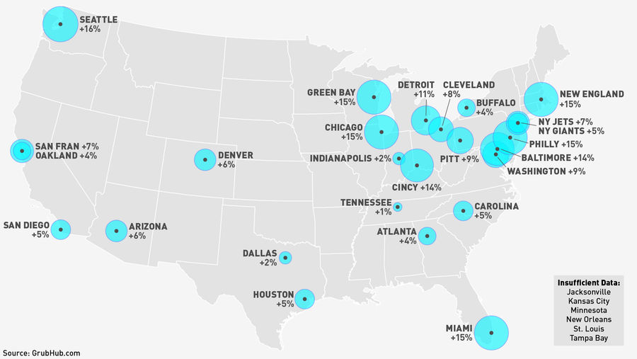
Which Lazy-Ass NFL Fans Order The Most Food Online During Games?
Watching Sunday football is already sweetly lazy, but to take the laziness to the next level you really have to order greasy delivery, and you have to order it online....

Deadspin Up All Night: Into The White
Thank you for your continued support of Deadspin. The World Series starts in a few. Maybe check it out if you're into that sort of thing....

Here It Is: The Only Spurs Alley-Oop From The 2012-13 Regular Season
As we mentioned last week, the Spurs have had a league-low five alley-oop dunks in the last two seasons, and they had just one in the 2012-2013 regular season. Here it is. It's pretty sad, for a couple of reasons:...
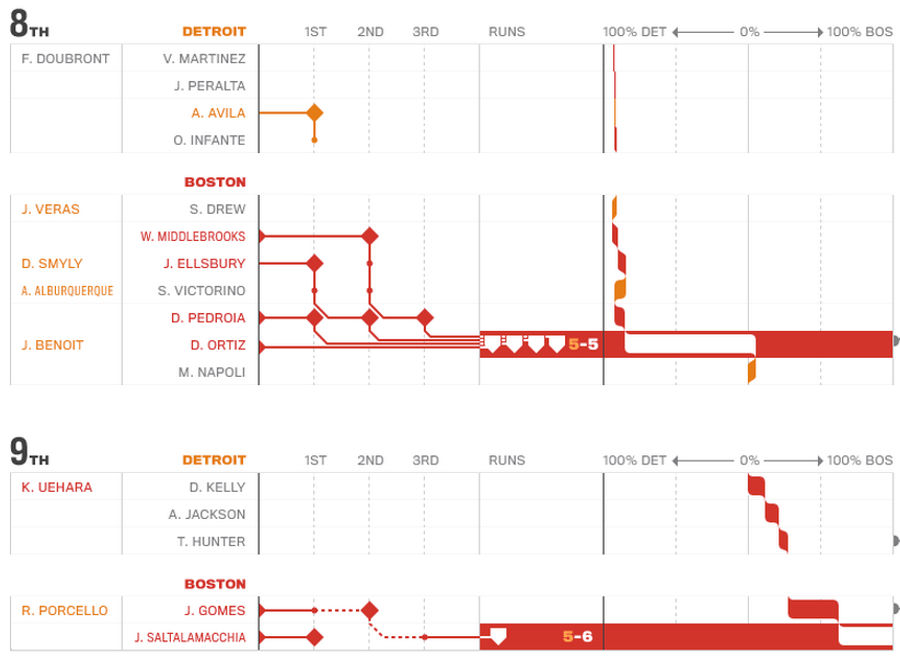
Check Out These Beautiful (And Useful) Graphic MLB "Box Scores"
Michael Deal, who previously gave us this infographic of every pitch of the All-Star game as part of his Statlas project, has developed a new take on the MLB box score. The sample above shows the 8th and 9th inning of Game 2 of the ALCS, which, as Deal's line-and-node representations make clear, wer...
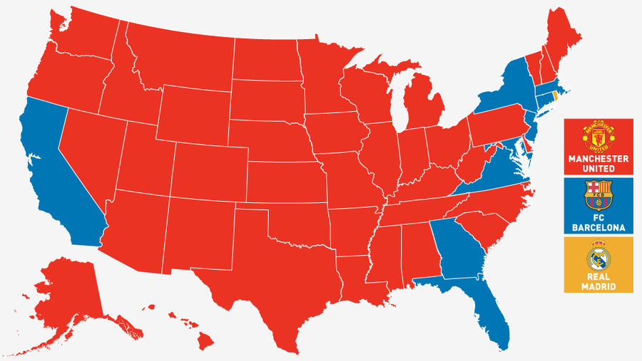
Facebook Map: The Manchester United States Of America
Champions League action resumes today, but who is America rooting for? The map above, using data provided by Facebook, shows which of the qualifying teams have the most "likes," by state. While Americans like to make fun of all the people overseas who randomly wear Yankees caps, it's a clean sweep i...
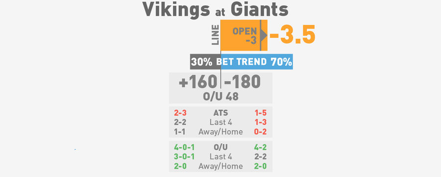
NFL Spreads, Visualized: <em>Monday Night Football</em> And Week 8
Based on your feedback from last Friday, we've made a few changes to our visual guide to NFL betting lines. Here's what's new:...
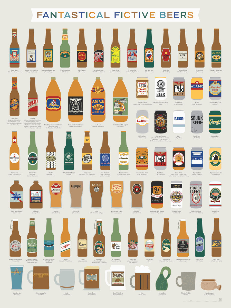
Chart: 71 Fictional Beers
Not content with mapping out over 500 actual beers, Pop Chart Lab has now cataloged 71 fictitious beers and beer-like substances from popular media. Everyone's heard of Butterbeer, but did you know about Heisler—an in-house fake beer from prop supplier Independent Studio Services—has been used in De...
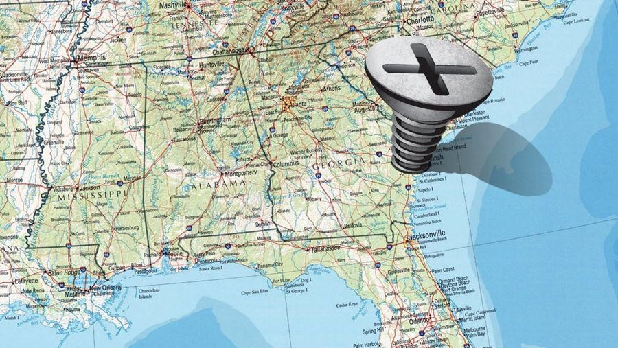
Which TV Market's Getting Screwed Today? Your Week 7 NFL Viewing Maps
A guide to the best and worst of the NFL slate (and to which fans are stuck with the most of worst). Maps via 506sports.com....
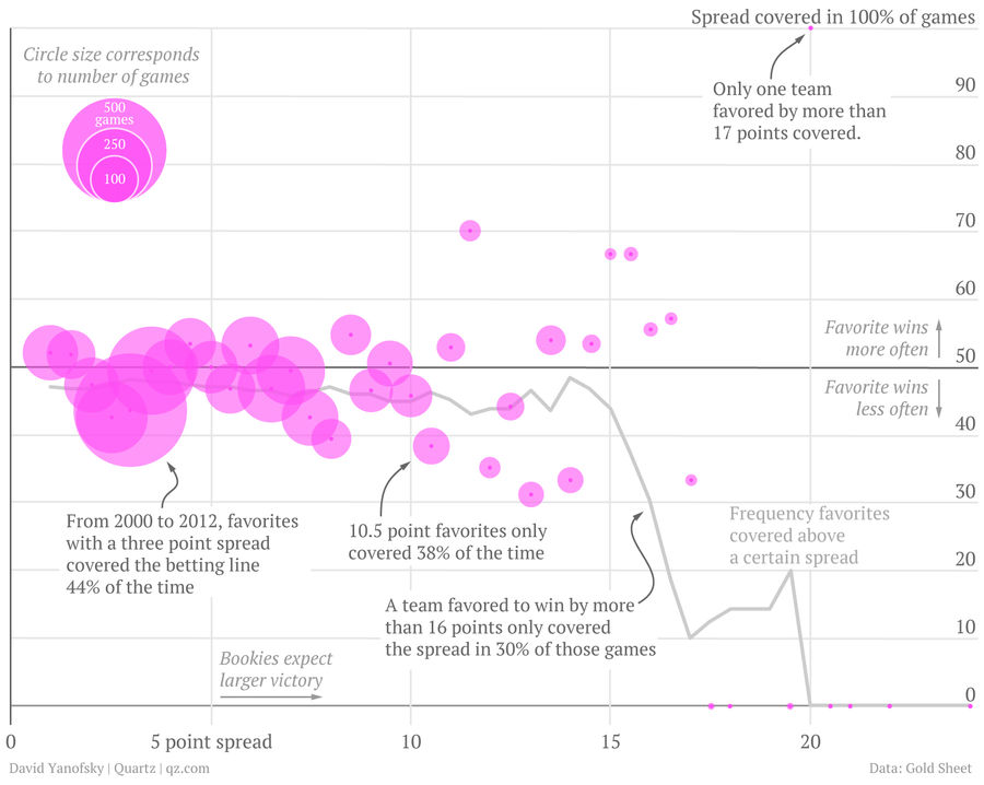
Chart: Friendly Reminder, Don't Bet On Favorites To Cover Huge Spreads
If you happened to bet on the Broncos to cover last week, David Yanofsky over at Quartz has put together a great chart to show just how much of a dumbass move that was....

NFL Betting Lines, Visualized: Week 7
So you want to gamble on football. Good—gambling is damn wonderful. Here's a resource to make looking at this week's lines a little more informative....
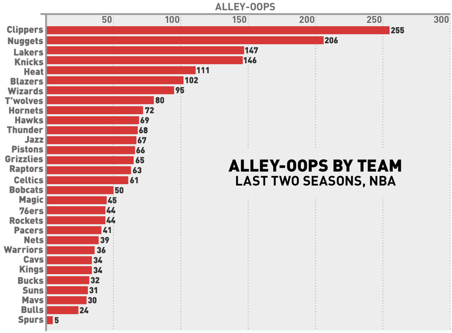
The Fun-Hating Spurs Threw Just One Alley-Oop Last Season
The chart above, based on data from NBA Stats, shows the number of alley-oops each team has thrown in the last two regular seasons. No surprises at the very top, although it's nice to see the mediocre/bad Blazers, Hornets, Timberwolves, and Wizards crack the top ten....
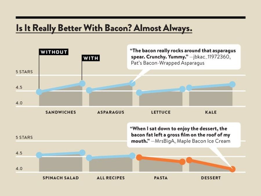
Science: Bacon Is The Ultimate Ingredient
While we always knew it within the thickening walls of our heaving hearts, Wired.com has managed to prove it empirically: Bacon does, in fact, make (nearly) everything better....
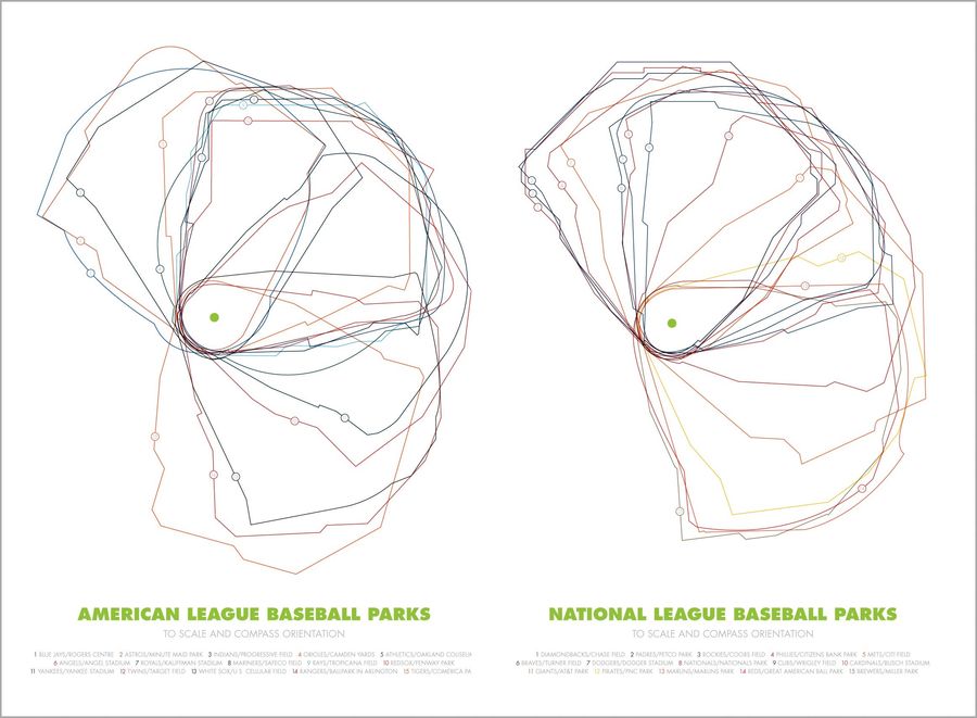
Infographics: Overlaying The Ballparks Of Major League Baseball
We've seen graphics that compare ballpark orientation (like this or this) and we've seen graphics that compare ballpark dimensions (here or here), but as far as we can remember, we've never seen a graphic do both at once. Here are some cool posters put together by designer Jeremy Huggins. It's alway...
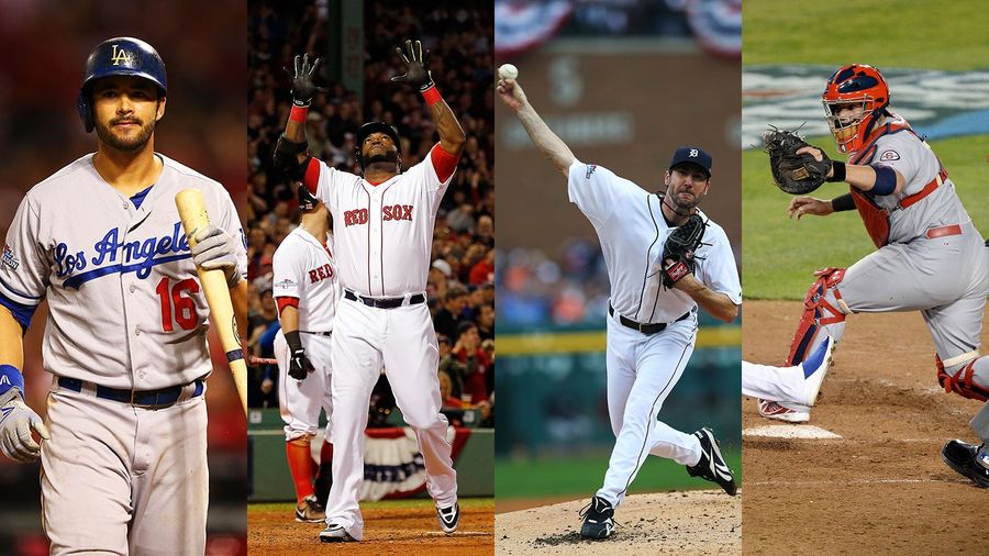
Charts: How Do You Build A Championship Baseball Team?
This season, the A's, Rays, and Pirates used front office wiles to build playoff-bound squads despite having minimal financial resources. Even with these feel-good stories eliminated, though, the four remaining teams still demonstrate that there are many good ways to build a competitive organization...
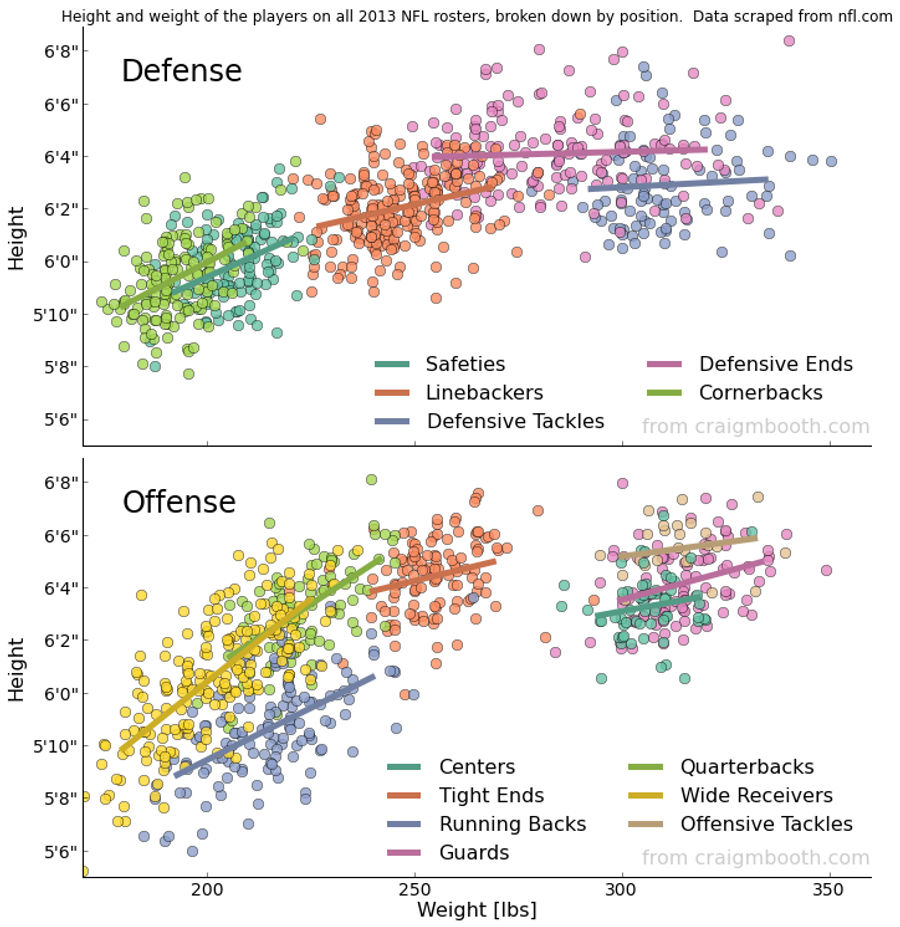
Chart: The Height And Weight Of Every NFL Player, By Position
Over on Reddit, user Craig Booth scraped the NFL's team roster websites for height and weight information and compiled it into the excellent graphic above....
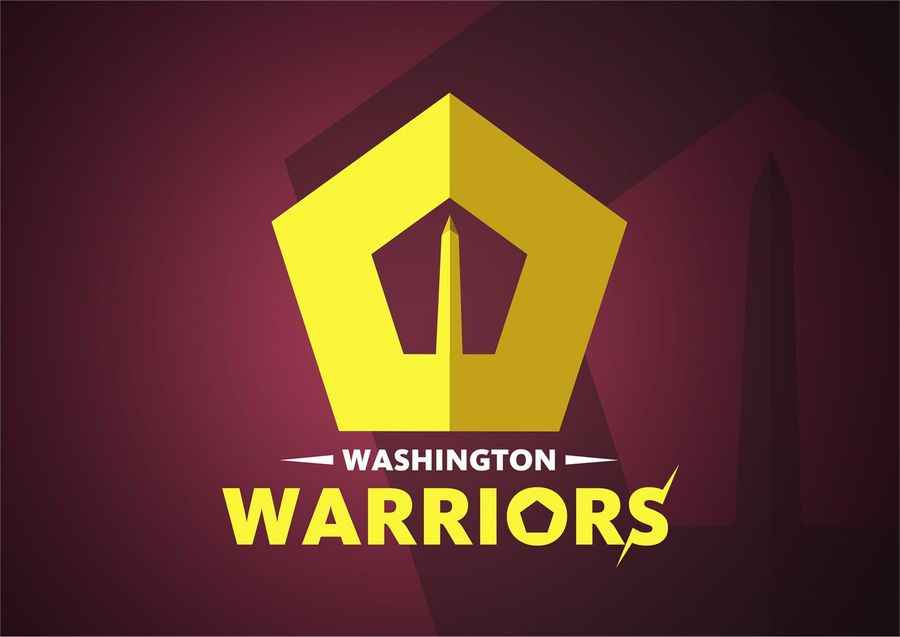
The Washington Redskins, Rebranded: Your Best Submissions
99design's "Rebrand The Washington Redskins" contest ended this weekend, with the logo above (by user Mixaurus) winning the $499 prize. Apparently the polls were overrun with pro-Redskins trolls or graphic designers are really nit-picky (or both), because the second-highest-rated submission garnered...

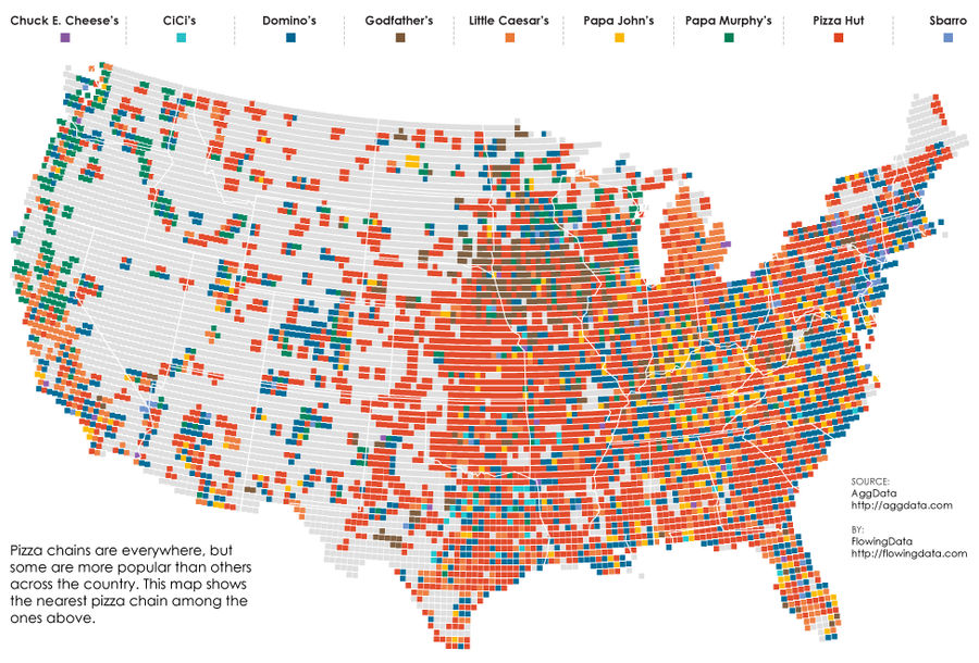
Map: What's The Nearest Pizza Chain?
The weird distribution of fast food across the United States is an endless source of conversation ("What do you mean you don't have Sonic?!"), and a pretty fun thing to map. We've seen these sorts of data visualizations for McDonald's, burger places, and breakfast haunts, but over at FlowingData, th...
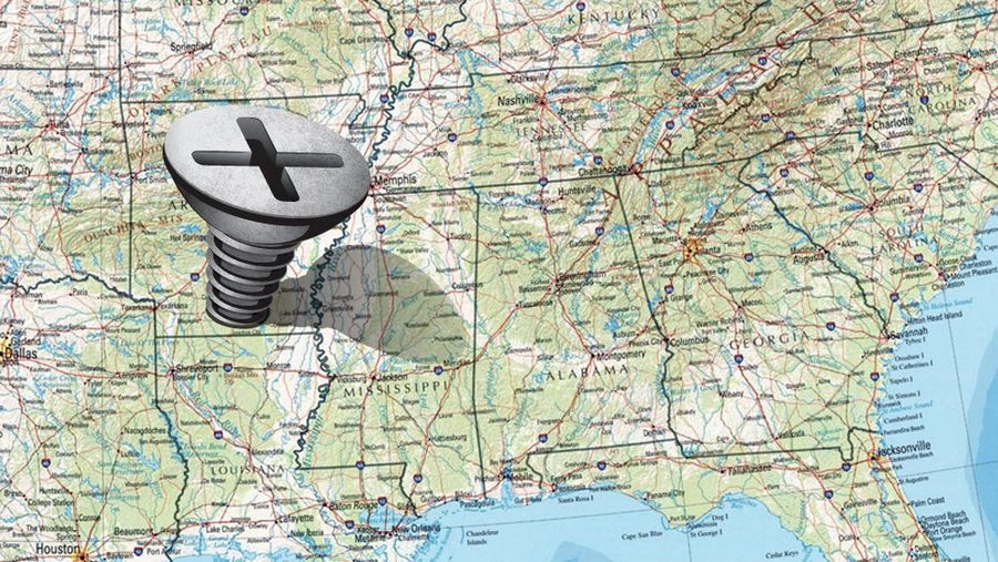
Which TV Market's Getting Screwed Today? Your Week 6 NFL Viewing Maps
A guide to the best and worst of the NFL slate (and to which fans are stuck with the most of worst). Maps via 506sports.com....
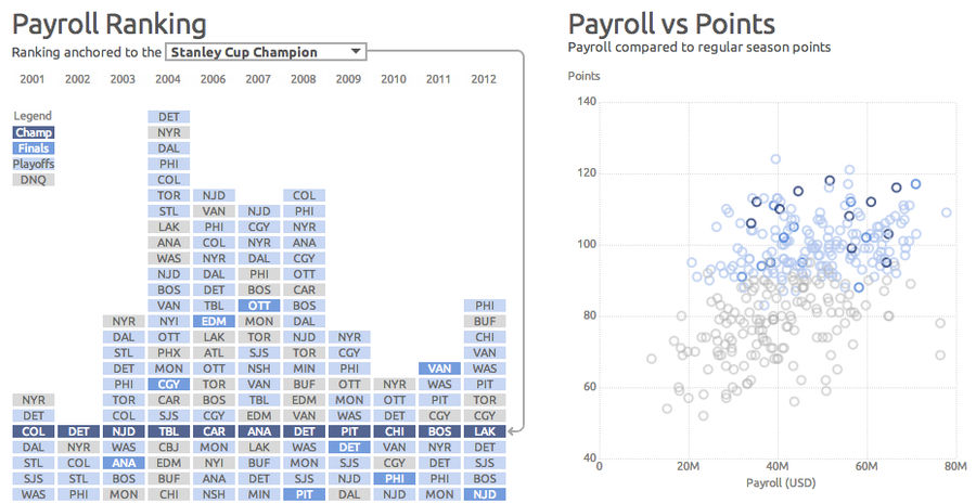
What Makes A Stanley Cup Champion? More Hockey Interactives To Explore
Continuing our industry-leading coverage of interactive hockey infographics, the charts above are a selection from an excellent piece of data viz by Dark Horse Analytics, which explore the relationship between payroll/attendance/offense/penalties and team performance....
