
Dear ESPN, Please Stop Using Yellow In Your Monday Night Football Down-And-Distance Graphic [UPDATE: It's Gone]


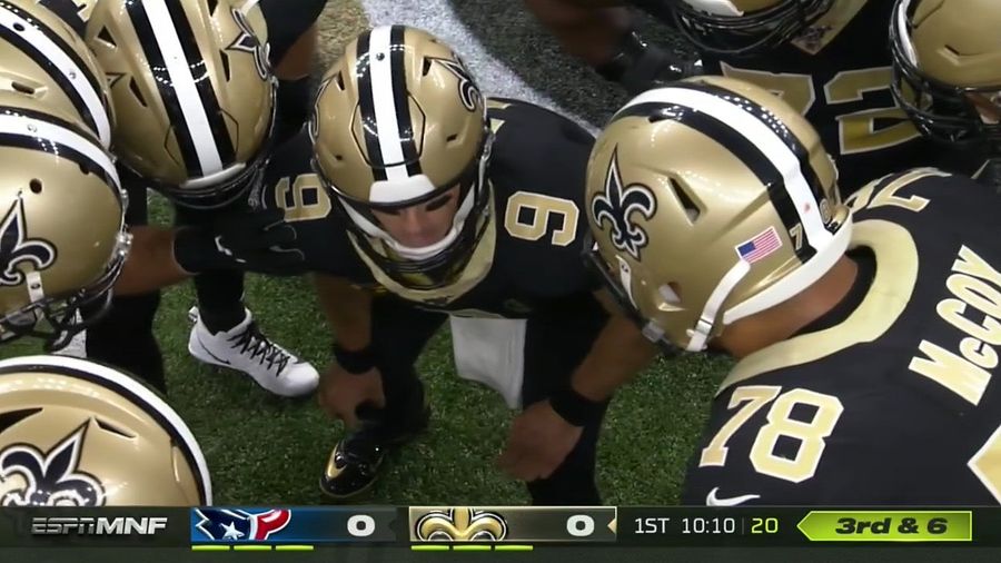
For reasons passing understanding, ESPN’s Monday Night Football presentation uses a sickly greenish-yellow color for the graphic showing the down and distance. It’s a big highlighter-yellow block on the bottom right of the screen, and it’s ugly, and I hate it. On top of being ugly, it looks like a penalty flag has been thrown after every single play.
 credits: ESPN
  credits: ESPN
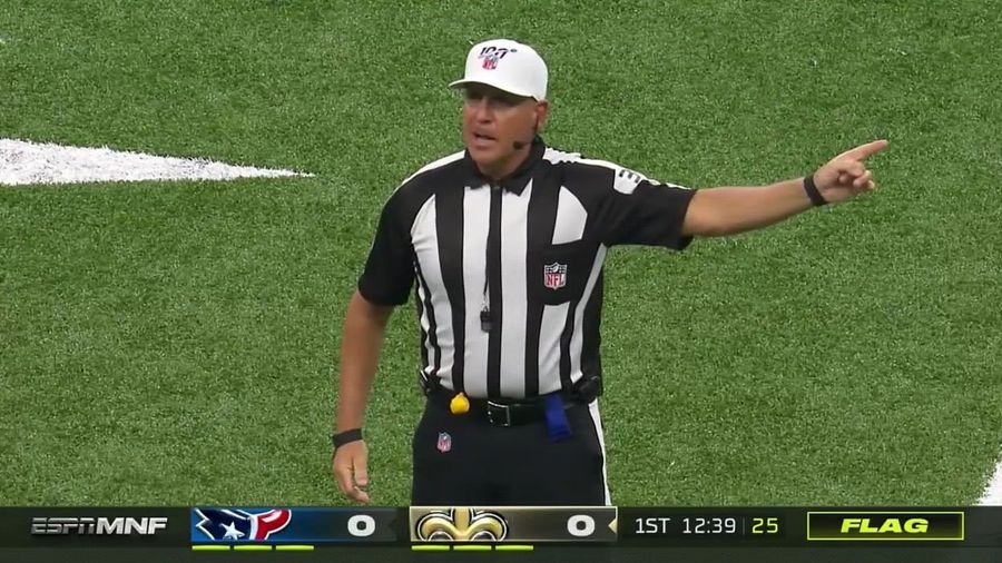
 Because they made the standard color of their down-and-distance graphic this vile yellow color, ESPN had to choose another color to indicate when a flag has been thrown. As one does, ESPN settled on black with a yellow background for flags, which raises the question of why they didn’t use this for the regular down and distance, which would’ve made for a less distracting and confusing (and hideous) presentation.
 credits: ESPN
 You have so many colors to choose from—the whole visible spectrum, in fact—and only one that viewers associate with penalty flags. How about you make that one color the color you use to indicate when a flag is thrown, and use the simpler, cleaner, less glaringly ugly color combination for the regular run of play? This should be so simple and straightforward.
UPDATE 8:52 p.m.: Well, that didn’t take long.
 credits: ESPN


- WNBA All-Star Weekend Best Bets: Caitlin Clark, Marina Mabrey and More
- MLB Player Props Today: Best Bets for Wednesday, July 22
- WNBA Best Bets: Wednesday Picks Featuring Lynx, Aces and Wings
- Twins vs. Guardians Prediction: Best Bets for Tuesday's AL Central Showdown
- MLB Best Bets: Jacob Misiorowski, Dylan Cease Lead Monday's Top Picks
- Athletics vs. Diamondbacks Predictions: Best Bets, Odds and Props for Monday
- UFC Fight Night Best Betting Picks for Du Plessis vs. Usman in OKC
