
Hawks Unveil New Neon Uniforms

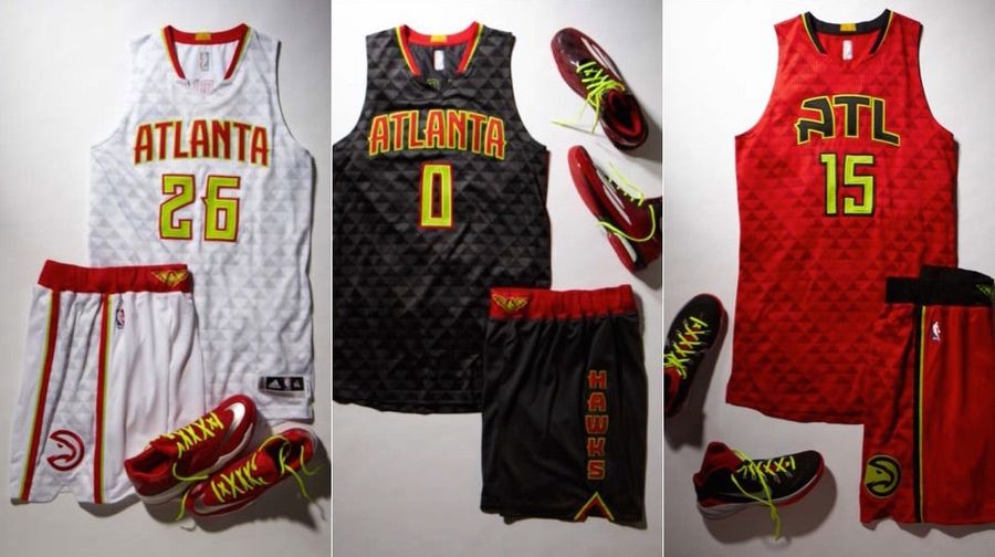
It didn’t have to be this way. The Atlanta Hawks could have designed nice, normal uniforms, like other teams get to have. They could have avoided aiming for “retro-futuristic” and missing so badly they ended up with “textured alarm clock.”
The Hawks will officially reveal their new uniforms later this morning, to go with the new logos released earlier this month, but images have been leaked early to the Atlanta Journal-Constitution. When the official announcement comes, you’re probably going to hear a lot of marketing speak about the Hawks hearkening back to their roots, but updating the past while looking to the future, etc. etc. Don’t be fooled. These feel like the an unholy basketball lovechild of the Tampa Bay Buccaneers and MLB’s 1999 “turn ahead the clock” promotion.
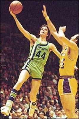
So that greenish-yellow, which might be fine if it were just the laces and some piping, but becomes overwhelming as the base color for the single largest element of the jerseys? That appears to be a throwback to one or two older uniforms of Hawks past. For two seasons, 1970-72, the Hawks used neon green in their logo and unis. If it’s familiar, it’s probably because you’ve seen it on Pete Maravich. It didn’t look so bad as an asymmetrical accent stripe on the road jerseys, but when the Hawks tried to make it anything more than that, it was disastrous.
From 1972 through 2007, the Hawks included yellow as one of their colors, though they gradually phased out its prominence. (Think the McDonald’s color scheme you picture on the Dominique Wilkins-era ‘80s teams, which also featured the “Pac-Man” logo Atlanta is bringing back this season.) This isn’t quite that either. It’s almost as if the Hawks took their lime green and mustard yellow, and split the difference to emerge with this sickly chartreuse nightmare.
It’s not all negative. The logo looks great, and it’s about time the Hawks ditched the blue that’s been a major part of their palette since 2007. I’m also fairly sanguine about the triangle pattern in the fabric. We’ll have to see how it looks in motion, but I tend to believe it’ll barely show up on TV. (Yeah, we’ve reached that point with the Hawks unis: calling a design element a positive because you probably won’t notice it.)
- NBA Best Bets Today: Top Betting Picks for Monday March 30th
- Michigan vs Tennessee Prediction: Why Wolverines Are the Elite 8 Best Bet
- Top NBA Bets Today: Expert Picks for March 29 Slate
- UFC Seattle Predictions: Adesanya vs Pyfer Main Event Betting Picks and More
- Arizona vs Purdue Elite 8 March Madness Betting Picks, Prediction
- NBA Picks for March 27: Best Bets for Friday Night Slate
- Why St. John's Can Cover Sweet 16 Spread Against Duke
