
Here's An Interactive Visualization Of Every NBA Stat Ever

Here's an interactive made by Alex Bresler that starts off a little unwieldy, but is functionally a treasure box of NBA oddities.
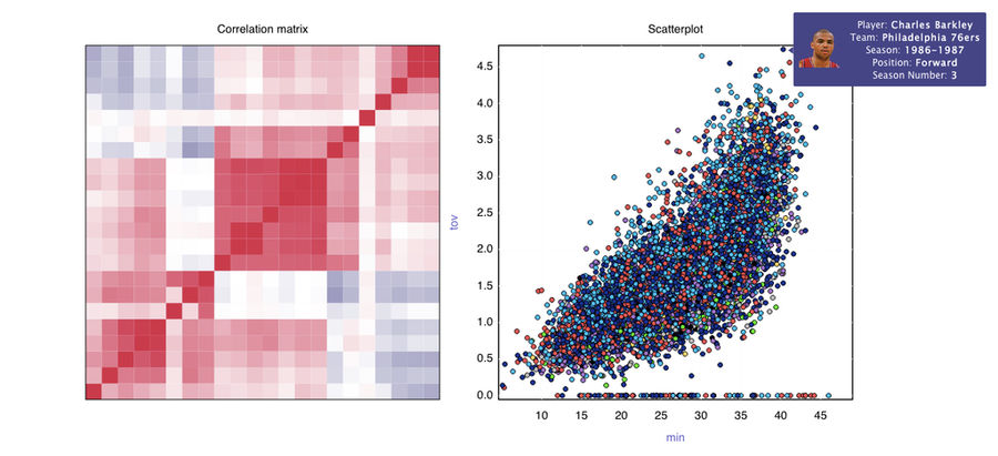
This has been floating around the internet since the weekend, but hasn't gotten much attention. (I only bumped into it while searching for an old post on /r/DataIsBeautiful.) But this is cool as hell. Just mouse over the matrix on the left to select which stats you want to compare, and the scatterplot on the right populates, with individual player season information supplied by each point.
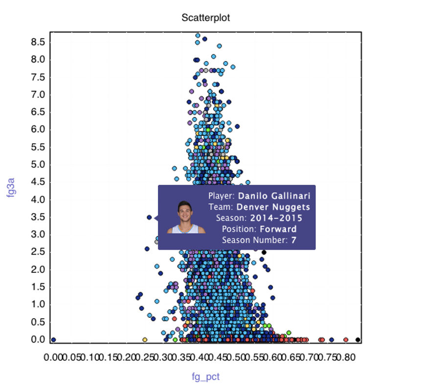
Bresler has sorted the tool into a version that's scaled to mean 0, standard deviation 1, and this is a little more fair and perhaps instructive. But it's also a little less fun than the unscaled version, wherein you'll find things like Chuck leading the way on turnovers in '87 in the image above, or Gallo chucking at a rate so prolific and so inept that he's one of the most egregious takes-to-FG-percentage outliers in history. (If you're wondering, the top blue dot over Gallo's head is this season's Trey Burke; the very top light blue dot is Baron Davis in '03-'04; and the blue dot that's sticking out to the right of those guys at the peak, just a little too efficient to make sense with all those chuckers, is this season's Steph Curry, who's always good for an appearance in any collection of outliers.)
Anyway, this tool is great. Go screw around with it instead of working today.
[ Alex Bresler]
Related


- Best NBA Betting Picks and Predictions for Monday April 6th
- National Championship Bet Pick: Why Michigan Has the Edge Over UConn
- UFC Vegas 115 Betting Picks: Moicano vs. Duncan Headlines April 4th Card
- NBA Betting Picks April 4th: Three Best Bets for Saturday's Slate
- Michigan vs. Arizona Bets: Wolverines Hold Edge in Final Four Showdown
- Best NBA Betting Picks Today: Friday April 3rd Expert Predictions
- MLB Pitcher Props Today: Best Baseball Bets for April 3rd
