
Ranking the WNBA’s latest round of refreshingly cool jerseys

 credits: WNBA
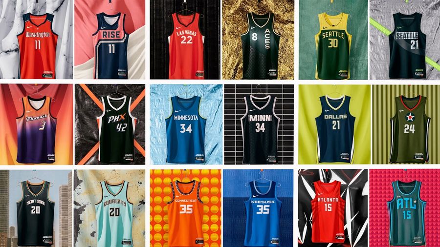
 The WNBA’s new uniforms are great, if for no other reason than because team names have been restored to a place of prominence after several years of sponsors clogging jersey fronts and relegating team identity to a shoulder patch. No fault to the league for maximizing its revenue that way, but there’s no arguing that it’s a lot better-looking when the team, not the sponsor, is the primary focus of the uniform.
Because the new uniforms are a Nike project, the WNBA’s new duds aren’t called home, road, and alternate, but Heroine, Explorer, and Rebel — HER, get it? Whatever they’re called, they’re generally quite good, so ranking the new uniform sets is a challenge, but we’ll do it anyway!
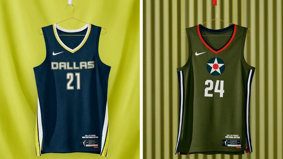
Dallas Wings
 credits: WNBA
 It takes too much explaining that the Rebel jersey salutes the P-40 Warhawk plane, which was test-piloted by women. It’s just drab, and the Explorer jersey isn’t so exciting with navy blue and hints of neon green. At least the military tribute isn’t camo.
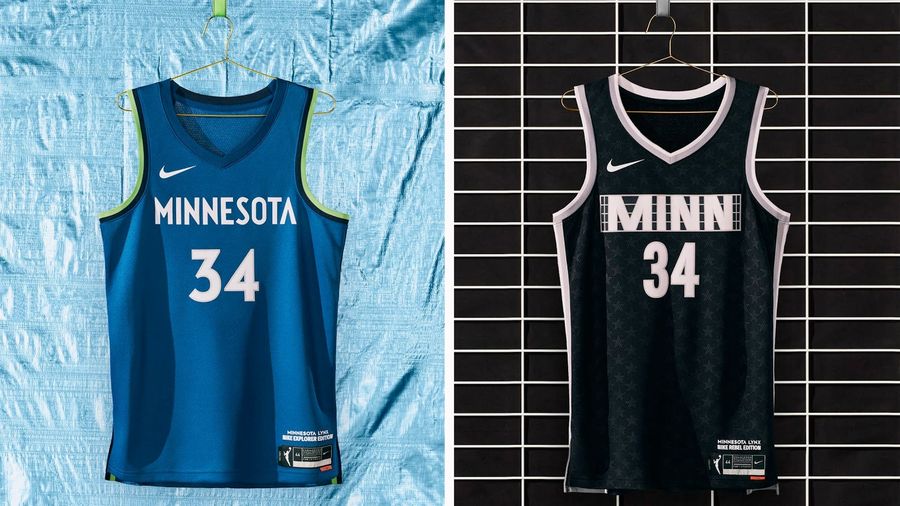
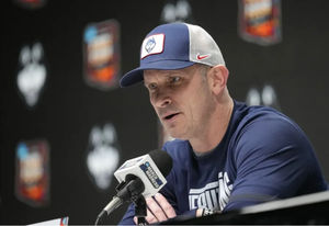
Minnesota Lynx
 credits: WNBA
 Timberwolves factory seconds, right down to the “icy blue background … for the Midwest’s frigid winters.” Remember, the WNBA is a summer league. Who cares about winter? Still, you could rip off a worse NBA jersey, and the Rebel jersey is fine, if dull.
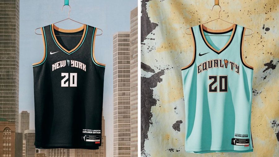
New York Liberty
 credits: WNBA
 It’s what Liberty uniforms feel like they should look like, across the board, but also suffers from looking like they borrowed heavily from the Atlanta Hawks’ black uniforms and the Charlotte Hornets’ “Buzz City” look, along with the weirdness of “EQUALITY” on the Rebel jersey. When the entire league goes for a redesign, coming up with this for the biggest market in the league is a bit of a letdown.
Chicago Sky
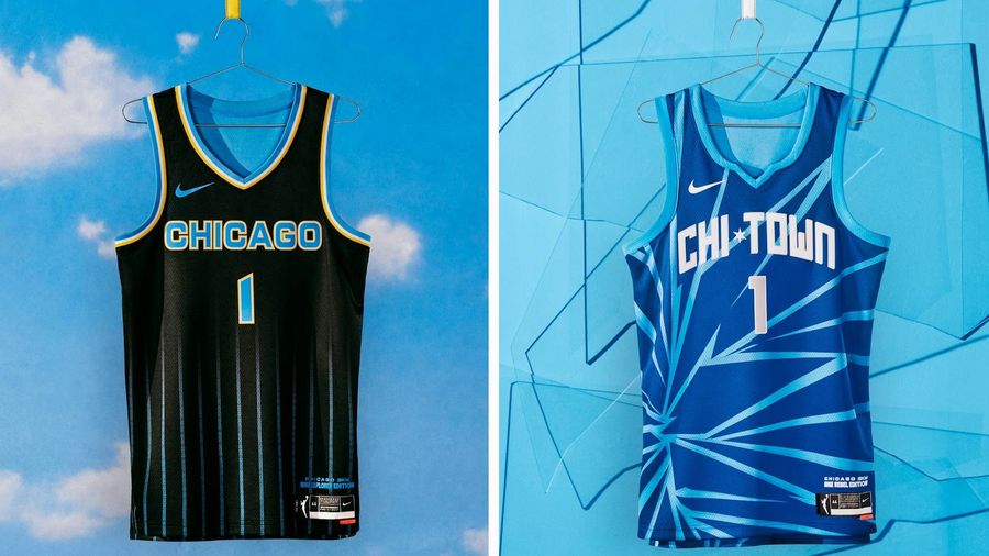 credits: WNBA
 The Rebel is the one that catches the eye here because it’s unique, with the feel of a throwback to 1990s college uniforms, molded into the present. Will it look good when five women are wearing it at the same time on the court? That’s hard to say. But the black Explorer uniforms with subtle striping are sure to be a hit.
Indiana Fever
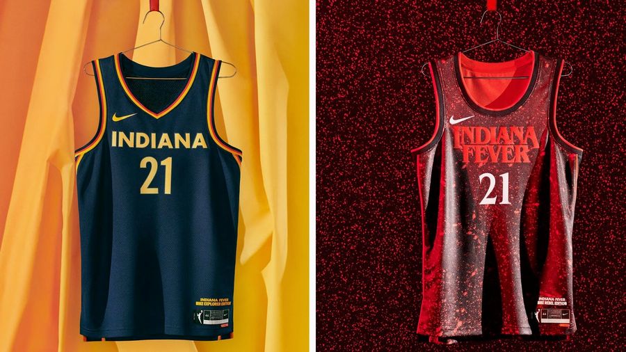 credits: WNBA
 It’s hilarious that Nike couldn’t actually say “Stranger Things” when describing the Rebel jersey as “drawn from the hit series that takes place in the fictional town of Hawkins, Indiana.” It’s also kind of weird to design a jersey based on a Netflix show, but it does look cool. It’s also the Fever jersey that clearly had the most energy devoted to it.
Atlanta Dream
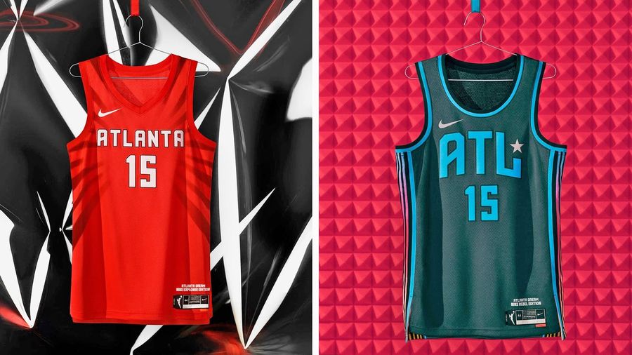 credits: WNBA
 Individually, each look is sharp and distinctive, with accents that don’t overwhelm the overall concept. Taken together, it feels like a throughline of color is missing, but that doesn’t detract from how good the individual pieces are.
Connecticut Sun
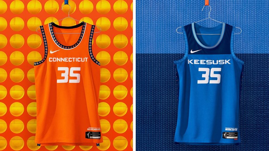 credits: WNBA
 Using Keesusk, the Mohegan word for Sun, is a fantastic choice for the Rebel jersey, and the Explorer also pays homage to Connecticut’s indigenous people with the circle details on the fringe of the brilliantly bright orange jersey.
Washington Mystics
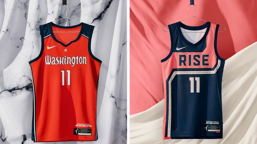 credits: WNBA
 The home/road looks are on point, though when you look closely, the choices of what letters to capitalize and which to leave lowercase are confusing. Putting the words of the 19th Amendment on the ribbon of the Rebel jersey is an excellent detail, but what holds it back is “RISE,” which feels forced.
Los Angeles Sparks
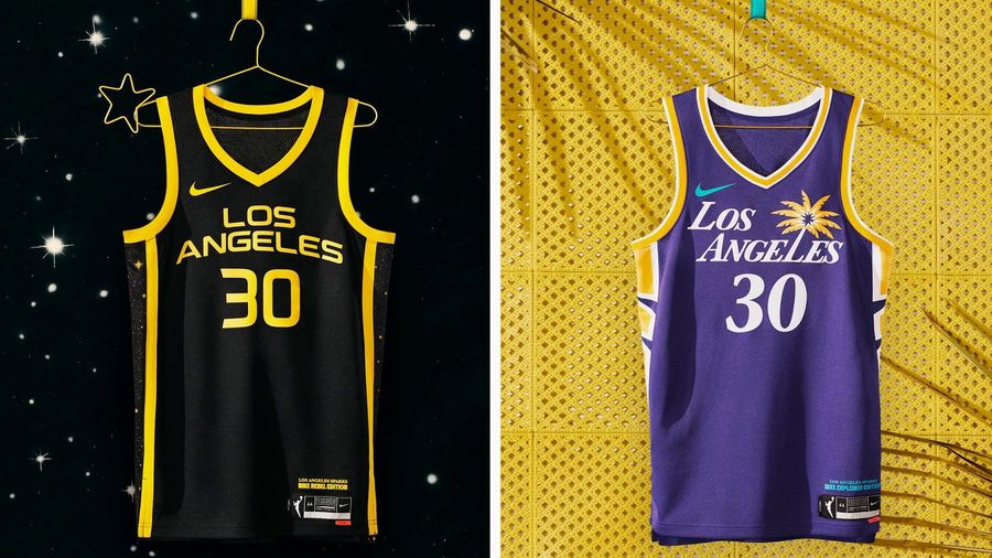 credits: WNBA
 You could say that the lettering is a little bit too Lakers, but it’s also been part of the Sparks’ identity for 25 years now and it looks tremendous. The black and gold of the Rebel jersey pops brilliantly.
Las Vegas Aces
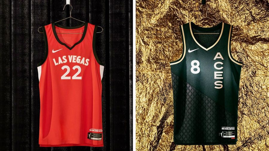 credits: WNBA
 Simple and smooth is not necessarily what you would expect from Vegas, but attention to detail and strong execution certainly are. The best number fonts in the league, for sure.
Seattle Storm
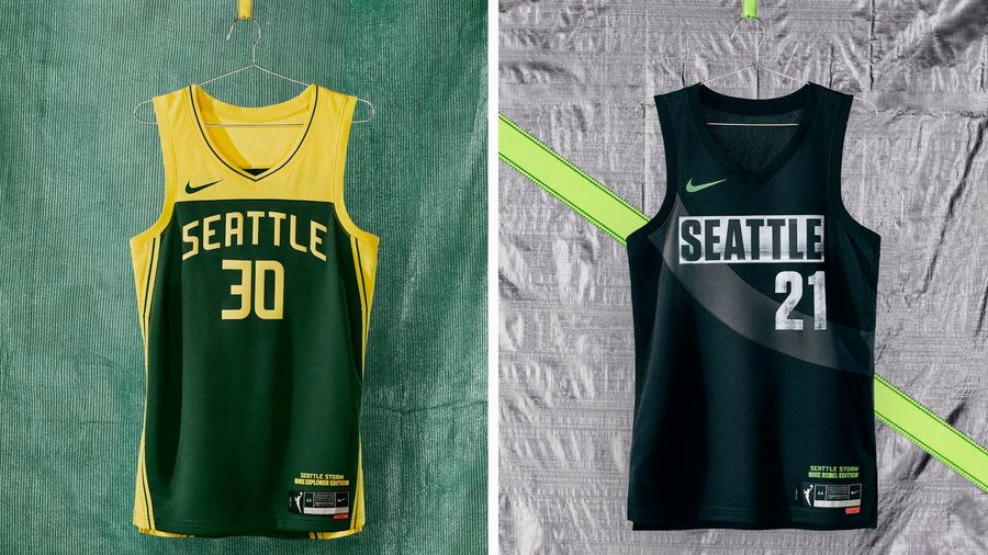 credits: WNBA
 No team in the league has done as much over the years with its city’s NBA heritage than the Storm, who have picked up the green-and-gold flag from the SuperSonics and run with it, making it their own. This uniform iteration is no exception, and the Rebel jersey does a lot with a black-and-white template.
Phoenix Mercury
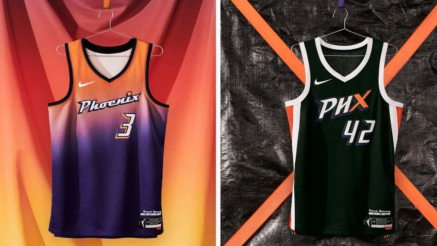 credits: WNBA
 The key difference here between other jerseys that tie together with the NBA and the Mercury’s Explorer jersey, which takes cues from the Suns’ City Edition, is that in this case, it’s not borrowing as much as it’s taking a concept and improving it. Improving it a lot. This purple and orange sunrise is the best look in the whole league, and the other uniforms are strong as well.
Related


- Best NBA Betting Picks and Predictions for Monday April 6th
- National Championship Bet Pick: Why Michigan Has the Edge Over UConn
- UFC Vegas 115 Betting Picks: Moicano vs. Duncan Headlines April 4th Card
- NBA Betting Picks April 4th: Three Best Bets for Saturday's Slate
- Michigan vs. Arizona Bets: Wolverines Hold Edge in Final Four Showdown
- Best NBA Betting Picks Today: Friday April 3rd Expert Predictions
- MLB Pitcher Props Today: Best Baseball Bets for April 3rd
