
fog Page 4 - Sports News, Headlines & Highlights
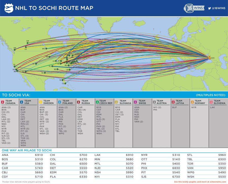
Where Olympic NHLers Are Coming From
16 Wins has put together this animated infographic showing each NHL team's contributions to Olympic rosters. I'd prefer an interactive version that lets me actually stop and look at each nation, but I get the idea....
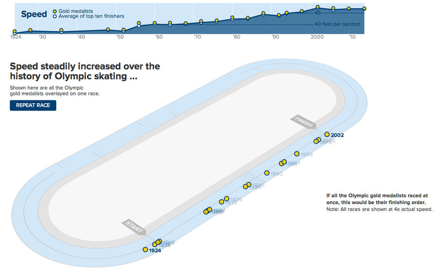
Speed Skaters Have Gotten A Lot Faster Since 1924
Similar to what The New York Times did for the 100m dash in 2012, The Wall Street Journal has developed a great graphic to show just how much faster the top speed skaters have gotten over the years. The still above is part of an animation pitting every male 500m gold medalist against each other; the...
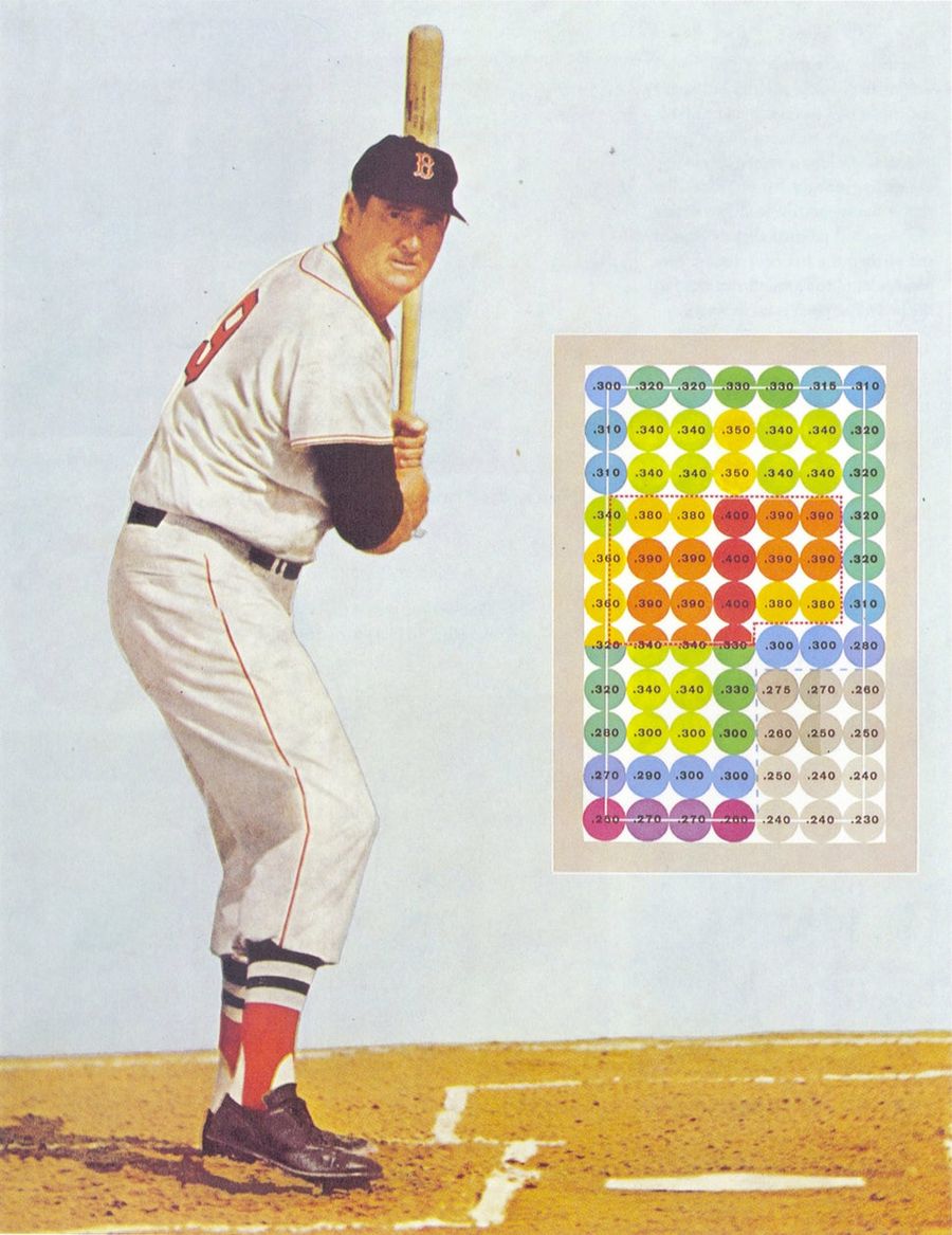
The Beautiful Infographics Of Ted Williams's <em>The Science Of Hitting</em>
In 1971, Ted Williams and John Underwood released The Science of Hitting, the definitive treatment of the subject. Few great athletes have ever been so articulate about the mechanics of their greatness, which is one reason the book holds up even today, well into the analytics era. (A decade ago, Sci...
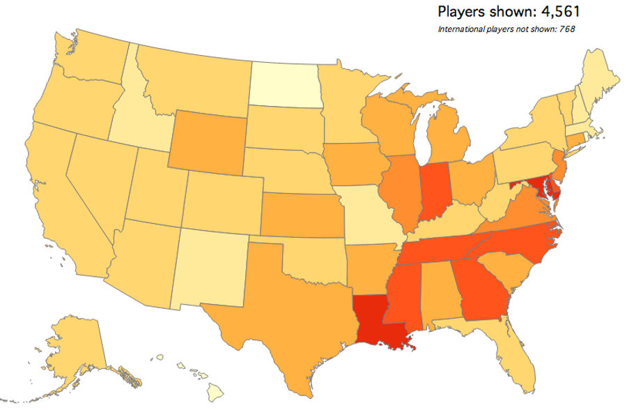
Map: Which States Produce The Most College Basketball Recruits?
Mode Analytics, which previously mapped out where college football players are from, has turned its attention to the much more timely sport of college basketball. The map above shows which states have produced the most current D1 players, relative to their college-age male populations....
Maps: Which Of Our Readers Were The Biggest Homers In The HOF Vote?
Thanks to your input, the Deadspin HOF vote—revealed earlier this month—was generally agreed to be pretty decent. That might be letting some of you off the hook a little easy, though. We've given MVP voters plenty of crap for their homer votes; who, among our readership, turned out to be the biggest...
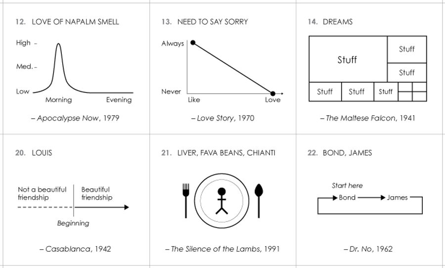
100 Charts For AFI's Top 100 Movie Quotes
Just in time for Oscar announcements, Nathan Yau of Flowing Data has made mini-charts for all of AFI's top 100 movie quotes. While not every quote lends itself perfectly to visualization, there are plenty of gems. Here are some of the best:...
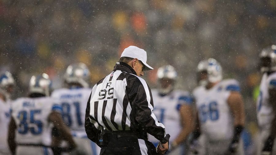
Do Colder NFL Games Have Fewer Penalties?
While watching some insanely frigid football last weekend, one Deadspinner wondered if there were fewer flags in cold NFL games, the result of referees deciding, consciously or not, to speed games up and get the hell off the field. Without scrutinizing hundreds of hours of game tape we can't really ...
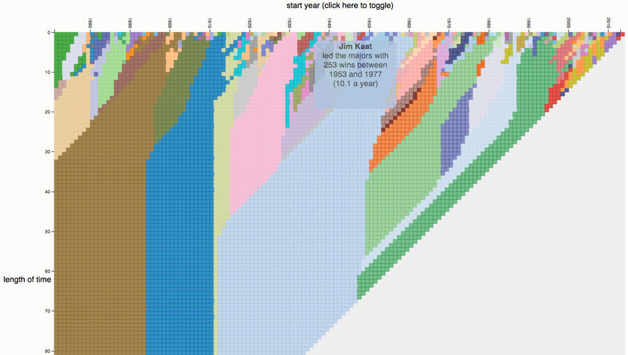
Cherrypick Your Way Through 143 Years Of Baseball Stats
Did you know that Curt Schilling led the league in complete games from 1992-2001? That Tim Raines led the league in hits from 1981-87? That Fred McGriff led the league in home runs from 1987-95? All great stats to argue for your favorite player's HOF admission, made possible by the magic of cherrypi...
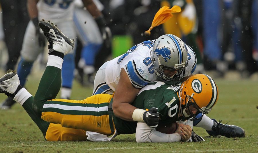
Is "Discipline" Overrated In The NFL?
The 2013-14 Seahawks finished the year with a 13-3 record, a +186 point differential, and +40.1 percent DVOA, making them arguably the best team in the NFL. They also led the league in penalties (128) and penalty yards (1,193). Baltimore led in both categories last year and won the Super Bowl over t...
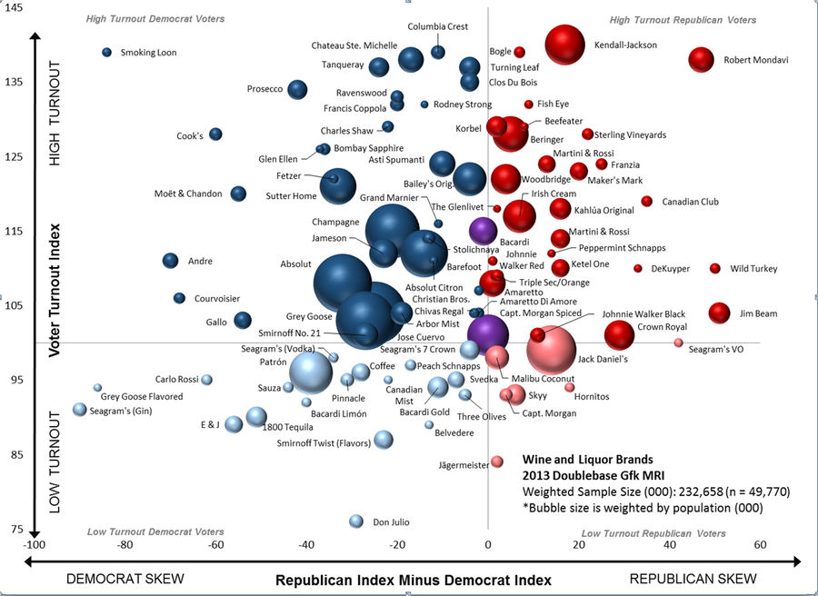
Chart: Does Your Choice Of Booze Reveal Your Politics?
The chart above, produced by the right-leaning research firm NMRPP and first published in the Washington Post last week, shows the comparative political inclinations (and relative voter turnouts) associated with the drinkers of various major liquor brands....
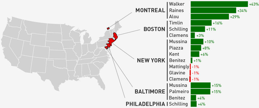
NFL Season In Review: Where Did Your Team's Offense Come From?
The NFL regular season is over. So how did your team do?...
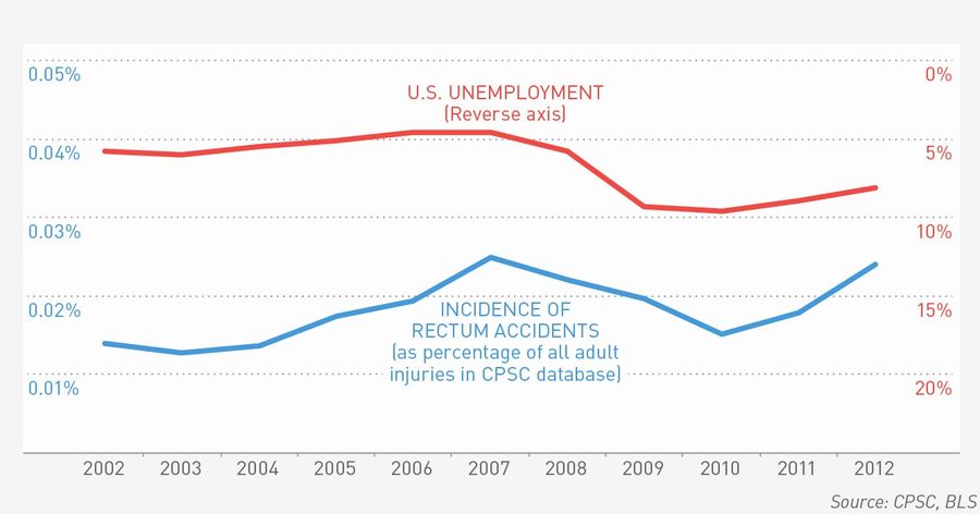
What Can We Learn About America From The Stuff We Put Up Our Asses?
This Christmas, we took our annual look at what Americans got stuck in their butts this past year. It sure felt like a banner year for rectum accidents, but was this really this case? And the obvious followup: What does it mean for the economy?...
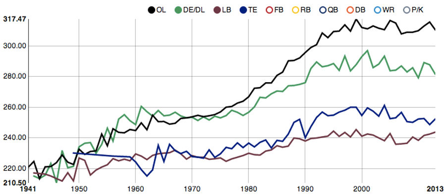
Chart: The Average Weight Of NFL Rookies, By Position And Year
While football in the mid-80s could be pretty brutally violent, it's worth remembering that these players were, typically, a lot smaller than the NFL behemoths we're so used to today. The chart above—pulled from an interactive visualization created by Reddit user abresler—shows the average weight of...
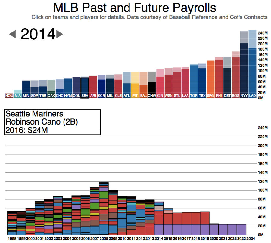
The Amazing MLB Payroll Graphic Gets An Update
Now that the winter meetings are over, Phil Roth has updated his excellent interactive payroll tool, which lets you explore the salary commitments of every MLB team from 1998 through 2024. That purple block you see above is $240 million worth of Robinson Cano, yours for just 10 flat payments of $24 ...
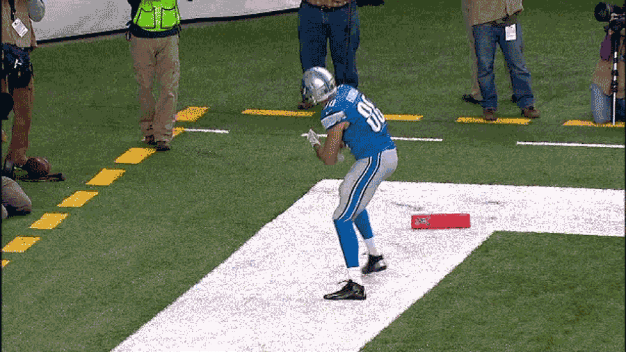
A Complete Breakdown Of The Year In Touchdown Celebrations
Geoff Foster of the Wall Street Journal has done the lord's work. He went back and watched every touchdown celebration that occurred in the NFL this year for the purpose of creating a comprehensive audit of how NFL players decided to get down after scoring....
The 12 Best Sports Infographics Of 2013
While 2013 saw plenty of "Snowfall"-inspired graphical masturbation, it was generally a great year for sports-related graphics and data viz. The 12 works below are some of our favorites, listed in order of publication. Sorry for the image fuzziness; click "expand" to get a better look. And let us kn...
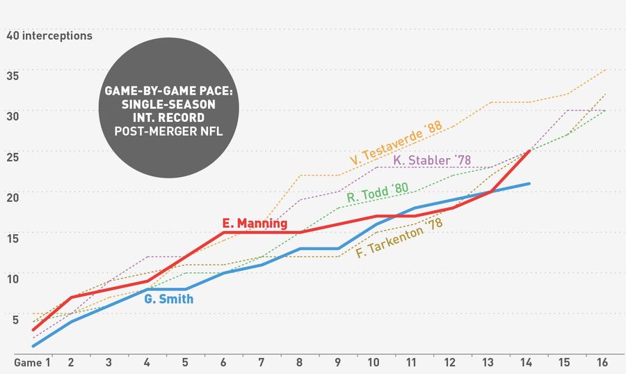
Eli Manning Makes A Late Push For The Interception Record Books
When we last checked in on Eli Manning's quest for the single-season interception record, the Giants QB had thrown 17 interceptions through 10 games, but was tapering off and seemed in danger of losing the league lead to Geno Smith. We wrote at the time that they'd need a Tarkenton-level meltdown to...
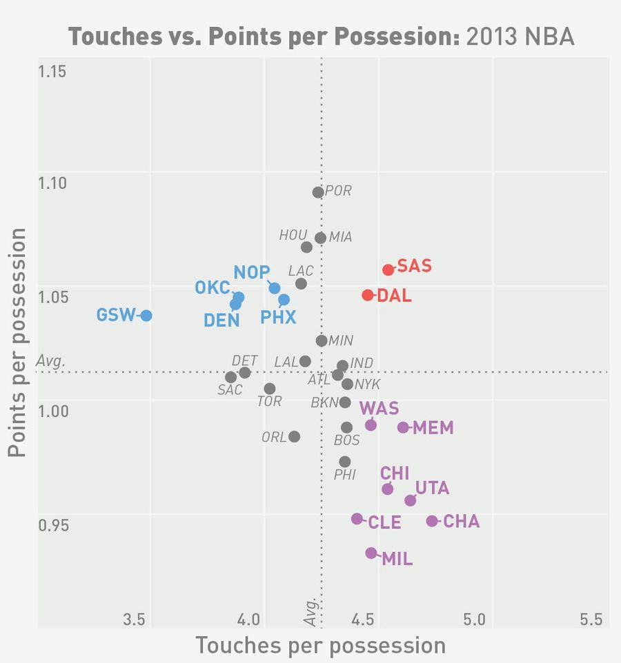
Does More Ball Movement Help An NBA Offense, Or Just Waste Time?
What counts as good NBA ball movement? The "seven seconds or less" theory developed by Mike D'Antoni's Phoenix Suns contends that teams are more efficient earlier in the shot clock (they are), and that the best strategy is, consequently, to get a shot off quickly with relatively few touches on the b...

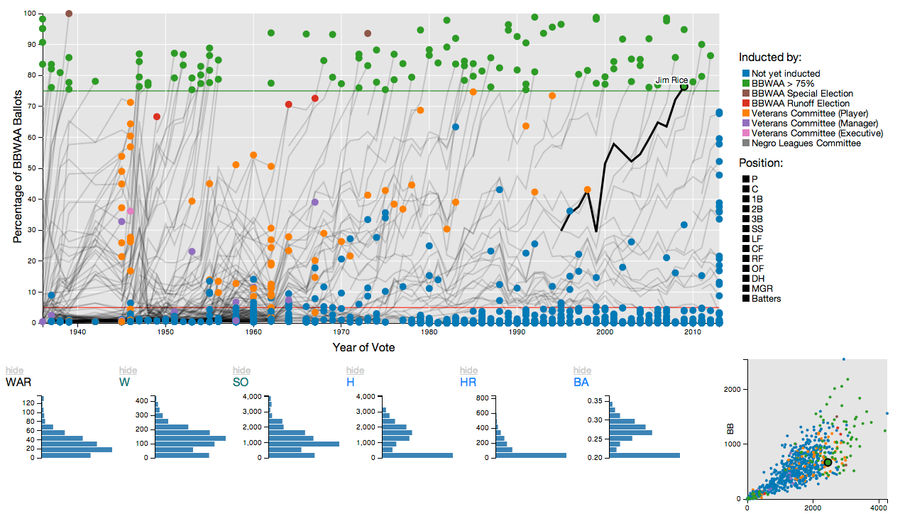
Chart: The Voting Trajectory Of Every Hall Of Fame Candidate Ever
To aid in your Deadspin HOF ballot decisions, Kenny Shirley and Carlos Scheidegger of AT&T Labs have created a great interactive graph for exploring the voting trajectories of all 1,000-plus players/managers ever to be candidates for the Hall. The screencap above might make it look a little dense, b...
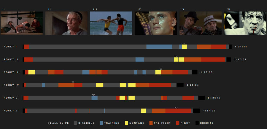
Where Are The Sweet Montages? Breaking Down The <em>Rocky</em> Movies By Scene
"Rocky Morphology," the chart above from Fathom.info, breaks down all six Rocky films by scene type: "dialogue" scenes, training scenes, pre-fight scenes, fight scenes, and—of course—montage scenes, complete with linked movie stills. Without wading too far into the endless exercise in bullshit that ...