
fog Page 9 - Sports News, Headlines & Highlights
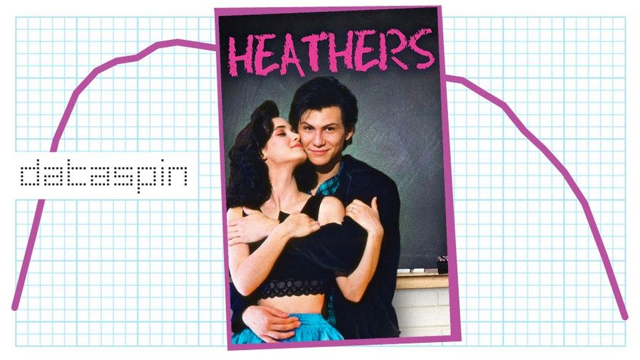
Did The Movie <em>Heathers</em> Kill The Name Heather?
Welcome to Dataspin, a new weekly data visualization of whatever the fuck....
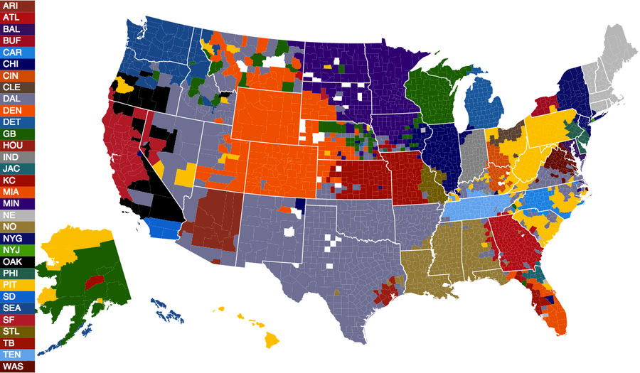
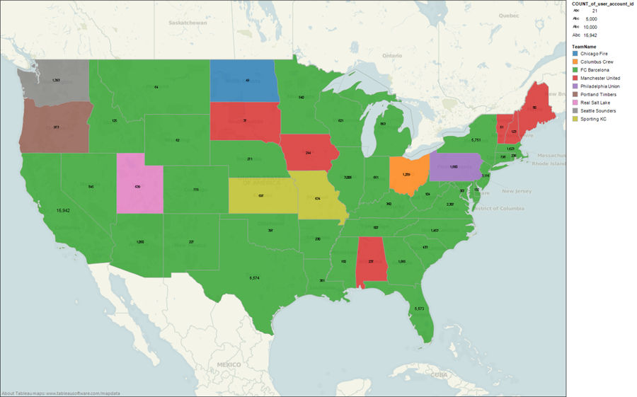
How'd Those Fans Get There? A Deeper Dive Into The Facebook NFL Fandom Map
After weeks of us awkwardly guessing who wanted to watch which NFL games, Facebook finally used its terrifying trove of user data and made the map that no one else could. In our original post, we pointed out some of the more surprising fan pockets, but the data deserve a deeper dive. ...
Facebook Data Provide The Most Accurate NFL Fandom Map Ever Created
It's long been a dream of mankind to put together a map showing the geographic locations of NFL fanbases. The CommonCensus map tried to do it though polling; we took a crack at one based solely on proximity. But all previous efforts have been self-selecting or otherwise flawed. If only there was a m...
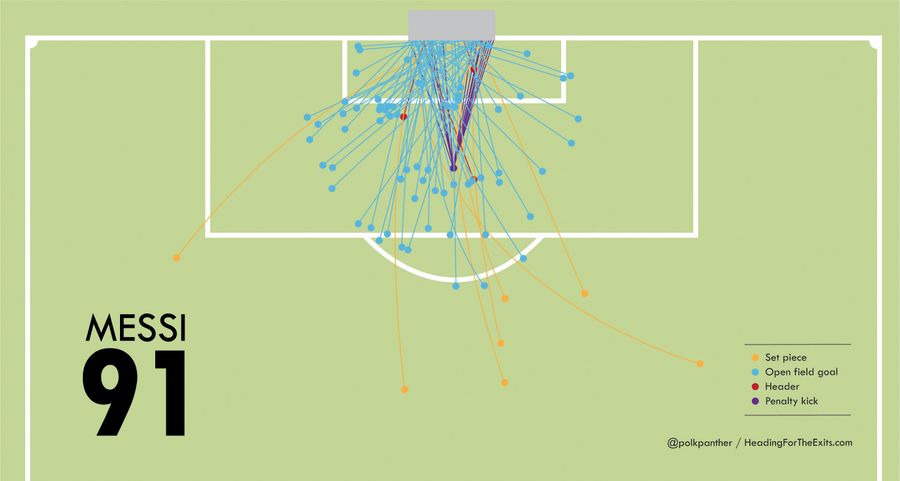
Here Are All Of Lionel Messi's 91 Goals In 2012
On Saturday, Lionel Messi scored another beauty—a dribble through the defender's legs, finished with a left-footed strike into the far corner. It was the 91st and final goal of his calendar year, an all-time record. A crack Youtuber has put together a compilation of every single one, so let Messi ...
Infographic: Watch More Coaches Climb Up Football's Hierarchies
Last week, after Cincinnati snagged Tommy Tuberville away from Texas Tech, we took a look at some of the longest chains of football-coach hirings in recent memory. Since then, this chain grew one link longer, as Texas Tech hired Texas A&M offensive coordinator Kliff Kingsbury to fill its vacant posi...

The 10 Best Sports Infographics Of 2012
For those who don't really enjoy scrolling through Baseball Reference spreadsheets, there are some great artists and analysts out there constantly developing new ways to elegantly present the data of sports. Below are the 10 best sports infographics/data visualizations from 2012, in approximate orde...
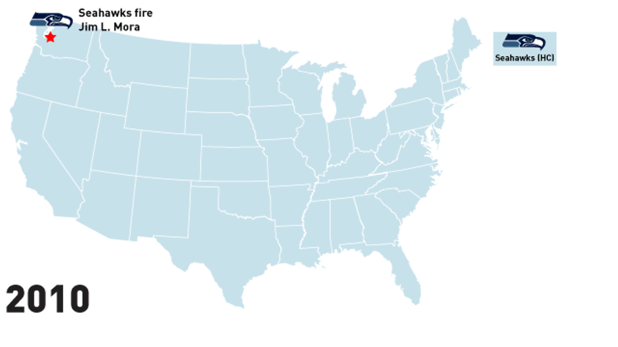
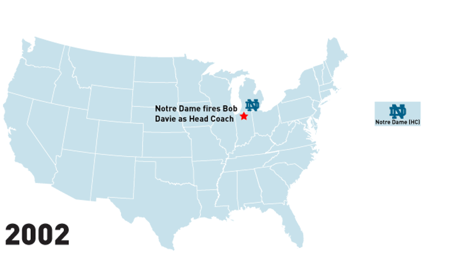
Infographic: Watch Coaches Climb Up The Hierarchy Of College Football
Three Saturdays ago, Tennessee lost to Vanderbilt, 41-18, dropping the Volunteers to 4-7 on the season and 0-7 in the SEC. This pretty inconsequential game has led to a brief but wonderful domino effect, wherein: ...
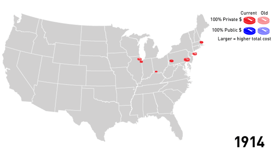
Animated Infographic: Watch As America's Stadiums Pile Up On The Backs Of Taxpayers Through The Years
When Jeffrey Loria decided to once again blow up his Marlins, it sparked a brief outrage over the $500 million in public money that had been spent on the team's brand new stadium. These outrages happen every couple years or so and are forgotten in time for the next bond issue. Public financing of st...
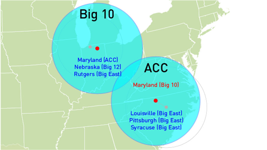
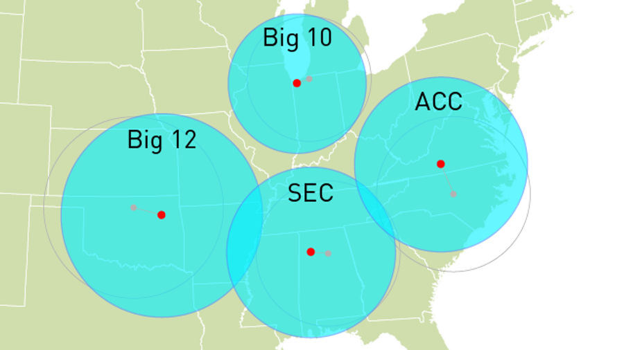
The Big Ten Is On The Move: Updating Our Conference Realignment Maps!
When we last checked in a month ago, it seemed the dust was finally settling after a period of bizarre college football reafuckinglignment. Pretty much everyone had made major moves except the Big Ten, a distinctly Midwestern conference that seemed happy to pretty much stay put....
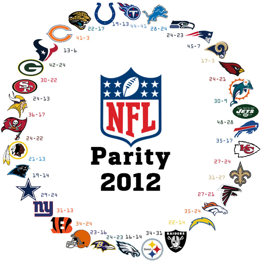
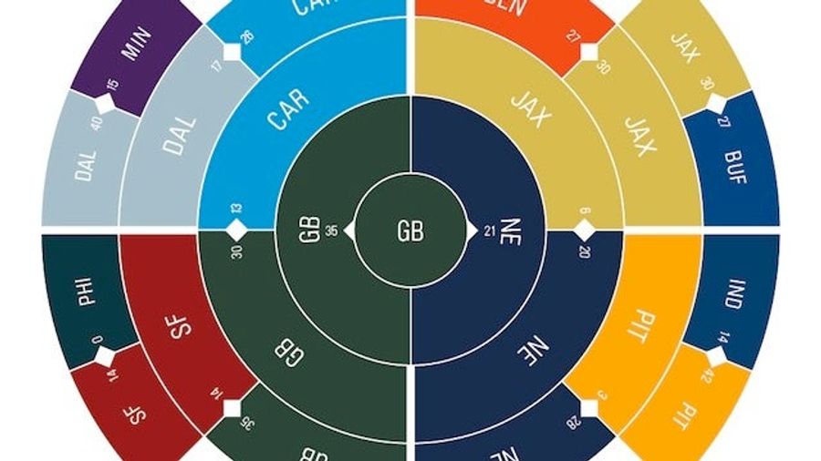
It Happened Again: The NFL's Parity In One Striking Graphic
Two years ago, we were taken by the NFL's ouroboros: a visual representation of the league's parity, where any team can beat anyone else. In the graphic, each team has a victory over the team next to it, going clockwise, until it circles back....
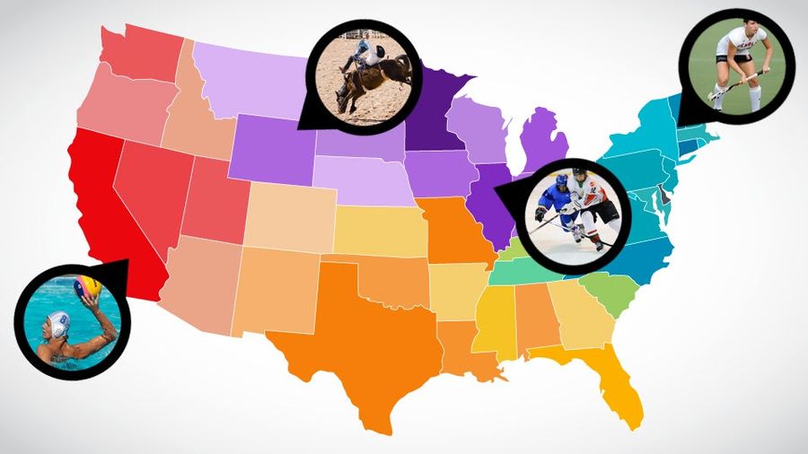
Field Hockey America Vs. Rodeo America: Mapping The Faultlines Of America's Regional Sports
America is a beautiful, horrifying, crazy-ass mishmash of distinct geographic regions, as we know from watching John King's index finger on election night. This extends to all aspects of American life, of which the most important is obviously sports. Beyond the televised pro leagues (and their colle...
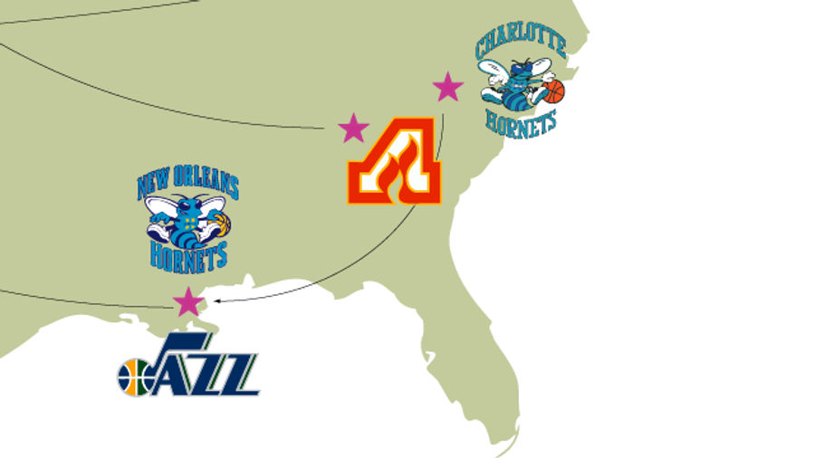
A Map Of The Most Absurd Team-Name Migrations In Sports
Two days ago the New York Islanders announced that they'd be making a short migration from Nassau County to the new Barclays Center in Brooklyn. Brooklyn's on Long Island so the name still makes sense (although the team might have to fix its logo), but franchises aren't always so lucky....
See The Big East Get Much Bigger And Much Less Eastern With Conference Realignment Visualizations
Here are six of the BCS conference games you can watch this Saturday:...
Americans' Favorite Soccer Clubs, As Determined By <i>FIFA 12</i> Plays
ESPN FC had a neat piece this week on the ties between soccer video games and soccer fandom, and the idea that even in the days of satellite television, nothing's done more to grow the sport in the United States than gaming. Here's the money quote, from social scientist Rich Luker:...
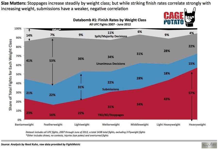
Fun With Graphs: How UFC Fights End, Sorted By Weight Class
Reed Kuhn, of the excellent Fightnomics, has run the numbers, and they've been graphed. Are there more knockouts and stoppages the higher you go in weight? A resounding yes. Don't you love it when the conventional wisdom is backed up by a colorful chart? [CagePotato]...

The <i>New York Times</i> Tries Its Hand At Animated Gifs. It Does Not Go Well.
If Buzzfeed and the Times made a baby, and it had epilepsy, it would look like this: "10 Animated GIFs From London 2012." These gifs are different—they're constructed from rapid fire shots taken by the Times's photographers, rather than from actual moving pictures. It sort of defeats the entire purp...
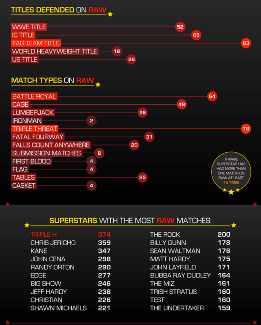
Everything You Need To Know About The First 999 Episodes Of <em>WWE Raw</em>
Monday marks the 1000th episode of WWE Raw, and to celebrate, Aftermath has put together an infographic on the stats for wrestlers, venues, titles, and match types to appear over the last 19-plus years of Monday night rasslin'. Here's just a part of the graphic; be sure to click through for the whol...
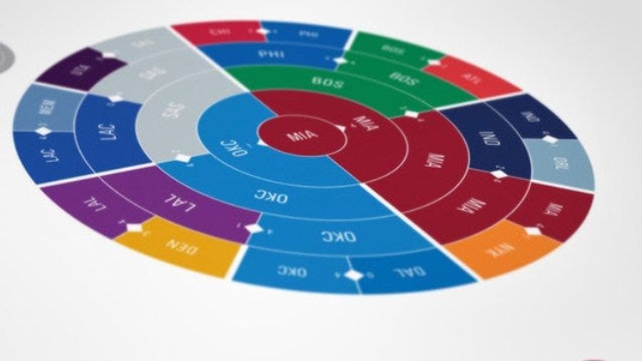
You Can Waste A Morning Looking At These New Sports Infographics
Co. Design has a story about New York designer Deroy Peraza's latest project, in which he has created visual representations of the result of every NFL, MLB, NHL, and NBA postseason in history. Each season is represented by a simple, radial infographic that have the power to evoke vivid memories of...

A Hypnotic Look At Every Goal In The NHL Playoffs
Part art, part statistic in motion, this living infographic from Bård Edlund is a soothing chronological tally of every single goal in this year's Stanley Cup Playoffs. Especially keep an eye on the puck diarrhea of that first round Flyers-Penguins series. It's a nice alternative to the real thing...