
infographic Page 8 - Sports News, Headlines & Highlights
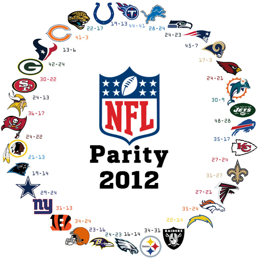
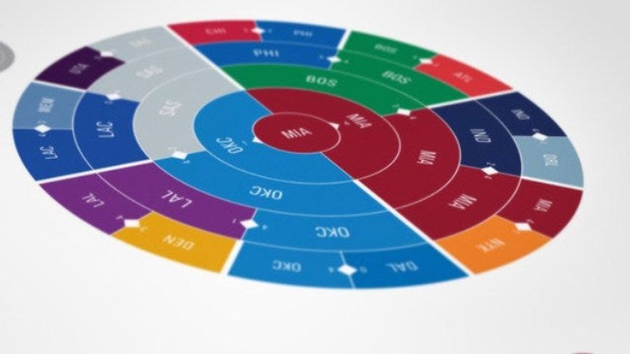
It Happened Again: The NFL's Parity In One Striking Graphic
Two years ago, we were taken by the NFL's ouroboros: a visual representation of the league's parity, where any team can beat anyone else. In the graphic, each team has a victory over the team next to it, going clockwise, until it circles back....
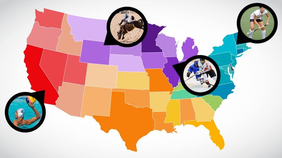
Field Hockey America Vs. Rodeo America: Mapping The Faultlines Of America's Regional Sports
America is a beautiful, horrifying, crazy-ass mishmash of distinct geographic regions, as we know from watching John King's index finger on election night. This extends to all aspects of American life, of which the most important is obviously sports. Beyond the televised pro leagues (and their colle...
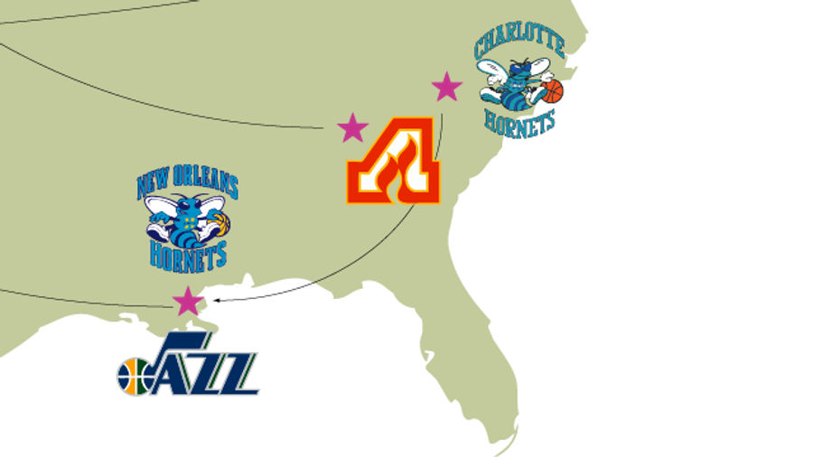
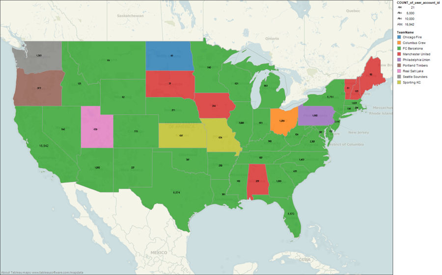
A Map Of The Most Absurd Team-Name Migrations In Sports
Two days ago the New York Islanders announced that they'd be making a short migration from Nassau County to the new Barclays Center in Brooklyn. Brooklyn's on Long Island so the name still makes sense (although the team might have to fix its logo), but franchises aren't always so lucky....
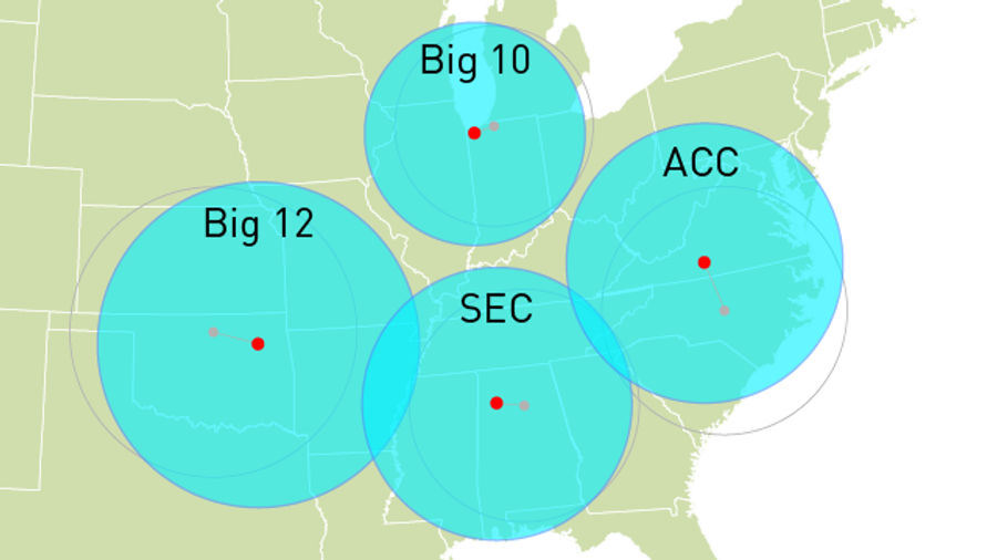
See The Big East Get Much Bigger And Much Less Eastern With Conference Realignment Visualizations
Here are six of the BCS conference games you can watch this Saturday:...
Americans' Favorite Soccer Clubs, As Determined By <i>FIFA 12</i> Plays
ESPN FC had a neat piece this week on the ties between soccer video games and soccer fandom, and the idea that even in the days of satellite television, nothing's done more to grow the sport in the United States than gaming. Here's the money quote, from social scientist Rich Luker:...
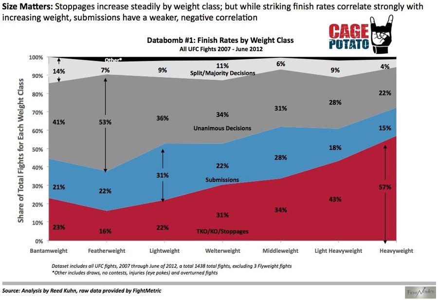
Fun With Graphs: How UFC Fights End, Sorted By Weight Class
Reed Kuhn, of the excellent Fightnomics, has run the numbers, and they've been graphed. Are there more knockouts and stoppages the higher you go in weight? A resounding yes. Don't you love it when the conventional wisdom is backed up by a colorful chart? [CagePotato]...
The <i>New York Times</i> Tries Its Hand At Animated Gifs. It Does Not Go Well.
If Buzzfeed and the Times made a baby, and it had epilepsy, it would look like this: "10 Animated GIFs From London 2012." These gifs are different—they're constructed from rapid fire shots taken by the Times's photographers, rather than from actual moving pictures. It sort of defeats the entire purp...
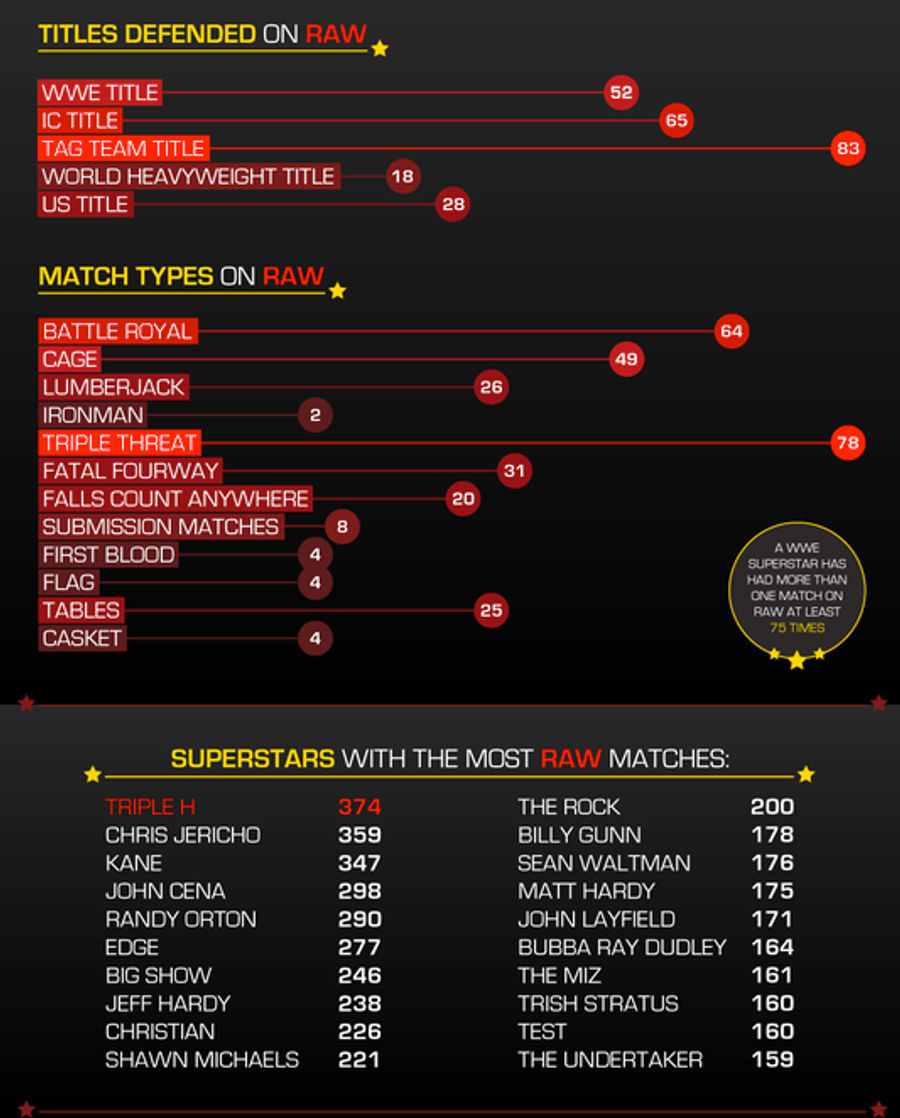
Everything You Need To Know About The First 999 Episodes Of <em>WWE Raw</em>
Monday marks the 1000th episode of WWE Raw, and to celebrate, Aftermath has put together an infographic on the stats for wrestlers, venues, titles, and match types to appear over the last 19-plus years of Monday night rasslin'. Here's just a part of the graphic; be sure to click through for the whol...
You Can Waste A Morning Looking At These New Sports Infographics
Co. Design has a story about New York designer Deroy Peraza's latest project, in which he has created visual representations of the result of every NFL, MLB, NHL, and NBA postseason in history. Each season is represented by a simple, radial infographic that have the power to evoke vivid memories of...

A Hypnotic Look At Every Goal In The NHL Playoffs
Part art, part statistic in motion, this living infographic from Bård Edlund is a soothing chronological tally of every single goal in this year's Stanley Cup Playoffs. Especially keep an eye on the puck diarrhea of that first round Flyers-Penguins series. It's a nice alternative to the real thing...
Kerry Wood's 20-Strikeout Game Was More Impressive Than Either By Roger Clemens
The latest work from our old friend and baseball infographic expert Craig Robinson delves into the exclusive 20-strikeout, complete-game club, of which there are just three instances comprised of two members. (Sorry, Randy Johnson.) Looking at Robinson's visual interpretation of all three games, as ...
Every U.S. Sports Championship, In Convenient Infographic Form
Our friends at Slate have created a slick infographic that lets you use a sliding bar to see the year-by-year chronology of every championship won in the four major professional sports. Click any given city and a stat box appears listing each championship, when it was won, and the percentage of the ...
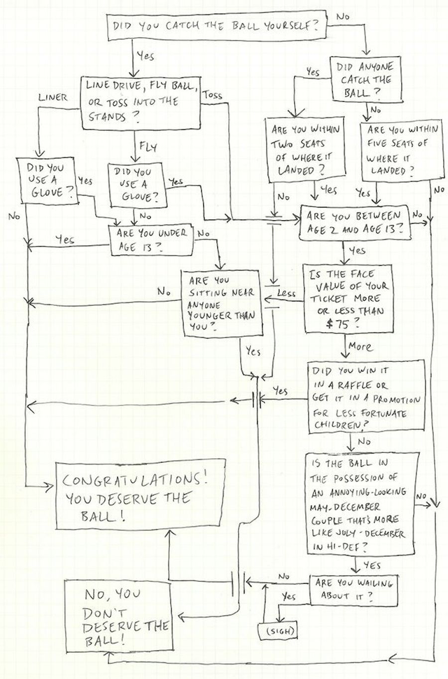
Do You Deserve That Foul Ball? Consult This Handy Chart
There's some impassioned debate going on in the comments on the post about the couple in Texas failing to surrender a foul ball to the weeping child beside them. What are the real rules, here? Possession is nine-tenths of the law? Children first? What's the right thing to do to avoid the censure of...
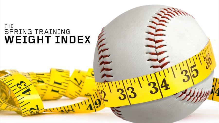
Cardio And Pooping: A Chart Of Every MLB Player Who Reportedly Lost Or Gained Weight This Offseason (And Why)
Every spring training, seemingly every other ballplayer shows up to camp and declares himself "in the best shape of my life." Our pal Craig Calcaterra over at HardballTalk has done yeoman's work on this phenomenon over the years, but we wanted to know more: Who gained weight? Who lost weight? How mu...
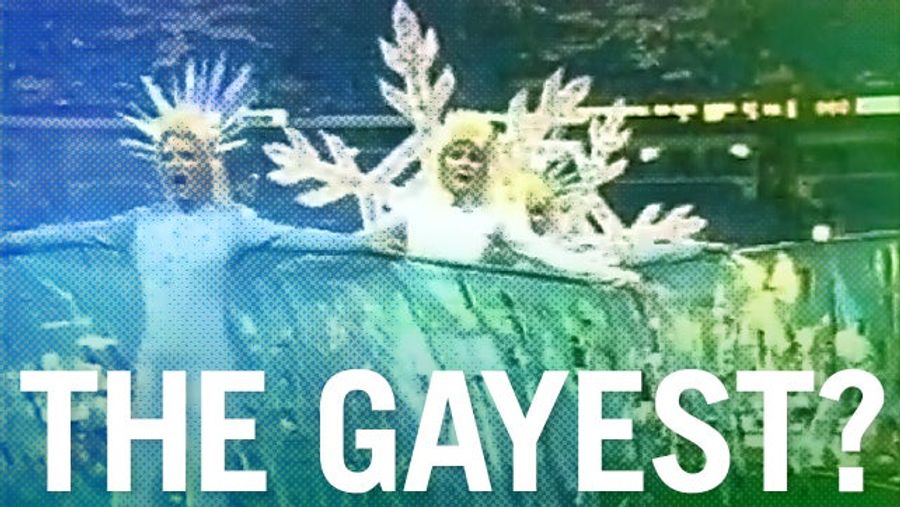
Homemade Infographic: What Were The Gayest (And Straightest) Super Bowl Halftime Shows?
We're doing a season-long NFL roundtable with our friends at Slate. Check back here each week as a rotating cast of football watchers discusses the weekend's key plays, coaching decisions, and traumatic brain injuries....
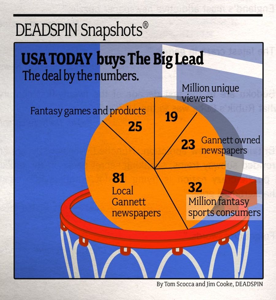
A Graphic Guide To Understanding <em>USA Today</em>'s Purchase Of The Big Lead
The old new paradigm got a piece of a newer paradigm this week, as once-revolutionary USA Today acquired the Big Lead. What does this mean? Blog posts slipped under your hotel-room door? We pulled some numbers from the press release to illustrate how it all might fit together....

Homemade Infographic: Google Images Isn't Excited About The Los Angeles Clippers Yet
Have Chris Paul and Blake Griffin led Los Angeles's No. 2 NBA team into a new era of respect and recognition yet? Here's an analysis of results from a Google Images search for "Clippers": ...
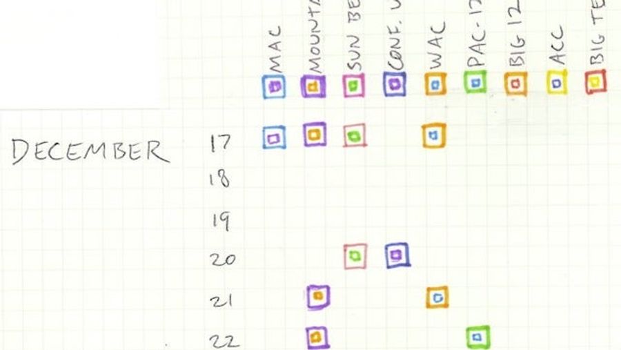
Homemade Infographic: When's Your Bowl Season?
Congratulations! Your football conference got invited to some bowl games. But "bowl game" covers nearly four weeks' worth of possibilities—from the MAC-WAC showdown in last week's Famous Idaho Potato Bowl to the SEC-on-SEC Alabama-LSU rematch in the national title game on Jan. 9....
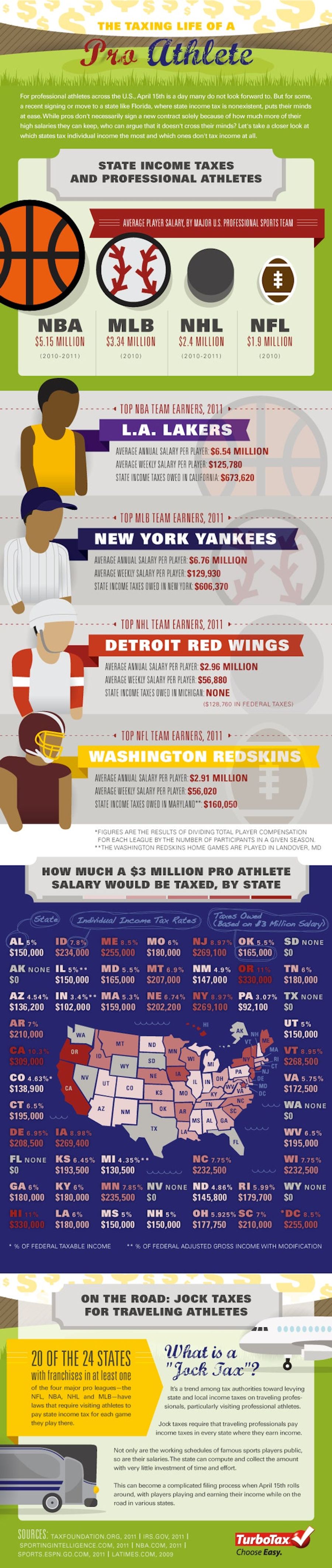
Why Albert Pujols Really Doesn't Care About The Money
Infographics: we have them! Click to enlarge. Turns out that by moving to a state with one of the highest income tax rates in the nation, Albert Pujols has a legitimate claim to not worrying about the extra "$3 or $4 million a year" he's getting from the Angels. Meanwhile, the zero state income tax ...
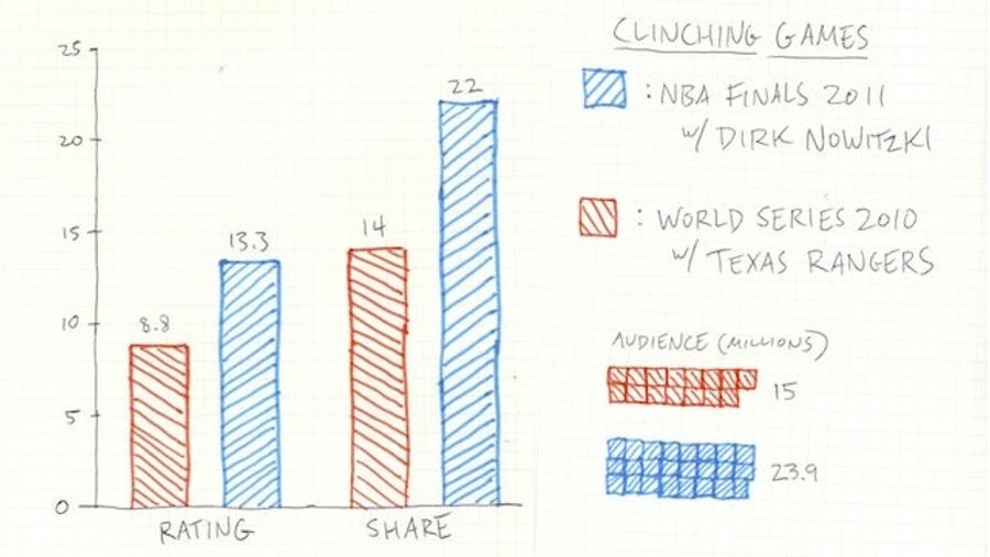
Homemade Infographic: Is The World Series Famous Enough For Dirk Nowitzki?
Maybe Major League Baseball is preventing Dirk Nozitzki from throwing out the first pitch for the Texas Rangers for some reason other than as a courtesy to NBA owners, an intersport extension of the basketball lockout. Maybe it really is that as they weighed "what makes sense for the team and a good...