
The 10 Best Sports Infographics Of 2012

For those who don't really enjoy scrolling through Baseball Reference spreadsheets, there are some great artists and analysts out there constantly developing new ways to elegantly present the data of sports. Below are the 10 best sports infographics/data visualizations from 2012, in approximate order of publication.
The Rise And Fall Of Scoring In Baseball
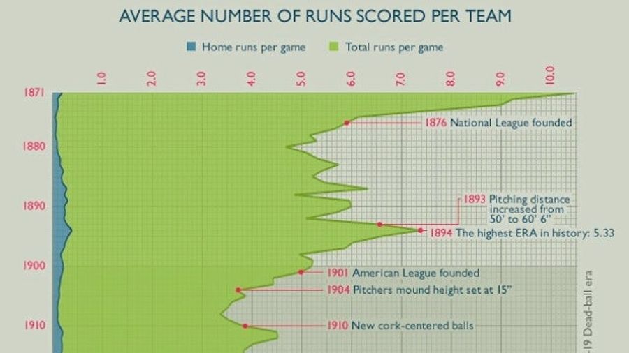
Craig Robinson of Flip Flop Flyin' did a lot of great work in 2012, but his best may be the graphic (partially) shown above, which he created for the Smithsonian. Follow how run scoring changed through 141 years of baseball history, with the effects laid bare of outlawing spitballs, lowering the pitching mound, and adding the designated hitter.
Where The Heat And The Thunder Hit Their Shots
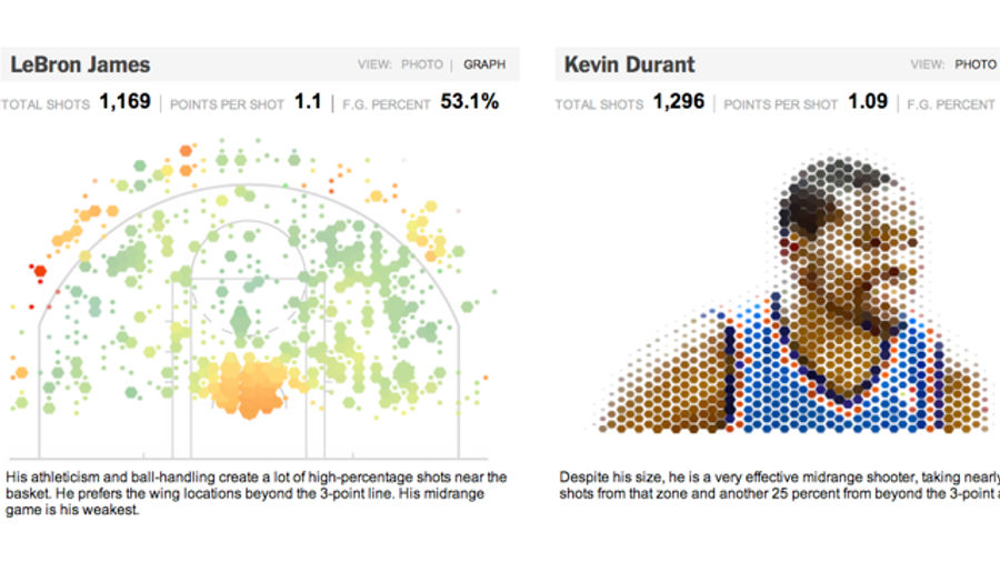
What could a geography professor possibly tell you about the NBA? A lot more than you'd think. Kirk Goldsberry, currently at Harvard, burst onto the sports scene in 2012 with his outstanding spatial analysis method he coined " Court Vision." Goldsberry's shooting maps charted the habits, strengths, and blind spots of some the NBA's tops stars; coupled with the New York Times's always-excellent graphics department, he produced perhaps the most essential infographic of the NBA season.
The Stanley Cup Summed Up

Half infographic, half data art, Bård Edlund of Edlundart put together a strange and mesmerizing video showing every goal scored in the 2012 Stanley Cup finals. Make sure to watch with the sound on and savor it during your hockeyless winter nights.
The Champions Ring

Deroy Peraza of Hyperakt first envisioned his radial playoff brackets during the 2010 World Cup, but it wasn't until 2012 that he put together a near-complete set of drawings covering most major sports championships. Peraza's elegant, colorful charts are major improvement over the traditional " branching tree" brackets that we've grown accustomed to, and he's inspired a few solid copycats.
World of Records
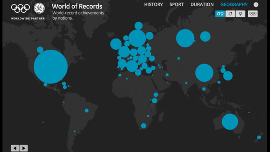
In this interactive chart from GE's Data Visualization Team, watch the number of world records set by each nation expand over the past 112 years. I don't want to spoil anything, but USA! USA! USA!
One Race, Every Medalist Ever
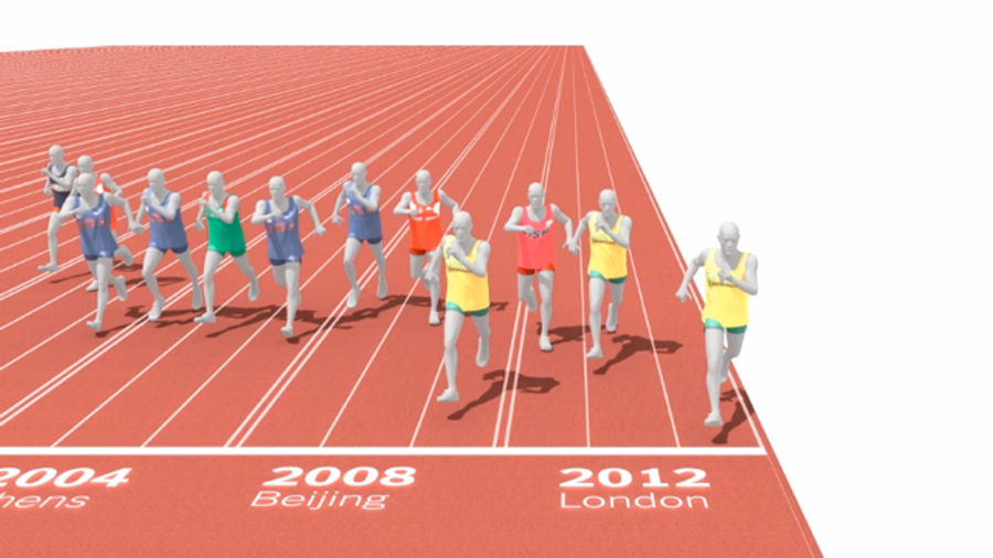
Are today's athletes better than those of earlier eras? For a lot of sports, this is an unanswerable and divisive Rorschach of a question. But for some competitions—like Olympic track and field—the answer is a little easier to come by. In another outstanding product of the you can see 116 years of Olympic gold-medal 100-meter sprinters compete against each other. Watch Jim Hines break the 10-second barrier in 1968, followed by modern runners inching toward 9.75 seconds, the apparent ceiling of human speed. Then watch Usain Bolt shatter that ceiling.
Augusta National Golf Club, Then And Now
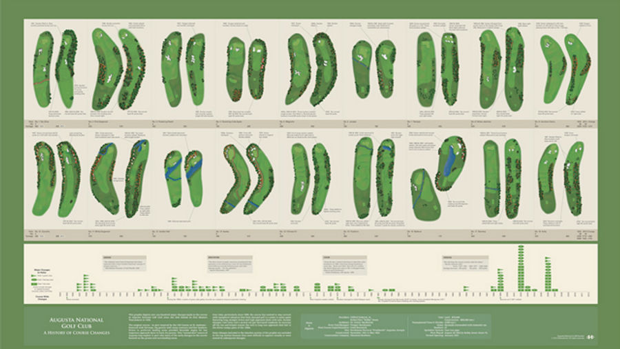
Track wasn't the only sport to see its practitioners improve over the last century. In this excellent poster by Bill Younker, check out the many ways that the Augusta National golf course has been altered since the 1934 Masters. To adjust for the modern game and its very modern equipment, the Augusta grounds crew has been forced to push back tees, build new bunkers, and add trees.
The Infinite Baseball Fields of America

Ballparks have always had a way of making people feel a bit whimsical, a mood well captured by Pop Chart Lab's beautiful "Infinite Baseball Fields of America" map. Perhaps inspired by the ExtendNY project, which laid the Manhattan grid across the entire globe, "Infinite Baseball Fields" imagines a world with no outfield fences, where ballparks just go on and on until they sort of fade into the distance.
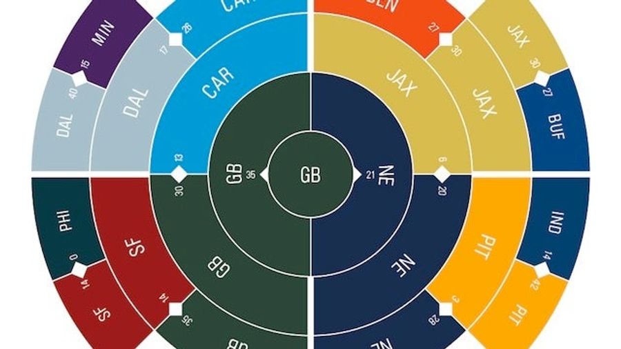
Parity 2012: The Circle Of Life In The NFL
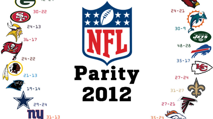
One of the joys of the NFL is its uncertainty—all that great Any Given Sunday stuff. Sure enough, by Week 11 of this season the NFL had achieved perfect parity—every team had beaten a team that had beaten a team, and so on and so forth. The whole thing was charted out on Reddit, as it had been in 2010.
(Almost) Five Decades Of Bulls
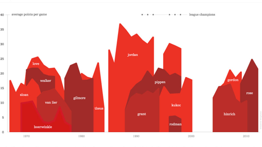
Team effort is important. That's Andrew Bergmann's basic thesis at Dubly.com, where he charts out the average points per game of Bulls, Celtics, Lakers, and Knicks stars across five decades. Bergmann's charts help reveal an important fact about the dominance of the Jordan-era Bulls and Bird-era Celtics: Teams achieve greatness only when the lesser players step up behind the superstar.
Know of any other greats infographics that should have made the list? Leave them in the comments. Two rules:
Always provide a link to the original source.
Don't include infographics that look like this.
Related


- Best NBA Betting Picks Today: Friday April 3rd Expert Predictions
- MLB Pitcher Props Today: Best Baseball Bets for April 3rd
- MLB Picks Today: Brewers vs Rays and Reds vs Pirates Predictions
- NBA Picks Today: Celtics vs Heat, Hawks vs Magic, Nuggets vs Jazz Bets
- MLB Best Bet Today: Los Angeles Angels vs Chicago Cubs Betting Pick
- NBA Best Bets Today: Top Betting Picks for Monday March 30th
- Michigan vs Tennessee Prediction: Why Wolverines Are the Elite 8 Best Bet
