
The Ducks Logos That Could Have Been

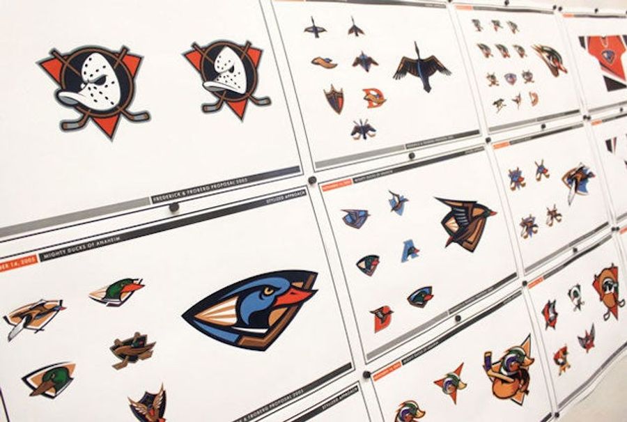
In 2006, the no-longer Disney-owned Mighty Ducks of Anaheim underwent a complete rebranding, changing their name, their purple-primary uniforms, and most crucially, dropping the duckbilled Jacques-Plante-Mk. 2 mask logo. In exchange, they unveiled the “D-foot,” which has now been the team’s identity nearly as long as its cartoonish predecessor lasted. It’s a fine enough logo, but only emerged after the design team rejected a whole bunch of mean ducks.
Over at the Sporting News, Todd Radom has an absorbing story on the design process of the Ducks’ current logo. Bill Frederick, creative director at Frederick & Froberg Design Office (now Fanbrandz), walked him through the process that resulted in the minimalist D-foot—a process that began with ideas every bit as campy as the old one.
“It became clear that the owners and management didn’t want an angry duck, an animated duck, an aggressive duck, or an ornithologically-correct duck — no matter the illustrative style,“ said Frederick. “None of these approaches resonated with the Samueli’s vision for a classic but sophisticated update with a color scheme that showed competitive toughness and a tie to Orange County.
“Our discussion turned to eliminating an image of a literally-depicted duck entirely, and we took a piece of one logo exploration that used a stylized duck foot as a graphic holding shape that also formed the shape of a capital ‘D.’ Henry and Susan immediately loved the approach of suggesting a duck without having to illustrate it. I sketched it as we talked, and when I showed them and the rest of the board room the quick drawing, they instantly said, ‘That’s it!’”
Here are some of their sketches of potential webbed-foot logos:
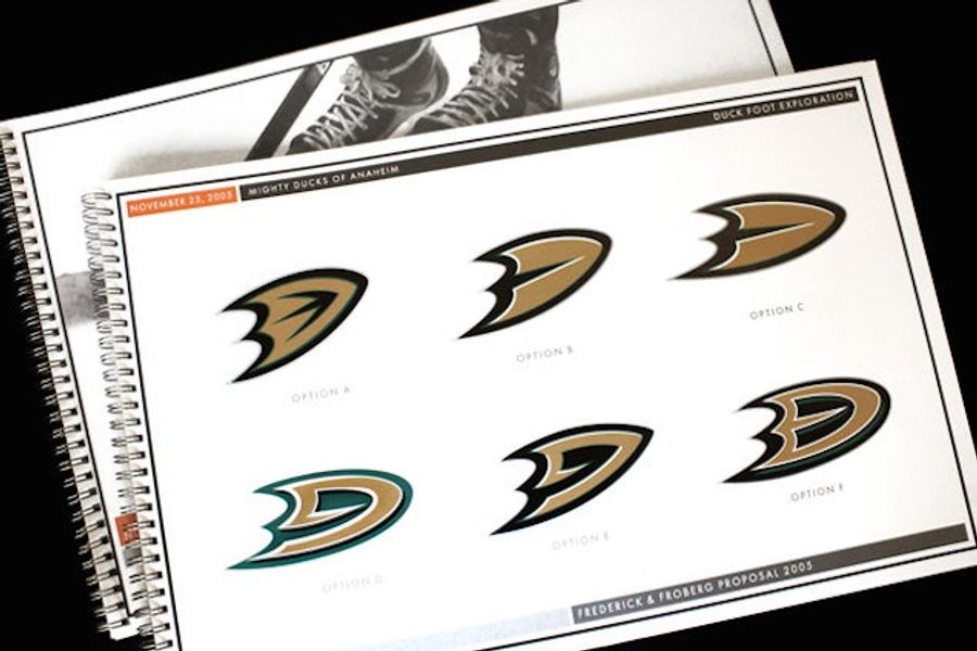
Option A proved to be the winner, once it got some orange and white accents.
One last hitch came when the new logo leaked from focus group testing, and ended up on the team’s Wikipedia page. Frederick had a plan for that, too.
“We quickly edited the page and since we were still well ahead of the rebrand unveiling, we came up with a stealthy solution. We took cell phone screen shots of the ‘flying duck’ logo as well as several other designs already out of contention and posted each of those on blogs claiming that they were the actual rebrand. Within a couple of days, the confusion over what the ‘real’ rebrand was going to be had its intended effect, and we were able to plan the unveiling without being spoiled by the leak.”
The whole story is worth your time if you’re even slightly interested in how sports logos are born, but the Ducks are a particularly interesting case. In just a couple decades, they’ve gone from the laughingstock of pro sports to a respectable member of the NHL.
Related: ‘90s jerseys were bad.
[ Sporting News | Fanbrandz]

Five WWE Superstars in the Spotlight Ahead of Wrestlemania

Best NBA Betting Picks and Predictions for Monday April 6th

Five Early 2026 MLB Takes That Might Already Be True
- NBA Betting Picks April 4th: Three Best Bets for Saturday's Slate
- Michigan vs. Arizona Bets: Wolverines Hold Edge in Final Four Showdown
- Best NBA Betting Picks Today: Friday April 3rd Expert Predictions
- MLB Pitcher Props Today: Best Baseball Bets for April 3rd
- MLB Picks Today: Brewers vs Rays and Reds vs Pirates Predictions
- NBA Picks Today: Celtics vs Heat, Hawks vs Magic, Nuggets vs Jazz Bets
- MLB Best Bet Today: Los Angeles Angels vs Chicago Cubs Betting Pick
