
Whoa, New ESPN.com

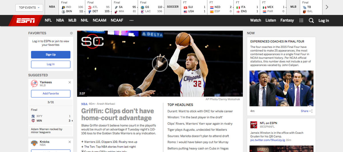
Go look! After six months of beta testing, ESPN.com officially unveiled its redesign. Considering it's the second most viewed sports website in the country, we're all going to need to get used to it.
We will get used to it, of course. There's always much bitching when a popular internet property undergoes an overhaul, because everyone hates change. Where's the thing that I used to know where it was? Oh, there it is. That took two extra seconds—they've ruined this site! You know the drill. (I work for Gawker Media. We do redesigns solely to piss readers off. So I definitely know the deal.)
But it seems fine? A lot of white space, nothing egregiously illogically placed. It feels like a lot of sites these days, down to the tiles, the breadcrumb navigation, the endless scroll, and (ugh) the scrolljacking. As it turns out, the ESPN FC aesthetic was a trial run. So it'll be fine. We'll all be fine.
What's the point? There's a welcome post that's heavy on the jargon, and echoes what ESPN's SVP of digital product management told Mashable back in September when beta testing opened (the final look is not markedly different):
"Furthermore, we aimed to create a cohesive aesthetic and experience across the new ESPN.com and our native applications like SportsCenter and Fantasy Football. Over time, you will hopefully notice that our site and our applications feel connected and familiar."
Essentially, they want all the ESPN properties to be visually and immediately on-brand. The new site will be much closer to the new mobile version than their older counterparts were. It'll match the look of all of ESPN's mobile apps. With its white base and red and black accents, it even resembles the massive new
So, try it out, and share your early impressions here in the comments. Within a few days, we'll all have forgotten it was ever different. (Remember ESPNet SportsZone?)

The SEC Dynasty Is Over and the Big Ten Proved It
MLB Betting Picks for Wednesday: Two Totals for May 27 Slate
- Knicks vs Cavaliers Picks Today: Best Bets for Game 4 of the ECF
- Best MLB Bets Today: Top Picks for May 24 Featuring Shohei Ohtani and Ketel Marte
- Thunder vs. Spurs Game 4 Picks: Best Bets for WCF Sunday
- Three MLB Futures Worth Betting Before the Odds Disappear
- MLB Best Bets Today: Guardians Value Play and White Sox-Giants Total
- MLB Best Bets Today: Blue Jays, Diamondbacks and Athletics Picks for Thursday
- MLB Pitcher Props Today: Best Bets for Cam Schlittler, Aaron Nola and More
