
reubenfb Page 16 - Sports News, Headlines & Highlights
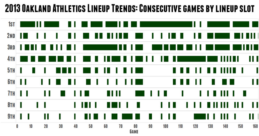
Cool Chart: A's Skipper Bob Melvin Is The King Of Platoons
Over at Sports on Earth, Jack Moore created this great graphic to demonstrate just how crazy A's manager Bob Melvin is about platoons. The green rectangles represent consecutive games in which the same hitter held the same spot in the batting order, with blanks showing a change from the previous gam...
Perfectly Timed Sports TV Graphics Are A Gift From God
We spend so much time here making fun of chyron mistakes that we sometimes forget to give thanks for the serendipitous moments where on-screen graphics and live action work in hilarious concert. ...

Photoshop Contest: Let's Rebrand The Washington Redskins
The folks at 99designs are running a community contest to rebrand the Washington Redskins with a new team name and logo. They reached out to a few journalists to get some suggestions—e.g. Warriors (Robert McCartney), Griffins (David Plotz), and Renegades (Ken Meringolo and Kevin Ewoldt)—but anything...

Deadspin Up All Night: Motion Movement
Thank you for your continued support of Deadspin. There's playoff baseball on as we speak, go give it a watch....
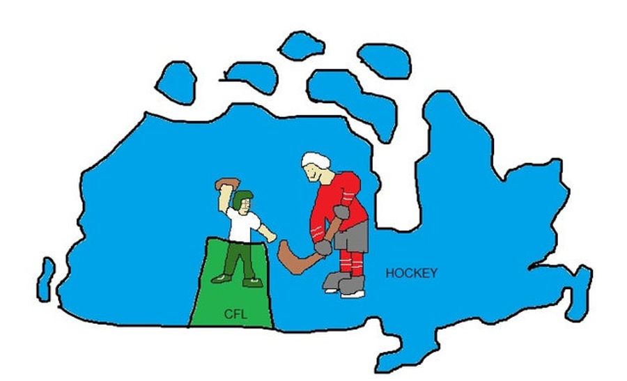
Less Awesome Map: The Provinces Of Canada, By Regional Sport
A reply to "Awesome Map: The United States Of America, By Regional Sport," by Carrie Hunt and the Spoonerisms....
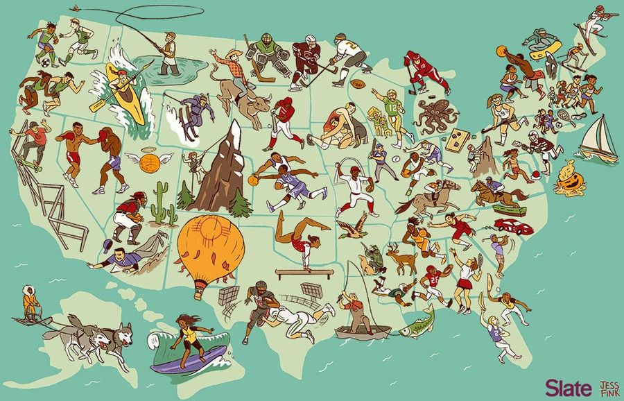
Awesome Map: The United States Of America, By Regional Sport
What sport can each state lay claim to? The map above, by Josh Levin and Jess Fink of Slate, attempts to answer this fun but fascinating question, picking 51 sports to dish out across the country. The results range from awesome (mountain climbing in Colorado) to goofy (cornhole in Ohio) to extremely...
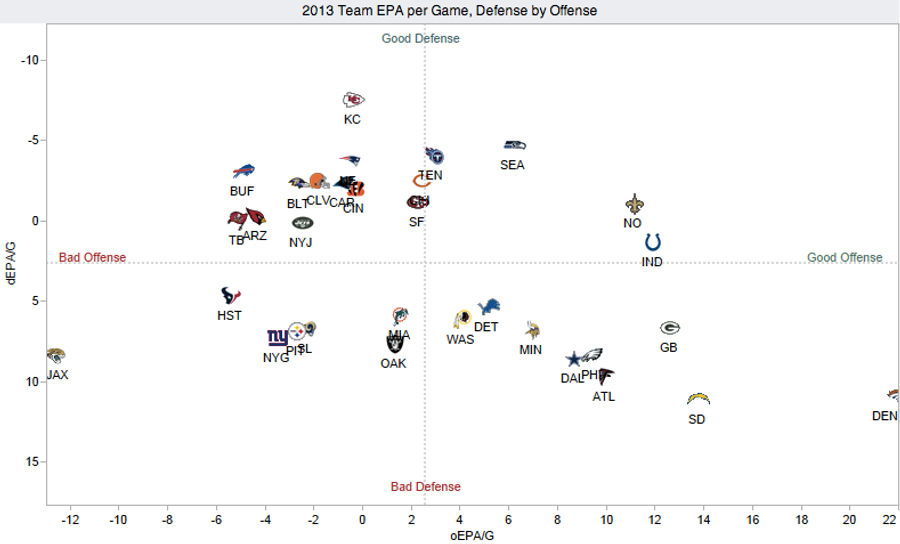
Chart: How Does Your NFL Team Stack Up On Offense and Defense?
Over at Advanced NFL Stats, Brian Burke has put together a great visualization plotting the offensive and defensive performance of the league's 32 teams. It's nothing too complicated—basically a NYMag Approval Matrix for football—but it reveals a lot about the state of the NFL through Week 5....
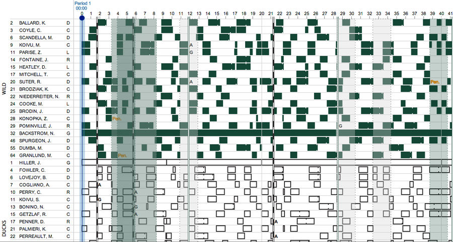
Who The Hell's On The Ice? Cool Interactive Explores Hockey Line Changes
It's hard enough to follow the puck in televised hockey, so forget about tracking the many, many on-the-fly line changes. Luckily ShiftChart, a sample of which you see above, is here to do the work for you. ...
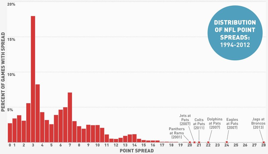
What's More Improbable: The Jaguars' +28 Line Or An 11-Inch Penis?
The murmurs began last week, before the Broncos put up 51 points against the Cowboys and the Jaguars lost second-overall pick Luke Joeckel to injury. And when the dust of Week 5 had settled, sure enough, the betting line for Jaguars at Broncos was set at 28 points, which is a lot....
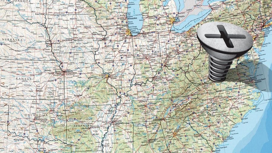
Which TV Market's Getting Screwed Today? Your Week 5 NFL Viewing Maps
A guide to the best and worst of the NFL slate (and to which fans are stuck with the most of worst). Maps via 506sports.com....
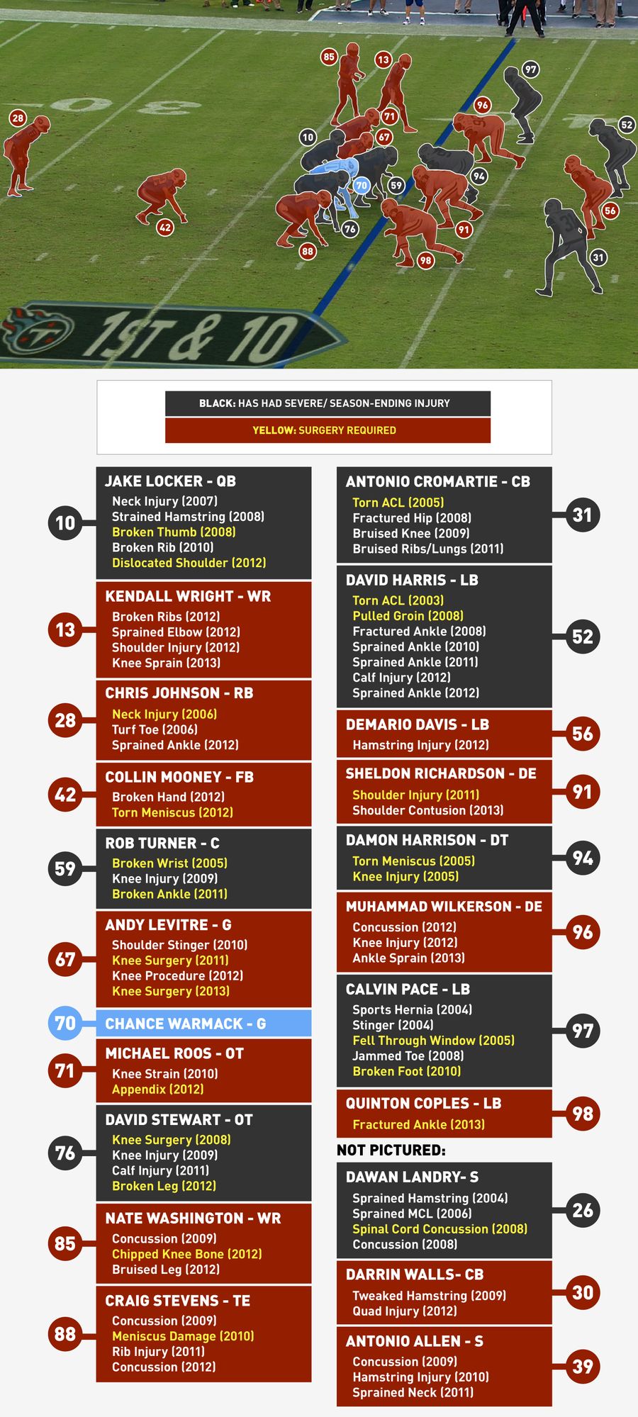
The Injury History Of Everyone On The Field When Jake Locker Got Hurt
Four seconds into the play above, Jake Locker took an awkward double hit from Muhammad Wilkerson and Quinton Coples and had to be carted off the field with a hip injury. If anyone could sympathize, it was, well, everyone else on the field....
Infographics: Every NFL Offense's Production, Visualized By Position
Instinctively, you know every team has strengths and weaknesses. You see it in the box scores and the advanced metrics, but when the teams line up, a shitty running back doesn't look impossibly different from Adrian Peterson. So, here's a visual aid. Every NFL offense, visualized by how each of the ...
What If The NBA And MLB Played An NFL-Style Season?
A big part of the NFL's appeal is all that "any given Sunday" stuff—a team like the Chiefs can come out of nowhere and look like world-beaters, while a team like the Giants can spend the first quarter of the season playing like the last reel of Horse Feathers. A lot of this uncertainty can be attri...
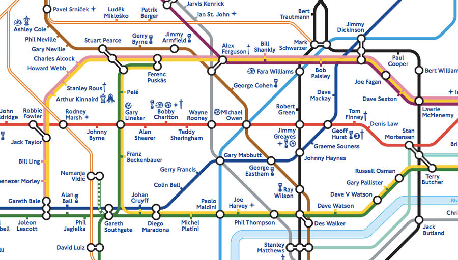
London Tube Map Redrawn With Footballer Names; England Rejoices
England's Football Association and the London Tube both turned 150 this year, so in commemoration the FA has released a neat soccer-themed version of the famed Tube map. As you can see in the excerpt above, each of the systems's near-400 stations (including the overgrounds) has been replaced by a no...
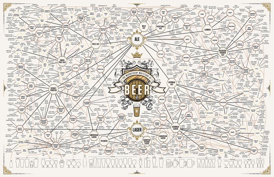
The Taxonomy Of Brewing: 500 Beers On One Ridiculous Chart
Updating their 2010 and 2011 offerings, Pop Chart Lab has released "The Magnificent Multitude of Beer," a 60'' x 40'' print/chart detailing dozens of brewing styles and sub-styles, as well as over 500 individual beers (click here for a larger version)....
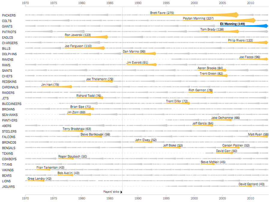
Chart: Eli Manning Has Started 150 Consecutive Games; We Are Old
Eli Manning made his 150th consecutive start for the Giants this Sunday, completing 18 of 37 passes for 217 yards, one touchdown, and one interception. The excellent New York Times graphics team has put Manning's feat of longevity into historical context, creating an interactive chart that chronicle...
Which TV Market's Getting Screwed Today? Your Week 4 NFL Viewing Maps
A guide to the best and worst of the NFL slate (and to which fans are stuck with the most of worst). Maps via 506sports.com....
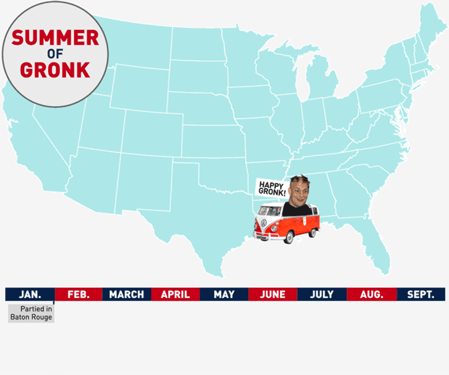
Map: The Long Summer Of Gronk
Rob Gronkowski played his last game for the Patriots on Jan. 13, breaking his arm in a playoff win against the Texans. A week later, New England was eliminated from the playoffs and Gronkowski was once again free to roam the Earth. The Summer of Gronk had begun....