
Can You Find The Five Differences In The New Vikings Logo?

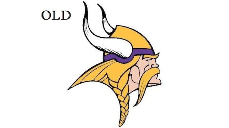
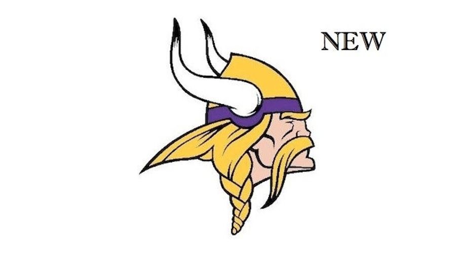
The Vikings have not "changed" or "altered" their Norseman logo, or whatever other plebeian teams do. It has been "enhanced." Play with the slider above to see both the old and new logos.
At first glance, it looks almost identical. But at this morning's official unveiling, the team was adamant that the enhancements are as necessary and vital as they are subtle. Let's play count the buzzwords!
The Vikings have enhanced the team's primary mark to give it a more natural and defined look... The sharper, bolder mark speaks to the direction the team is heading while still preserving the tradition of the Norseman. Fans will see from the side-by-side comparison that this is not a logo change. Rather, the enhancements simply give the mark an improved, more defined appearance.
But can you actually spot the differences? There are five of them. Examine the images above to find them all. When you're done, highlight the following magic inviso-text to read about the "enhancements," straight from the Vikings' official description.
1) Horn Shape The shape of the horns has been adjusted and the shading in the horns has changed.
2) Horn Base The base of the horn now resembles the horn on the players' helmets.
3) Face Detail Thicker lines have been added to the mustache and face.
4) Vikings Gold The Vikings Gold is now brighter and less brassy.
5) The Braid The braid has been shortened, resulting in a reduced logo height.
How did you do?
[ Vikings.com]

Biggest NBA Playoffs Concerns for Contenders Outside OKC
Five WWE Superstars in the Spotlight Ahead of Wrestlemania
Best NBA Betting Picks and Predictions for Monday April 6th
- National Championship Bet Pick: Why Michigan Has the Edge Over UConn
- UFC Vegas 115 Betting Picks: Moicano vs. Duncan Headlines April 4th Card
- NBA Betting Picks April 4th: Three Best Bets for Saturday's Slate
- Michigan vs. Arizona Bets: Wolverines Hold Edge in Final Four Showdown
- Best NBA Betting Picks Today: Friday April 3rd Expert Predictions
- MLB Pitcher Props Today: Best Baseball Bets for April 3rd
- MLB Picks Today: Brewers vs Rays and Reds vs Pirates Predictions
