
Columbus Crew Get Rid Of The Worst Logo In Sports

American soccer culture is formed by the continual tension between copying the traditions and behaviors of soccer abroad, and creating something uniquely American. With the United States Men's National Team firmly established as good but not great and MLS coming into its own as neither a retirement nor a development league, soccer might finally be comfortably settling into the American sporting landscape. It is no longer seen as an oddity.
But almost 20 years ago, as MLS was playing its inaugural season, the scale was firmly tilted towards an American version of soccer. There were playoffs instead of a table, shoot-outs at the end of full-time instead of draws, a countdown clock instead of extra time, and wacky-ass team names like the Tampa Bay Mutiny and Kansas City Wiz. Yes, the team was officially called the Wiz for its first year in existence. The absolute worst departure from foreign soccer, however, were the logos. Oh, the logos.
Most soccer teams outside of the United States don't have logos. They have badges, or crests. These are worn on the jerseys, and are more akin to a familial coat of arms than a marketing firm designed logo, reflecting their origin a hundred years ago in much less commercial (for sports, anyways) times. They're something to be proud of, and any time a team tries to depart from this tradition, fans revolt.
A month ago MLS came up with a new logo, dropping the image of a cleat kicking a ball that had always seemed more appropriate for a local Under-8 soccer team than America's top tier professional league. Shoot-outs and the countdown clock were abolished awhile back, and for the most part teams have gotten rid of the worst parts of their mid-1990s. The Kansas City Wiz are now Sporting Kansas City, a sorta lame rip-off of Sporting Lisbon but an undeniable improvement nonetheless.
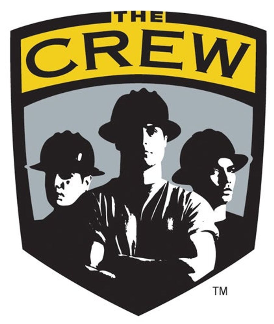
The Columbus Crew was the first MLS team to build and play in a soccer-specific stadium, and over the past two decades Columbus has become the spiritual home of the USMNT. Yet even the crown-jewel of American soccer, the team and place that has led the way in defining what it means to be both American and a rabid soccer fan, was still handcuffed by some of the poor decisions in 1996. Namely, that godawful logo of construction workers above.
Seriously, Columbus Crew players have worn that thing on their jerseys for the past 18 seasons. The team name was the winner of a contest, and is supposed to represent the city's blue-collar identity. I can get behind the name and the idea, but was it really necessary to design a badge with three guys in hard hats? (And what's up with those wide-brimmed construction hats? They kind of look like fire helmets or trillbys.)
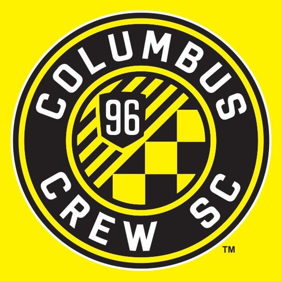
But as of Wednesday night, the construction dudes are no longer. The Crew unveiled a complete rebranding, changing their official name to Columbus Crew SC and revealing a new logo that would look mostly right at home in the Bundesliga. There is a bunch of marketing gobbledygook to explain the new logo/badge—"Original; Energetic; and Authentically Columbus"—but the main takeaway here is that it is a vast improvement.
That's not to say that doing away with everything uniquely "American" about soccer and blindly copying Europe is the path to follow. I certainly wouldn't want any of the racism or vestiges of hooligan culture that remain in European soccer to become part of the American game. But in this specific case, it was far preferable for Crew SC (better use the new nickname!) to copy Borussia Dortmund than the Colorado Rockies.
Related


Five WWE Superstars in the Spotlight Ahead of Wrestlemania

Best NBA Betting Picks and Predictions for Monday April 6th

Five Early 2026 MLB Takes That Might Already Be True


- NBA Betting Picks April 4th: Three Best Bets for Saturday's Slate
- Michigan vs. Arizona Bets: Wolverines Hold Edge in Final Four Showdown
- Best NBA Betting Picks Today: Friday April 3rd Expert Predictions
- MLB Pitcher Props Today: Best Baseball Bets for April 3rd
- MLB Picks Today: Brewers vs Rays and Reds vs Pirates Predictions
- NBA Picks Today: Celtics vs Heat, Hawks vs Magic, Nuggets vs Jazz Bets
- MLB Best Bet Today: Los Angeles Angels vs Chicago Cubs Betting Pick
