
Oregon's New Uniforms Are Sewn Together With Lies

The uniforms that the Oregon Ducks are going to wear in the national championship are not only bad and boring, they were created by liars.
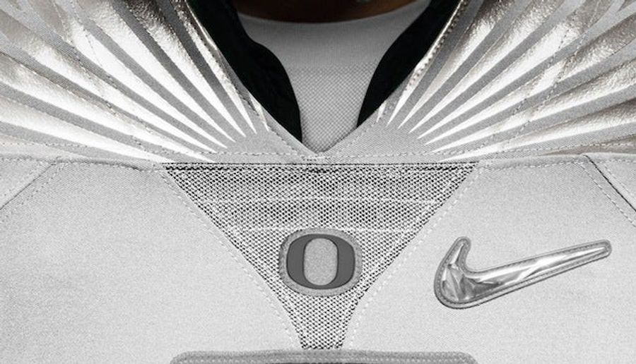
Above is a close-up shot of the Oregon "O" on the neck of the jersey. You probably noticed that it's sitting a little crooked, but Nike has an explanation for that:
The Nike Mach Speed uniforms feature a special fractal diamond color Swoosh on the front of the jersey and pant. Additionally, the Oregon "O" chest graphic is placed at a 27-degree tilt, representing the Ducks' 27 bowl appearances.
(Update: Nike has since edited the photo caption on its Facebook page. It now reads: "The Nike Mach Speed uniforms feature a special fractal diamond color Swoosh on the front of the jersey and pant.")
Interesting idea, Nike! Well, it would be an interesting idea if it wasn't totally fucking wrong. That "O" on the jersey is nowhere near a 27-degree tilt. This is what the "O" looks like when you drop it into Photoshop and tilt it exactly 27 degrees.

Nike sewed that shit on crooked, and now they are just trying to play it off like they did so on purpose.


Why Kyler Murray is a Perfect Match For Minnesota Vikings

Five NFL Free Agency Predictions That Can Still Happen

Five College Pro Days That Could Shake Up the 2026 NFL Draft


Mark DeRosa Needs To Take More Accountability for Team USA


Thursday NBA Betting Guide: Key Spreads and Totals to Target
- Players Championship Betting Guide: Top Picks, Props, and Odds
- College Basketball Best Bets Today: Kentucky and Texas SEC Tournament Picks
- MLB ERA Player Prop Future Bets: Four Pitchers Worth Betting the Under
- Why Duke Blue Devils Look Unstoppable Entering the ACC Tournament
- Big 12 Tournament Preview: Arizona, Houston, Kansas, and Iowa State Contend
- College Basketball Bets Today: Gonzaga, Virginia Tech in Key Tournament Matchups
- MLB Batting Average Player Props: Best Over/Under Future Bets for 2026
