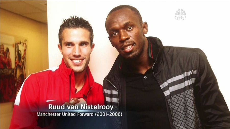
graphics Page 10 - Sports News, Headlines & Highlights
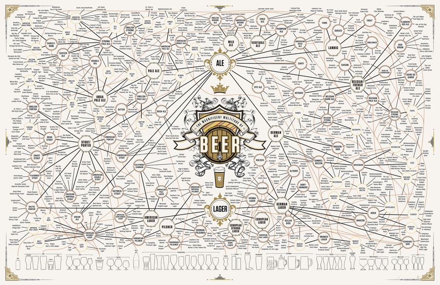
The Taxonomy Of Brewing: 500 Beers On One Ridiculous Chart
Updating their 2010 and 2011 offerings, Pop Chart Lab has released "The Magnificent Multitude of Beer," a 60'' x 40'' print/chart detailing dozens of brewing styles and sub-styles, as well as over 500 individual beers (click here for a larger version)....
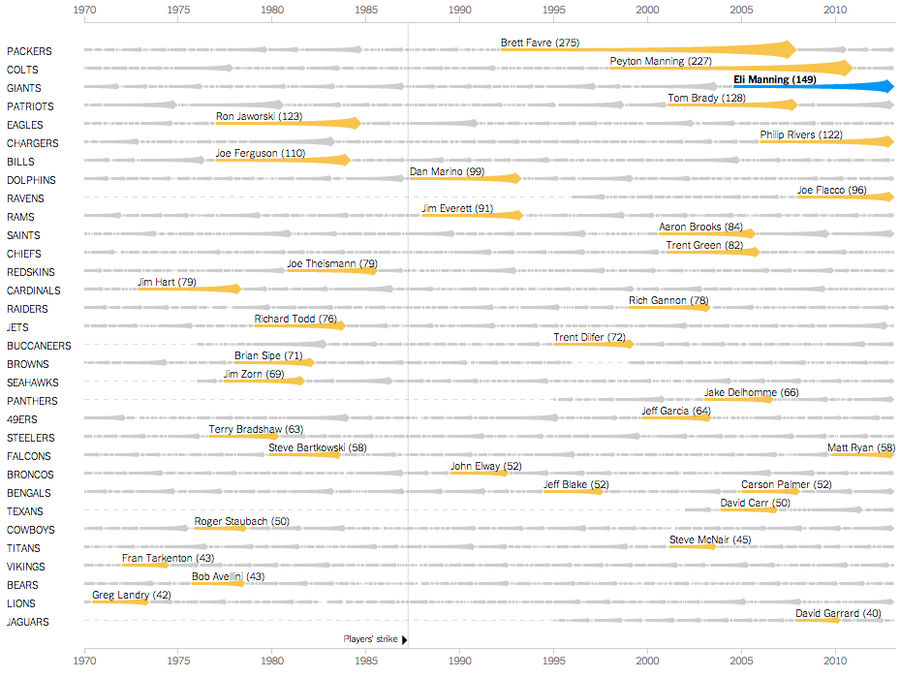
Chart: Eli Manning Has Started 150 Consecutive Games; We Are Old
Eli Manning made his 150th consecutive start for the Giants this Sunday, completing 18 of 37 passes for 217 yards, one touchdown, and one interception. The excellent New York Times graphics team has put Manning's feat of longevity into historical context, creating an interactive chart that chronicle...
Who Is The Most Pompous Sports Pundit? A Scientific Investigation
Of all the stupid rhetorical plays columnists use—issuing thundering imperatives, positioning their banal opinions as the exact midpoints between varieties of unyielding madness, championing their cronies' worthless businesses as examples of the disciplinary power of markets, etc. etc.—the funniest ...

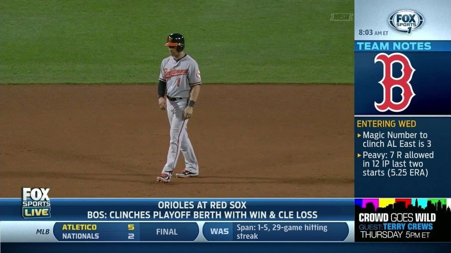
Royals Win In 10 On Justin Maxwell's Walk-Off, Pimp-Hit Grand Slam
It wasn't a good day for the person doing the closed captioning on the Royals' TV broadcast. ...
Villa Scores Hat Trick As Atlético Beats The Washington Nationals 5-2
Send stories, photos, and anything else you might have to [email protected]....
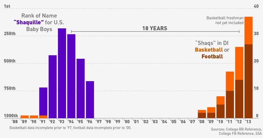
Infographic: Are College Sports In The Midst Of A "Shaq Boom"?
Over on his blog, Ken Pomeroy makes a convincing case that we're in the midst of a "Shaq Boom." The babies named "Shaquille" that were born in O'Neal's heyday in the '90s are now turning 18 and entering college basketball. The name "Shaquille" first entered the list of top 1,000 baby names in 1991 (...
![Dear CBS, Please Stop Using Yellow In Your Ticker [Update]](https://images.deadspin.com/tr:w-900/1909tcpxkznnrgif.gif)
Dear CBS, Please Stop Using Yellow In Your Ticker [Update]
I've been bugged by this since around 3:55, and I'm not the only one—we've gotten emails and tweets from people complaining about CBS's ticker, which uses a striking yellow "Final" box to indicate which games are over. If you're half paying attention, it makes you think there's a flag on the play. E...
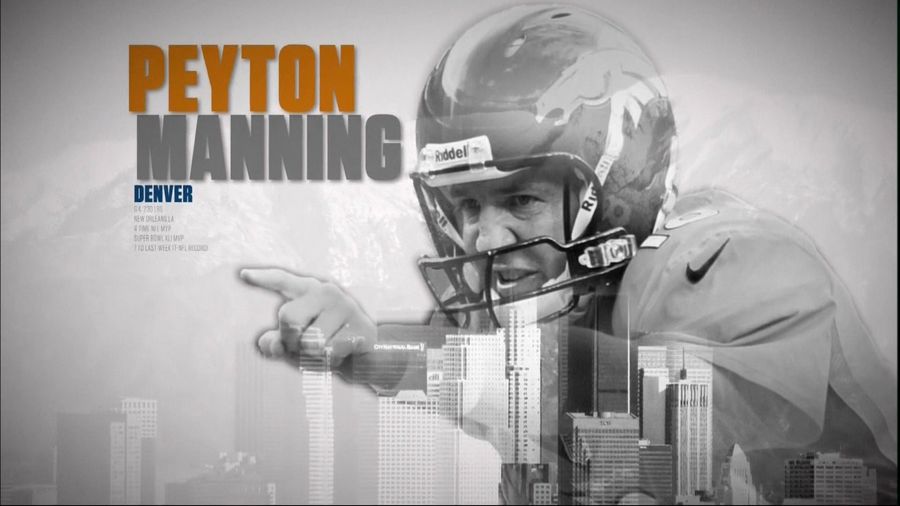
Peyton Manning Is From Los Angeles, According To CBS
CBS's Manning Bowl graphics have played up the brothers' backgrounds, with a New York City skyline for Eli and for Peyton.. Los Angeles? Wait, why?...
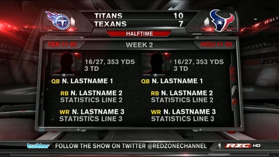
The Red Zone Channel Is Screwing Up Graphics, Too
Lastname's had an excellent day so far, but Lastname's touchdown pass to Lastname was definitely the highlight of the half. This kind of performance elicits the question: Is Lastname elite?...
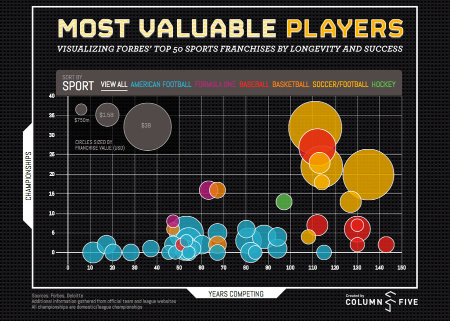
The World's Most Valuable Sports Teams, Visualized
Column Five has put together an interactive that visualizes Forbes's list of the 50 most valuable sports teams in the world. The takeaway: It's good to be good, and it's good to be old. ...
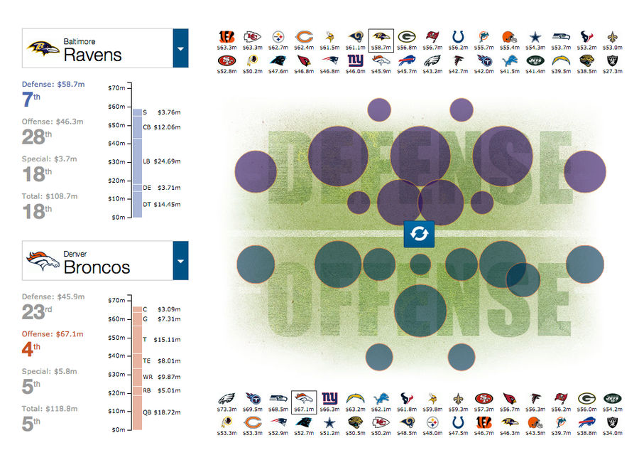
Cool Charts: NFL Team Salaries By Position
This week, The Guardian released an excellent interactive graphic on the salaries (technically, the cap hit) of NFL players by team and position. Franchises that look like cheapskates are generally heavy in rookie contracts–nothing in the NFL is as cost-effective as talented young blood–but it's sti...
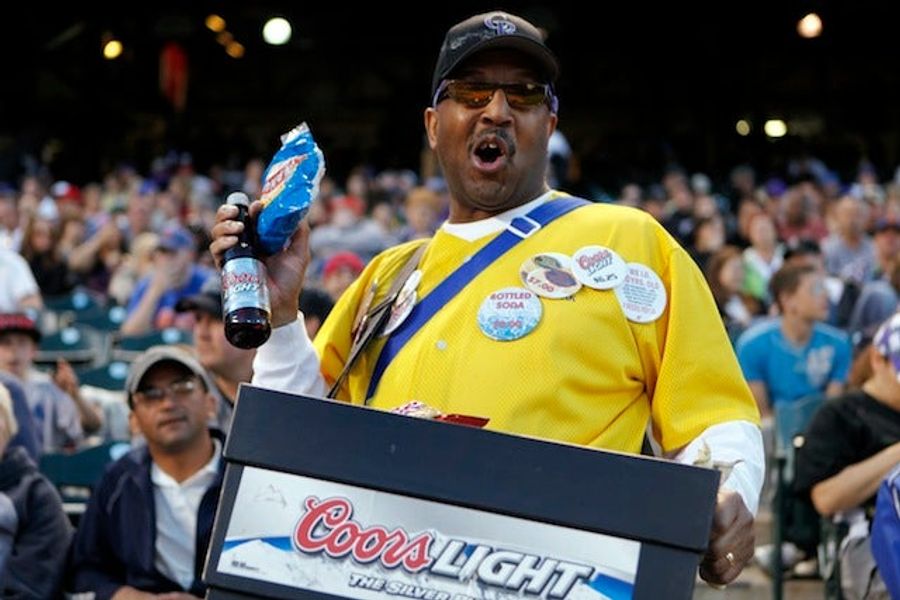
Infographic: Which MLB Team Has The Most Expensive Beer, Per Ounce?
We've given plenty of grief to the Yankees for their misleading advertising, but new data from the Team Marketing Report—which tracks sports attendance costs for its annual fan index—show that Boston has the most expensive beer at $0.60 an ounce, followed by St. Louis, Toronto, and Washington. The A...

Is Wladimir Balentien Having The Most Dominant Baseball Season Ever?
Wladimir Balentien, the impeccably named, once-heralded Mariners prospect who hit just .221 in three seasons in the majors before retreating to Japan, is smacking the everloving shit out of baseballs right now. Friday he hit his 52nd home run—three shy of the Nippon Professional Baseball record—and ...
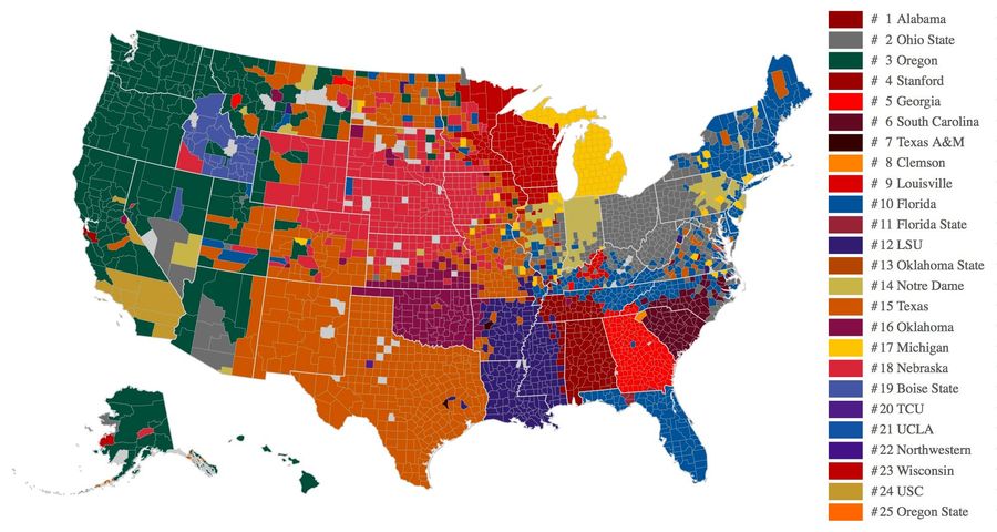
Facebook Data Now Give Us The Best Map Of College Football Fandom
Taking off from its outstanding NFL and college basketball maps, Facebook has compiled county-by-county data on which Top 25 college football teams have the most "likes" across the nation (click here for a larger image). With the usual caveat that many of the counties shown here have very few people...
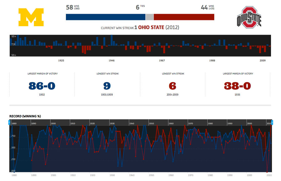
The History Of College Football In One Shiny Website
The fantastic, graphics-centric Sports Design Blog mysteriously stopped updating last fall, as its proprietor Steven Little began devoting more time to "other projects." One of those projects was finally revealed yesterday with the launch of Winsipedia, a data viz database of the history of college ...
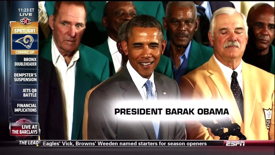
ESPN Can't Deny It's A Joke Of Itself After This
Send stories, photos, and anything else you might have to [email protected]....
This Is What Happens When ESPN Lays Off All Its Competent Employees
Send stories, photos, and anything else you might have to [email protected]....