
graphics - Sports News, Headlines & Highlights

![Dear ESPN, Please Stop Using Yellow In Your <i>Monday Night Football</i> Down-And-Distance Graphic [UPDATE: It's Gone]](https://images.deadspin.com/tr:w-900/dwso0v6k6heg9kpry9fk.gif)
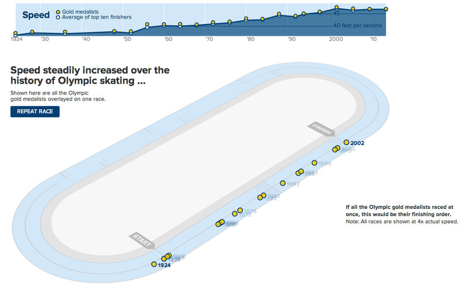
Speed Skaters Have Gotten A Lot Faster Since 1924
Similar to what The New York Times did for the 100m dash in 2012, The Wall Street Journal has developed a great graphic to show just how much faster the top speed skaters have gotten over the years. The still above is part of an animation pitting every male 500m gold medalist against each other; the...
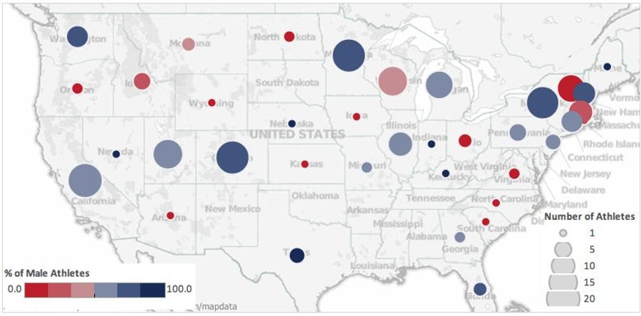
Where Do Our Winter Olympians Come From?
This morning, the Washington Post published a map and list of the home states of the U.S.'s Winter Olympians. Commenter Jessica Minton wasn't a fan, so she took the data and created her own interactive map that breaks down the states' athletes by gender and by sport....
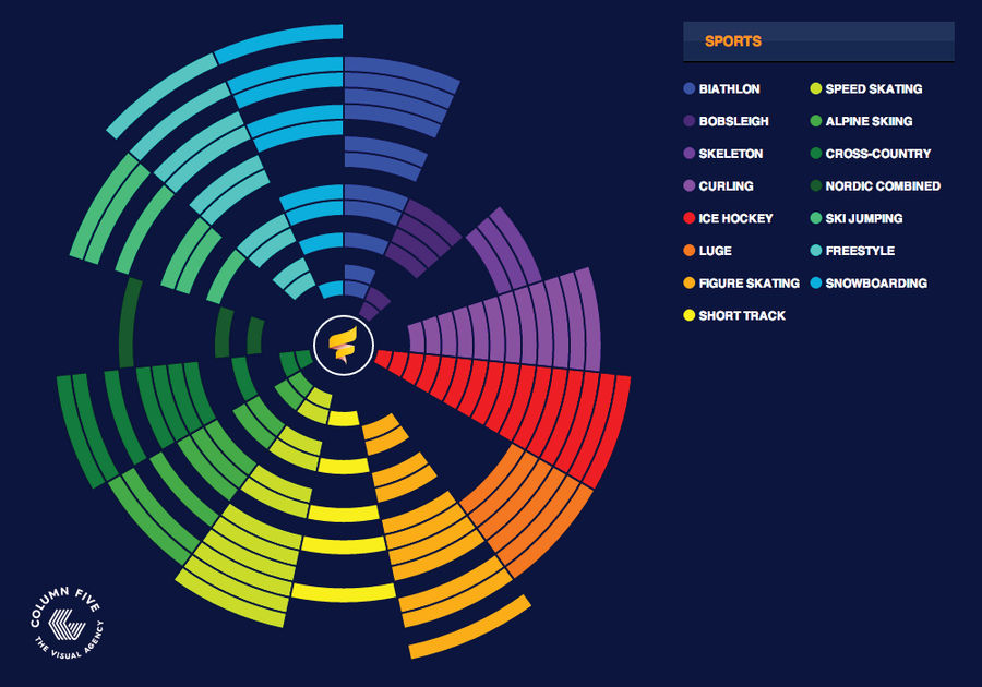
This Interactive Olympic Calendar Is Useful And Pretty
You'll want to bookmark this interactive calendar, produced by Column Five Media. It's an intuitive way to sort the Sochi goings-on by sport and date, and the events are listed by an actual American time zone....
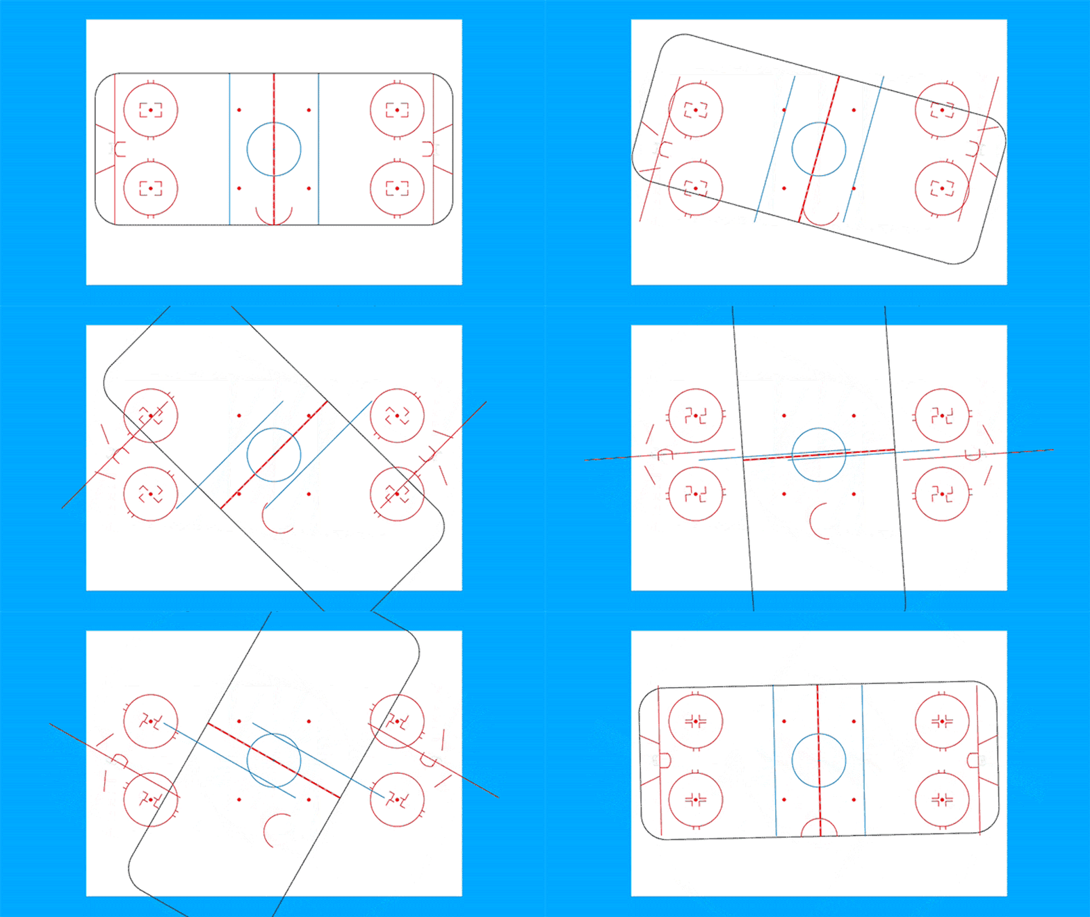
Check Out These Bizarre Spinning Field Graphics
In a series of weird graphics, designer Taylor Holland takes vectors of various sports fields and rotates all the individual elements around and around and around. The results are kind of mesmerizing, although not without the occasional unfortunate swastika....
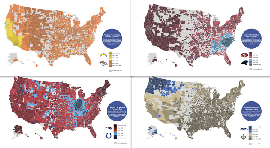
Who Is America Rooting For This Weekend?
Below are four maps showing which team in each of this weekend's games has more Facebook fans in every county in America....
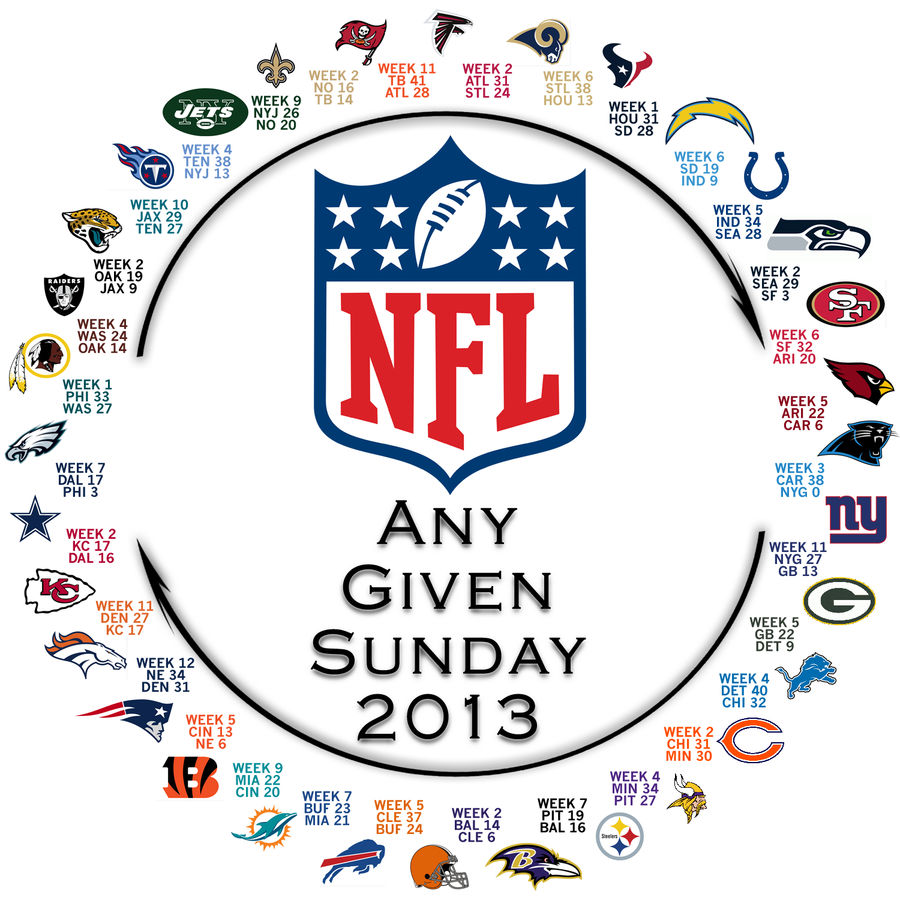
Behold! The NFL's Circle Of Parity
It took 12 weeks, but we've reached that point in the season. It's now possible to visualize the NFL's circle of life, where every team has lost to the team preceding it. Any Given Sunday, indeed....
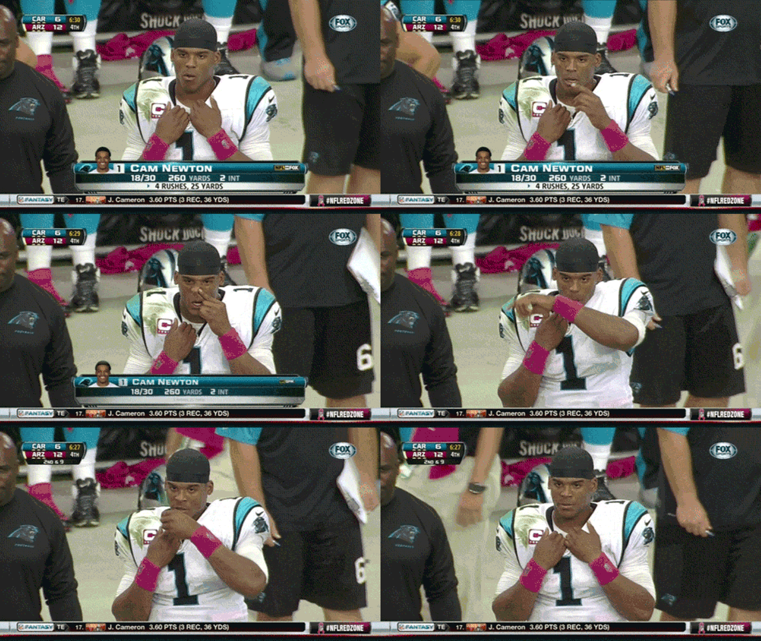
Perfectly Timed Sports TV Graphics Are A Gift From God
We spend so much time here making fun of chyron mistakes that we sometimes forget to give thanks for the serendipitous moments where on-screen graphics and live action work in hilarious concert. ...
![Dear CBS, Please Stop Using Yellow In Your Ticker [Update]](https://images.deadspin.com/tr:w-900/1909tcpxkznnrgif.gif)
Dear CBS, Please Stop Using Yellow In Your Ticker [Update]
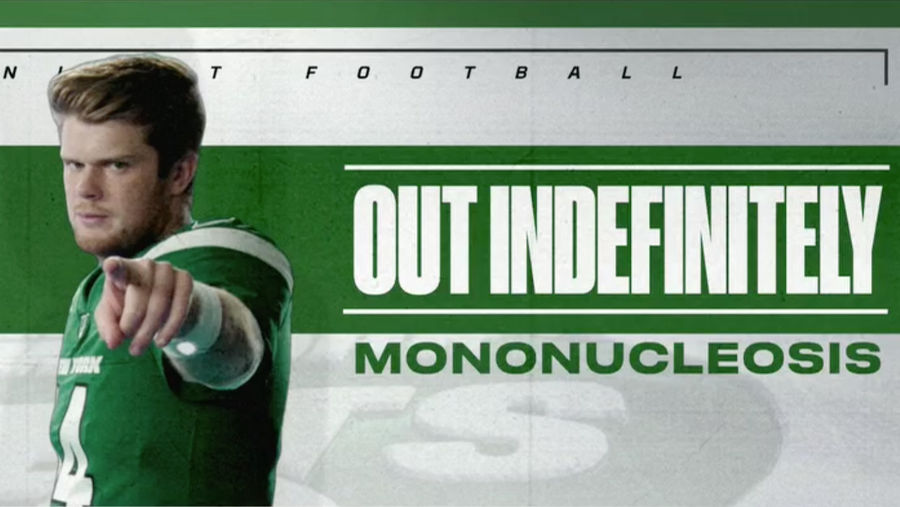
I've been bugged by this since around 3:55, and I'm not the only one—we've gotten emails and tweets from people complaining about CBS's ticker, which uses a striking yellow "Final" box to indicate which games are over. If you're half paying attention, it makes you think there's a flag on the play. E...
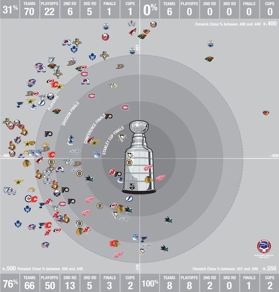
This Wonderful Graphic Proves That In The NHL, Puck Possession Is All
The hockey internet is fawning over this graphic from Chris Boyle at Canadiens blog Eyes on the Prize, and it's easy to see why. The chart takes a second to understand, but when you do, it's hard to come away thinking there's any stat more telling than Fenwick....
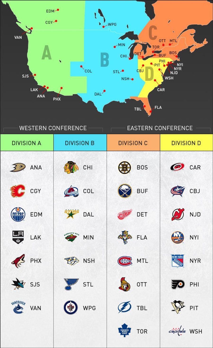
NHL Realignment, In One Handy Graphic
Thanks to NHL.com for putting this one together. It becomes super-easy to visualize the new format, which was approved by the NHL's Board of Governors today and will go into effect next season. Four divisions, two conferences. It'll mean more rivalry games, every team playing in every arena every se...
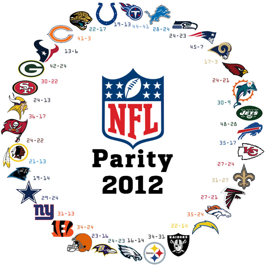
It Happened Again: The NFL's Parity In One Striking Graphic
Two years ago, we were taken by the NFL's ouroboros: a visual representation of the league's parity, where any team can beat anyone else. In the graphic, each team has a victory over the team next to it, going clockwise, until it circles back....
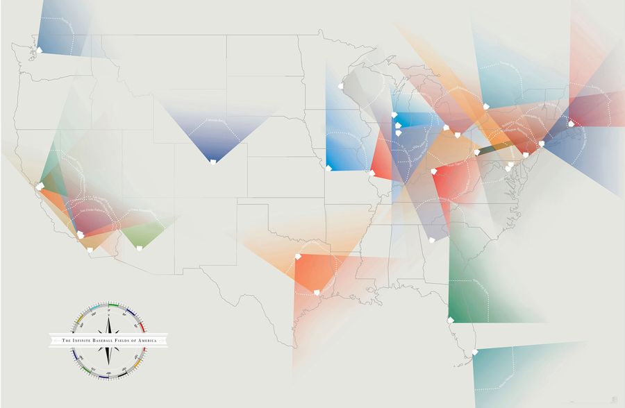
What If Baseball's Foul Lines Ran On Forever?
In W.P. Kinsella's novel, The Iowa Baseball Confederacy, the narrator's father muses upon a loophole in the rulebook. There's nothing that specifically states the foul lines end at the fence....