
graphics Page 12 - Sports News, Headlines & Highlights
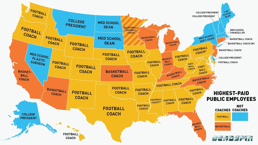
Infographic: Is Your State's Highest-Paid Employee A Coach? (Probably)
You may have heard that the highest-paid employee in each state is usually the football coach at the largest state school. This is actually a gross mischaracterization: Sometimes it is the basketball coach....
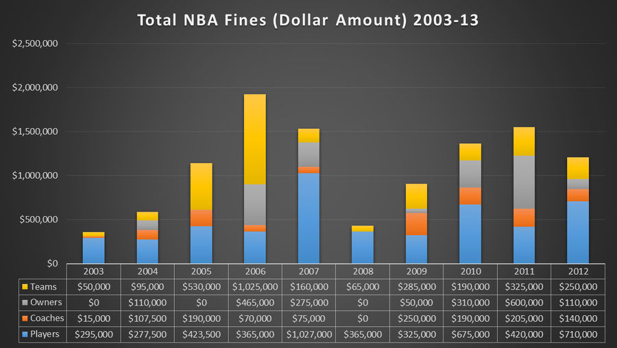
10 Years Of NBA Fines, Visualized
SeatCrunch has come up with a whole mess of ways to break down and chart all the fines handed out by the NBA over the last 10 seasons. It's fascinating....
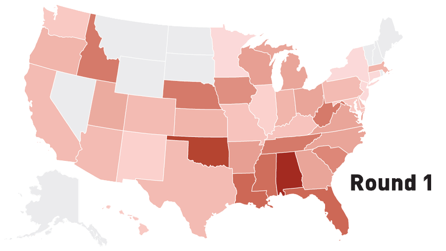
Infographic: Where Do NFL Draft Picks Come From?
Tonight, we get to watch the first round of one of the saddest NFL drafts in recent memory, with teams tripping over each other trying to trade down in a weak year. Even in the good years, success in the college game doesn't always translate to the pros, but some regions and conferences have a reput...

That's Not Your Mouse Pointer
Send stories, photos, and anything else you might have to [email protected]....
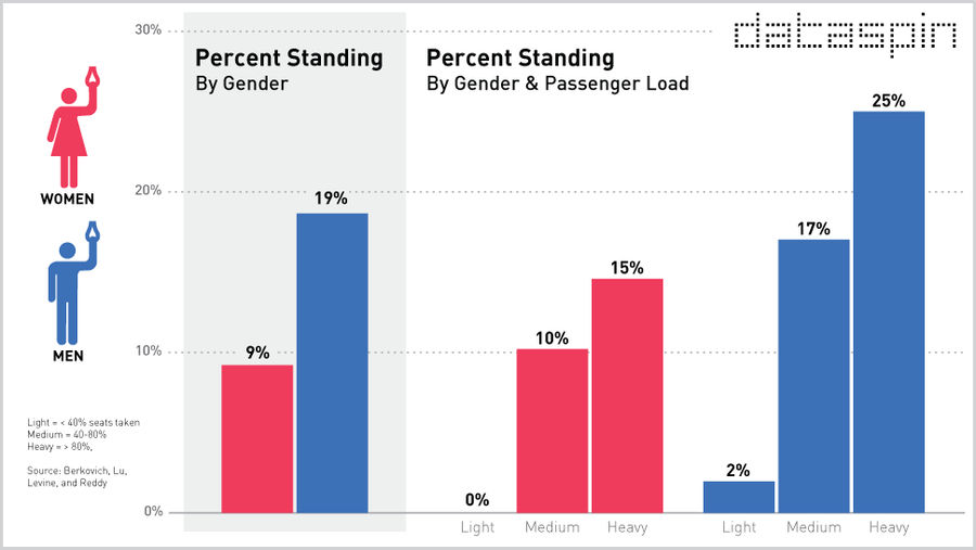
Are Men More Likely To Stand On The Subway Than Women?
Welcome to Dataspin, a weekly data visualization of whatever the fuck....
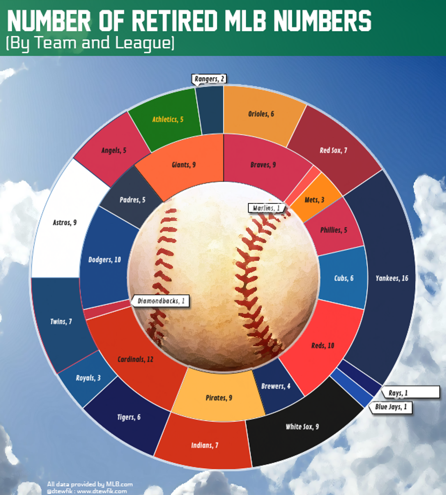
MLB Retired Numbers, Infographic'd
Daniel Tewfik has wrangled up the data on the numbers retired by MLB teams, and put together a slew of visualizations. We love this stuff....
Watch Where You Stand
We loved the Jack Hoffman story, & we're glad ESPN gave it plenty of attention. But watch your blocking, fellas....
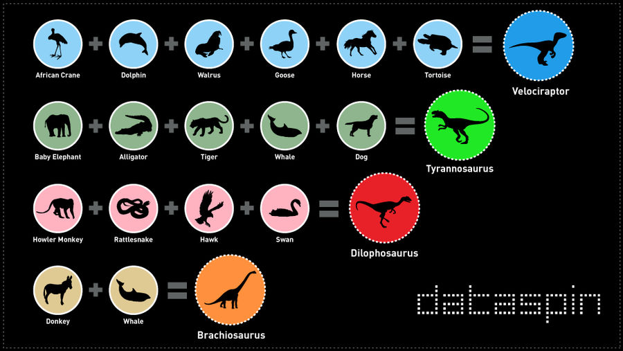
How'd They Make That <em>Jurassic Park</em> Dinosaur Noise? A Handy Chart
Welcome to Dataspin, a weekly data visualization of whatever the fuck....
Kornheiser's Eyes Grew Wide When He Saw Pernetti's Big Package
Send stories, photos, and anything else you might have to [email protected]....
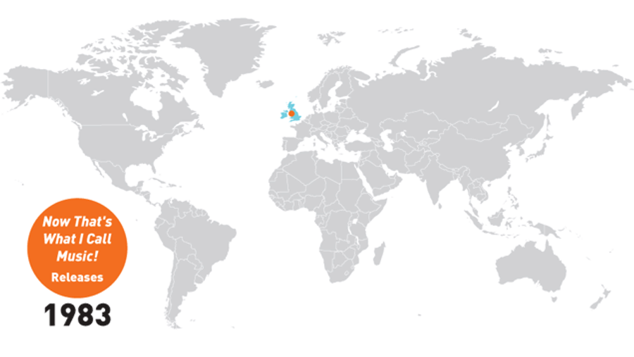
Infographic: Now That's What I Call Global Dominance
Welcome to Dataspin, a weekly data visualization of whatever the fuck....
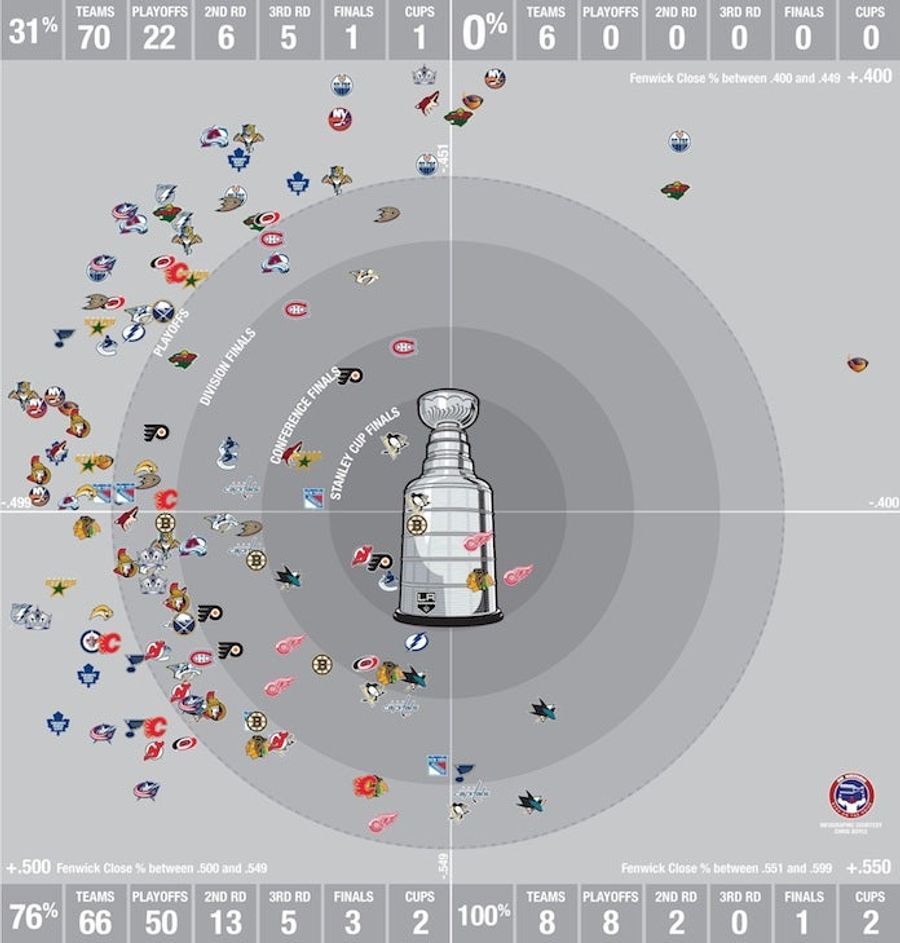
This Wonderful Graphic Proves That In The NHL, Puck Possession Is All
The hockey internet is fawning over this graphic from Chris Boyle at Canadiens blog Eyes on the Prize, and it's easy to see why. The chart takes a second to understand, but when you do, it's hard to come away thinking there's any stat more telling than Fenwick....
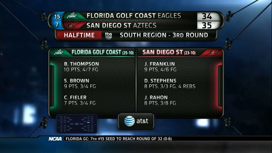
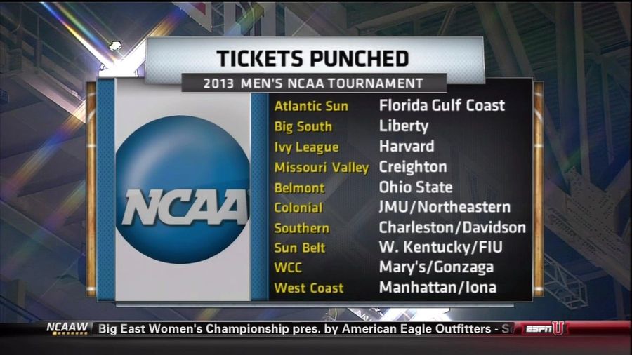
Fun With Graphics: TBS Calls FGCU "Florida Golf Coast"
Lest you think it just a simple typo, it's there in multiple places! ...

Infographics: Where Do High School Basketball Stars Come From, And Where Do They Go?
Last month, the McDonald's All-American Game released its 2013 rosters. The game is a showcase of some of the best high school talent in the country, which this year largely came out of Texas (five players), California (four), Florida (three), and North Carolina (two). Of these 14 players, only five...
Cayce Pollard's Career As An ESPN Graphics Operator Didn't Last Long
Send stories, photos, and anything else you might have to [email protected]....
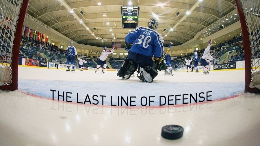
The Deadspin Guide To Goalkeeping
Welcome to Dataspin, a weekly data visualization of whatever the fuck....
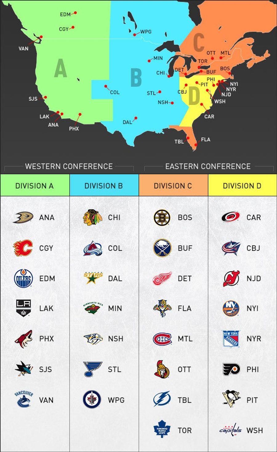
NHL Realignment, In One Handy Graphic
Thanks to NHL.com for putting this one together. It becomes super-easy to visualize the new format, which was approved by the NHL's Board of Governors today and will go into effect next season. Four divisions, two conferences. It'll mean more rivalry games, every team playing in every arena every se...

West Virginia TV Station Graphic Refers To WVU Football Coach As "Dana Horsewomen"
West Virginia's not known for its excelsior journalism, but Charleston/Huntington NBC affiliate WSAZ has long been the flagship for getting it right in the Mountain State and is, seriously, a fantastic news operation. Alas, the auto-correct bug can bite even the most seasoned TV vets, as we assume...

“Are You A Nerd?” And Other Questions We Asked Our Fellow Nerds At The Sloan Sports Analytics Conference
Last weekend, I went to the sixth annual MIT Sloan Sports Analytics Conference. Attendance has gone up every year, and it gets harder and harder to get a feel for who actually goes to this thing: Why were they there? Were they still all sabermetrics geeks? High-powered businessmen? To find out, I di...

The Known Universe Of TV's Funny People, Mapped
Welcome to Dataspin, a weekly data visualization of whatever the fuck....