
infographic Page 2 - Sports News, Headlines & Highlights
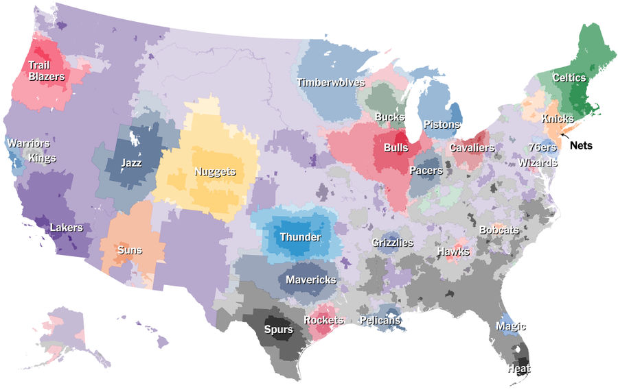
Which NBA Teams Does Your Town Root For?
Like they did for baseball fandoms, The Upshot has put together a map of which zip codes root for which NBA teams, based on Facebook data. It's pretty cool....
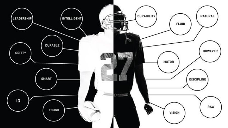
Which Words Are Used To Describe White And Black NFL Prospects?
Do NFL scouts talk about white players and black players differently? Are certain words reserved for white players? Are others used primarily to describe black players?...
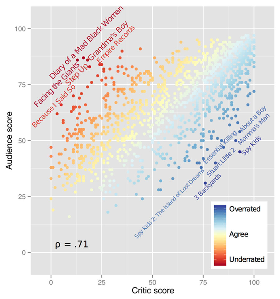
What Are The Most "Overrated" and "Underrated" Movies?
What movies do audiences love, but critics hate? Over on his blog, Ben Moore tackles this question with data scraped from the Rotten Tomatoes API. The chart above shows the critic and audience scores for over 1,200 films; movies that scored high with viewers (and were panned by critics) are in red i...
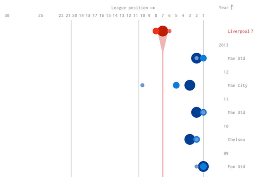
Liverpool Would Have The Biggest Turnaround For A Champion In 29 Years
The race for the Premier League title got a lot closer this Sunday, as Liverpool fell to Chelsea and Manchester City topped Crystal Palace. With one fewer game played, City holds the goal differential tiebreak over Liverpool, and is currently a 4/5 favorite to win it all....
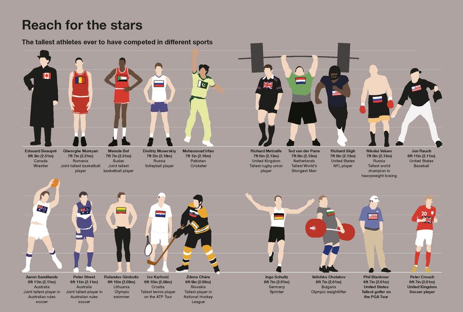
Who Were The Tallest Athletes In History?
As part of the new collection Sportographica, the chart above shows the tallest players in history by sport/league/discipline. While there isn't a regular-sized human in there to give you context, consider this: If you stacked all these professional athletes on top of each others, the pile would str...
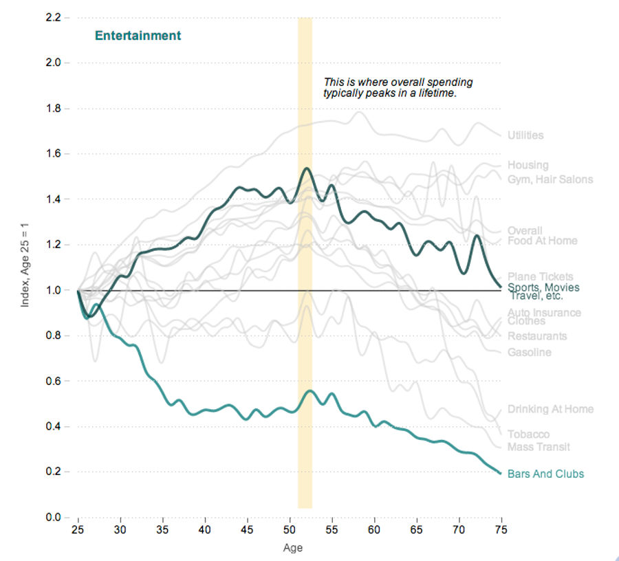
Charts: Your Spending Habits Get Lamer As You Age
In a neat series of charts, NPR Planet Money looks at how spending changes over the course of an average American's lifetime. All the data are indexed against the average spending of 25-year-olds, which is when "Bars And Clubs" spending peaks, and not much else....
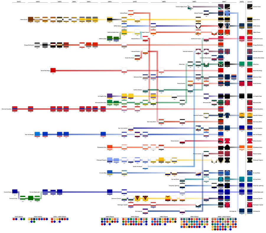
Graphic: The History Of NHL Home Jerseys
Reddit user Tomer139 has created this fantastic chart showing the evolution of the home sweaters of every NHL team. It's massive, so click below or here to see it at full size....
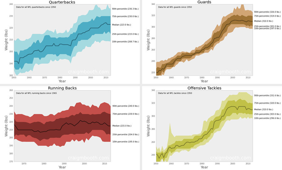
How Have The Weights Of NFL Positions Changed Over Time?
Craig Booth—who previously made those NFL height/weight charts—just released a great series of graphics showing how the median weights of various positions have changed since 1950, based on data from Pro Football Reference. Booth isn't the first to visualize this sort of trend, but the inclusion of ...
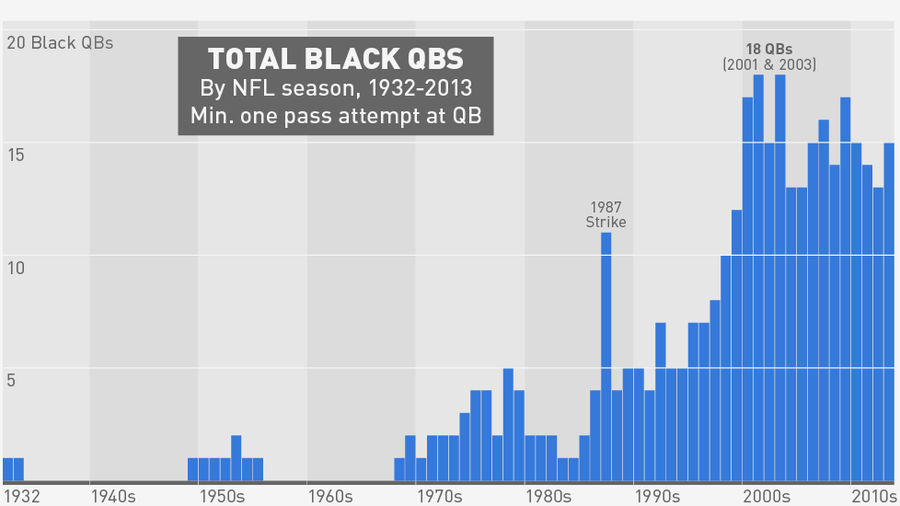
Was 2013 Really The Golden Age Of The Black Quarterback?
Charts excerpted from The Big Book Of Black Quarterbacks, published Feb. 6th....
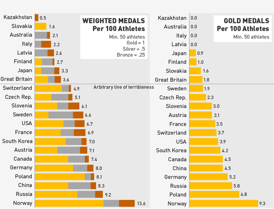
So, Which Countries Had The Worst Olympics?
After the usual agonizing about who's winning the Olympics—Do you use medal count or gold count? What about something weighted? WHAT ABOUT GDP?—Russia made things relatively easy at the end of the day, seemingly establishing itself as the consensus winner....
Which Winter Olympic Sport Has The Biggest Athletes?
Originally published on Mode Analytics....
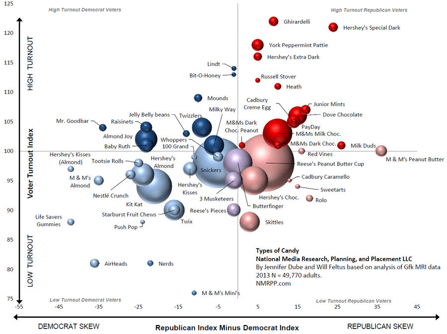
Chart: Does Your Choice Of Candy Reveal Your Politics?
We already covered this for booze, but the research firm NMRPP has released a chart showing the political leanings (x-axis) and voter turnout (y-axis) of various major candy brands. Bubble size is proportional to the population of survey respondents who ate each type of candy....
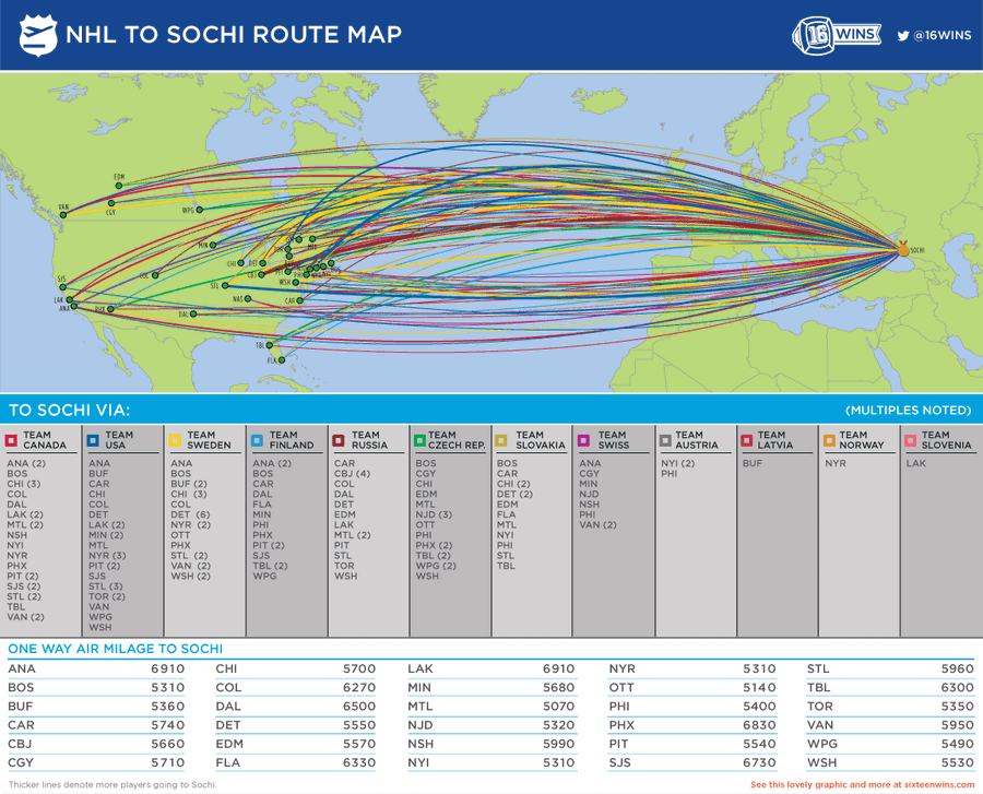
Where Olympic NHLers Are Coming From
16 Wins has put together this animated infographic showing each NHL team's contributions to Olympic rosters. I'd prefer an interactive version that lets me actually stop and look at each nation, but I get the idea....
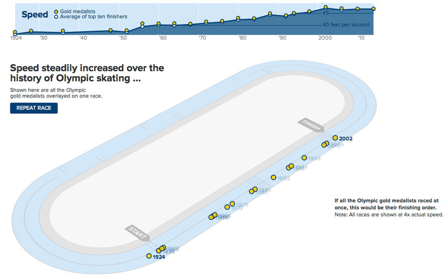
Speed Skaters Have Gotten A Lot Faster Since 1924
Similar to what The New York Times did for the 100m dash in 2012, The Wall Street Journal has developed a great graphic to show just how much faster the top speed skaters have gotten over the years. The still above is part of an animation pitting every male 500m gold medalist against each other; the...
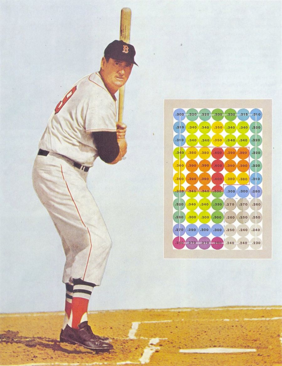
The Beautiful Infographics Of Ted Williams's <em>The Science Of Hitting</em>
In 1971, Ted Williams and John Underwood released The Science of Hitting, the definitive treatment of the subject. Few great athletes have ever been so articulate about the mechanics of their greatness, which is one reason the book holds up even today, well into the analytics era. (A decade ago, Sci...
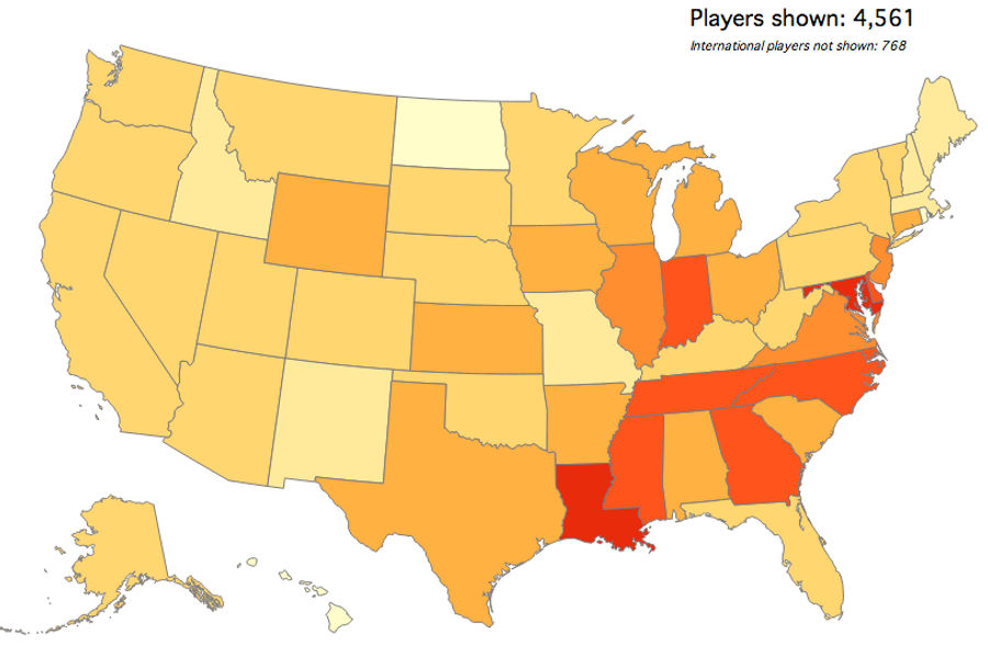
Map: Which States Produce The Most College Basketball Recruits?
Mode Analytics, which previously mapped out where college football players are from, has turned its attention to the much more timely sport of college basketball. The map above shows which states have produced the most current D1 players, relative to their college-age male populations....
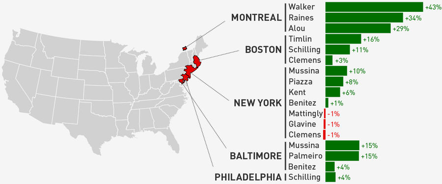
Maps: Which Of Our Readers Were The Biggest Homers In The HOF Vote?
Thanks to your input, the Deadspin HOF vote—revealed earlier this month—was generally agreed to be pretty decent. That might be letting some of you off the hook a little easy, though. We've given MVP voters plenty of crap for their homer votes; who, among our readership, turned out to be the biggest...
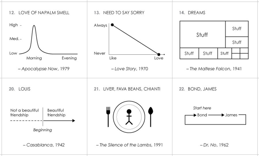
100 Charts For AFI's Top 100 Movie Quotes
Just in time for Oscar announcements, Nathan Yau of Flowing Data has made mini-charts for all of AFI's top 100 movie quotes. While not every quote lends itself perfectly to visualization, there are plenty of gems. Here are some of the best:...
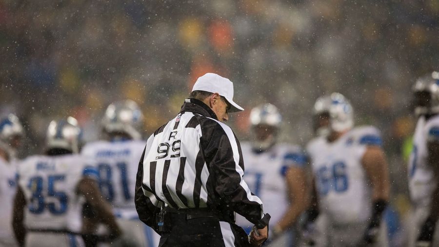
Do Colder NFL Games Have Fewer Penalties?
While watching some insanely frigid football last weekend, one Deadspinner wondered if there were fewer flags in cold NFL games, the result of referees deciding, consciously or not, to speed games up and get the hell off the field. Without scrutinizing hundreds of hours of game tape we can't really ...
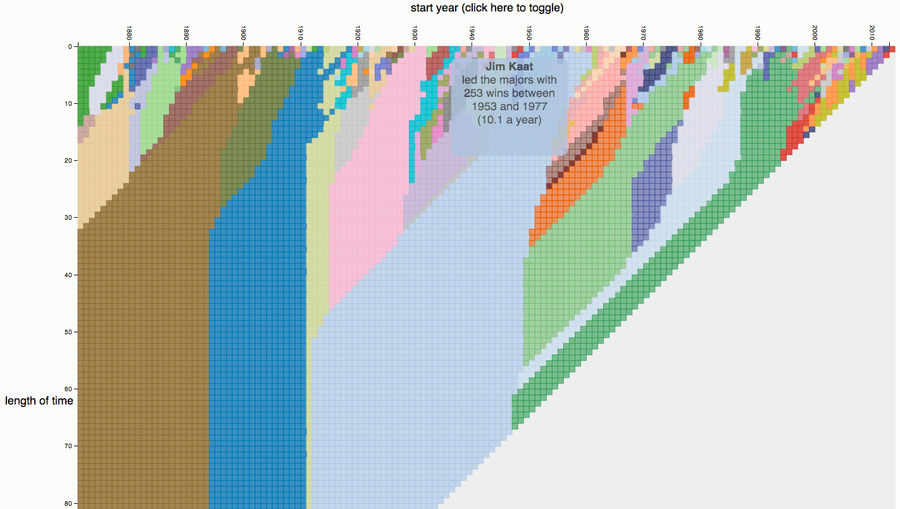
Cherrypick Your Way Through 143 Years Of Baseball Stats
Did you know that Curt Schilling led the league in complete games from 1992-2001? That Tim Raines led the league in hits from 1981-87? That Fred McGriff led the league in home runs from 1987-95? All great stats to argue for your favorite player's HOF admission, made possible by the magic of cherrypi...