
map Page 11 - Sports News, Headlines & Highlights
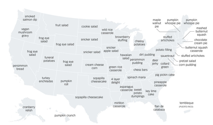
Map: Every State's Most Distinct Thanksgiving Recipe
Consider this your family small talk cheat sheet for this Thanksgiving. The Upshot has a useful new post that presents what it claims are the most distinct recipes in every state, according to some wrangling of Google analytics. ...
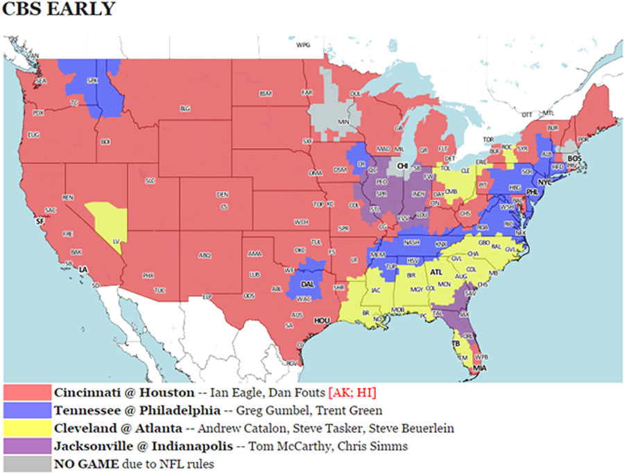
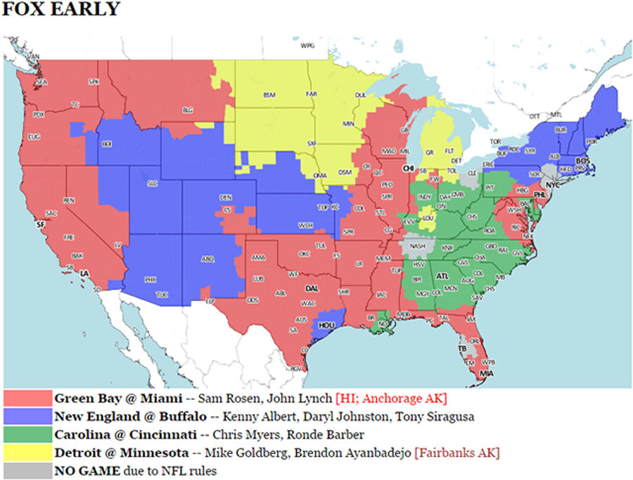
Your NFL Week 12 Viewing Maps
There's a clear main event at 1:00, with the 7-3 Lions traveling to see the 8-2 Patriots. Then 4:00 gives us co-main events with the 6-4 Dolphins at the 7-3 Broncos and the 9-1 Cardinals at the 6-4 Seahawks. This is solid....
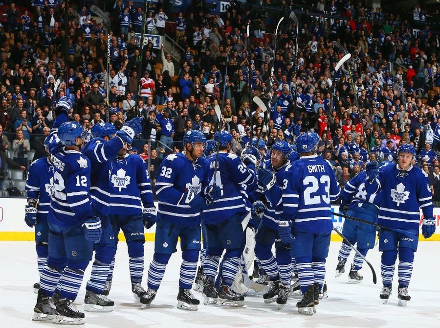
Maple Leafs Return To Saluting Fans, World Returns To Axis
We can put this to rest now, I think. Four days after a brutal loss that had many predicting impending meltdown, and two days after Saluteghazi, the Maple Leafs beat the Red Wings 4-1, and, yes, raised their sticks to the fans. ...

Maple Leafs Fans Finish "Star-Spangled Banner" After Mic Cuts Out
Before the Predators blew out the Maple Leafs Tuesday night, the pregame singer's microphone broke. The Toronto crowd picked up where she left off and finished out "The Star-Spangled Banner" strong. Crowds singing national anthems might rank above instrumental national anthems....
God Help Me, I <em>Do</em> Care About The Maple Leafs' Stupid Salute Controversy
The Maple Leafs—or more specifically, their fans and their media—have a talent. Every controversy seems to immediately skip a stage and go directly to the meta. It's been 12 hours, and it's no longer about whether the Leafs deliberately snubbed their fans by skipping the customary stick salute aft...
Tie Domi Only Wants To Talk About Microsoft In Awkward Radio Interview
Longtime enforcer Tie Domi appeared on TSN radio yesterday afternoon, and wouldn't you know it, it was a good day to have opinions on the Leafs. But Domi didn't want to talk about the Leafs; he just really, really wanted to talk about Microsoft. ...
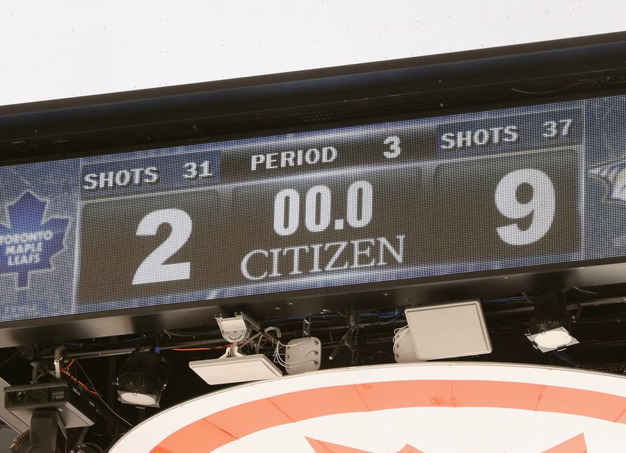
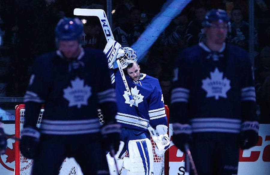
Fan Throws Jersey Onto Ice As Maple Leafs Get Blasted 9-2
The Toronto Maple Leafs got absolutely shellacked at home tonight, giving up five third-period goals to the Predators en route to a 9-2 loss. Leafs fans were so mad that one of them tossed their jersey onto the ice late in the third period: ...
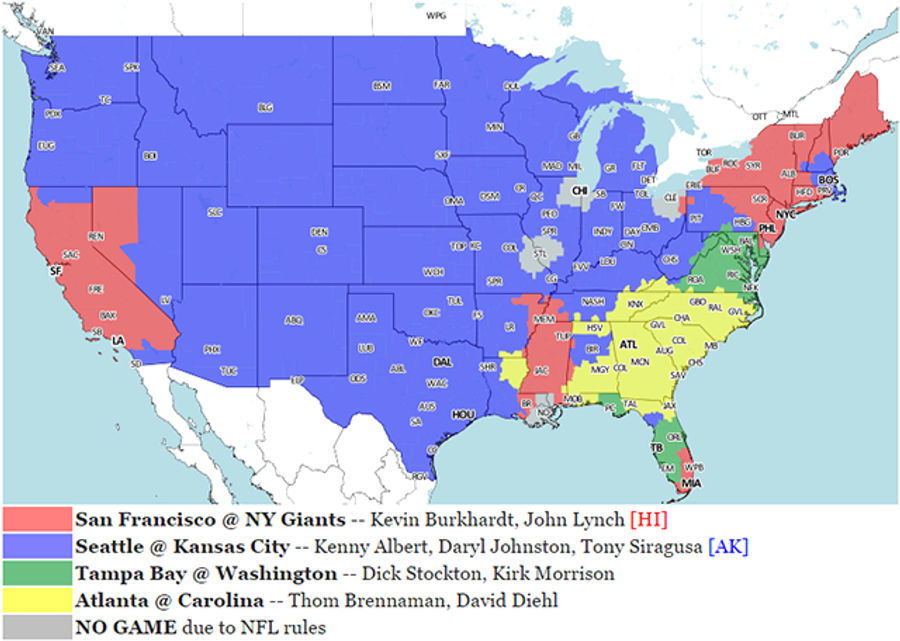
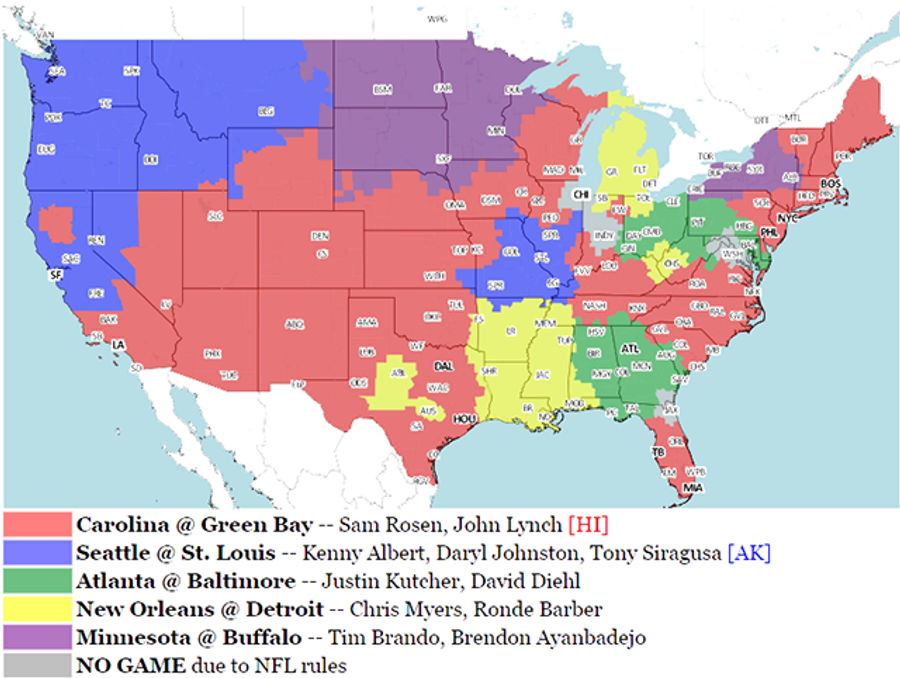
Your NFL Week 11 Viewing Maps
There are four games today between teams that both have a record of 6-3 or better: Seahawks @ Chiefs at 1:00, Lions @ Cardinals at 4:25, Eagles @ Packers at 4:25, Patriots @ Colts in the night game. There's high-stakes football all day long, so pace yourself....
Bruins Go Down 1-0 In First Period; Young Fan Loses All Sense Of Chill
This kid is apparently six years old, and that is an unsettling piece of information given the fact that he sounds like a nine-week-old baby when he gets upset. Anyway, he's mad because he's just watched his beloved Bruins go down 1-0 to the Leafs in the first period. ...
Hockey Fan Fight Starts And Ends With A Flight Down The Stairs
This starts off just like any other fight between fans at a sporting event, with two guys puffing up their chests and talking some shit while the rest of the crowd waits for something to happen. It escalates quickly when a bystander decides to get things moving with a beer to the head, and then it r...
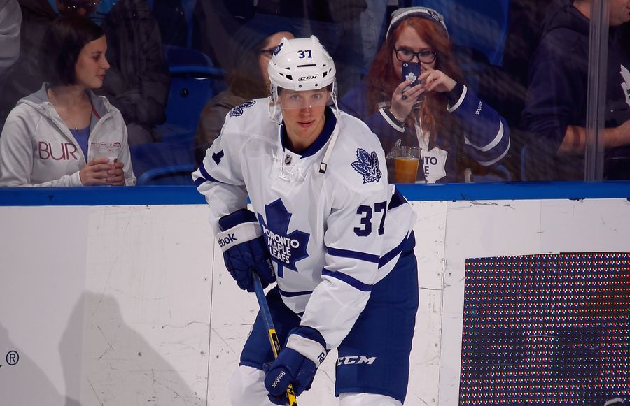
Carter Ashton Suspended 20 Games For PED Use
Maple Leafs forward Carter Ashton has been handed a 20-game suspension, and will forfeit nearly $170,000 in salary, after testing positive for the banned substance clenbuterol. Ashton blamed it on his use of an asthma inhaler:...

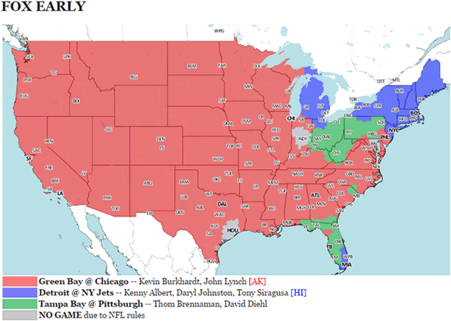
Your NFL Week 8 Viewing Maps
Morning football feels weird, and I don't understand how you West Coasters have adapted to this....
Watch The Emotional Ceremonies Preceding Tonight's NHL Games In Canada
This week's dual tragedies in Ottawa and Montreal have understandably driven both remembrance and national pride in Canada. On the heels of Pittsburgh's display earlier this week, a pre-game ceremony in Ottawa was simulcast to Toronto and Montreal, providing fans in those arenas the opportunity to...
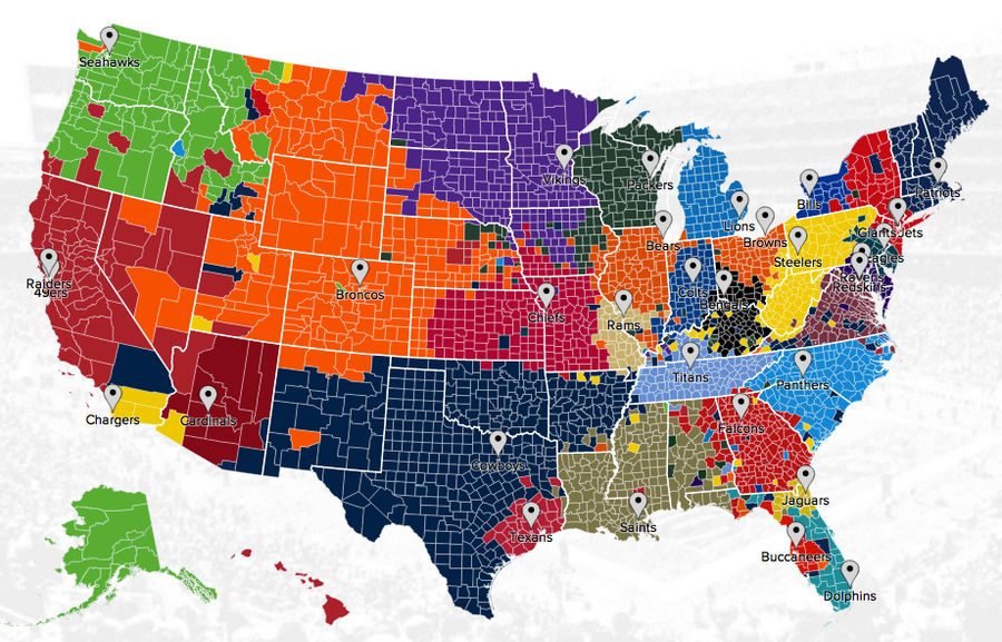
The NFL Fandom Map Of America, According To Twitter
We've seen this based on Facebook likes, but now Twitter's data team has released released its own interactive NFL fandom map: who each county in America roots for, based on the number of users who follow the team's official account....
![Senators, Maple Leafs In "Lockdown" After Ottawa Shootings [Update]](https://images.deadspin.com/tr:w-900/eityudb6baal3lgb5vml.jpg)
Senators, Maple Leafs In "Lockdown" After Ottawa Shootings [Update]
Update: Tonight's game between the Leafs and Senators has been postponed....
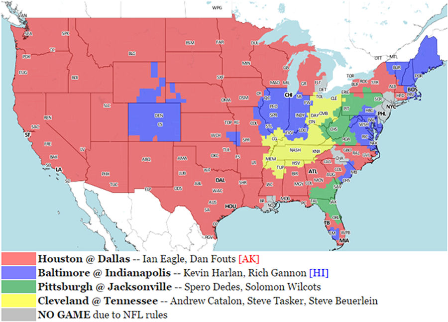
Your NFL Week 7 Viewing Maps
The Week 7 early set gives us the Bengals and the Colts, two of the AFC teams that, at this early stage, look to have legitimate Super Bowl aspirations. The only other early game that features two teams at .500 or better is Panthers at Packers. And later, the Giants are the opponent in what seems li...
Your NFL Week 6 Viewing Maps
Two AFC teams play on Fox today, which isn't something I remember ever seeing before. The Bills and Patriots will fight for divisional supremacy under the watchful gaze of Moose Johnston, because of something called cross-flexing. Why I find this interesting, I couldn't tell you....
Your NFL Week 5 Viewing Maps
There's not a lot that stands out on the NFL's early Sunday afternoon schedule this week, save for maybe the duel between the 3-1 teams from Texas. If you're west of the Mississippi, you're probably getting that one. In the later set, the undefeated Cardinals attempt to announce their presence agai...
Your NFL Week 4 Viewing Maps
The highlight of the 1:00 slate is, I suppose, Steve Smith and the Ravens hosting the Panthers. I don't know if it's that intriguing of a game, but I'm pretty sure I heard on ESPN this week that Steve Smith has promised to disembowel several of his ex-teammates on live television. So I'm looking for...