
visualizations - Sports News, Headlines & Highlights
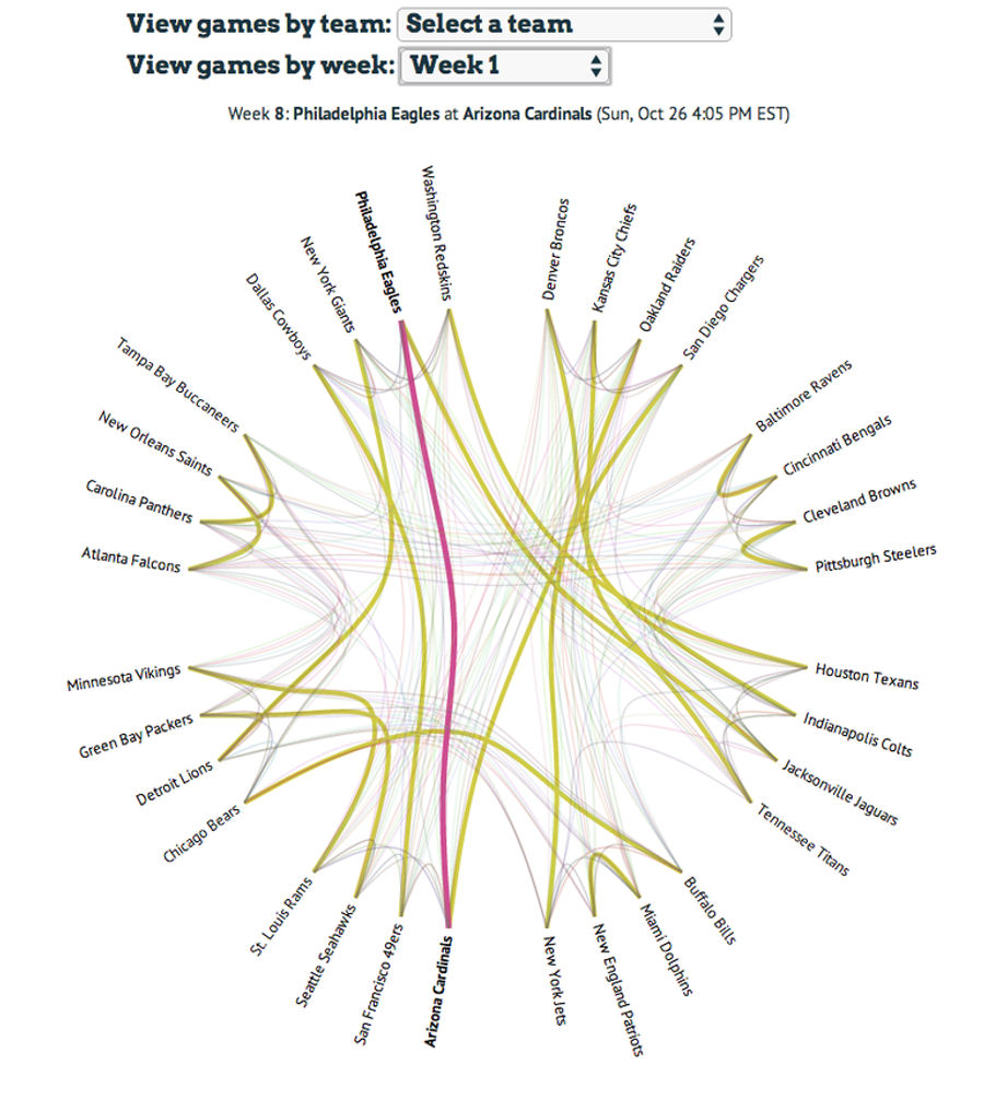
This Year's NFL Schedule, Visualized
Here's a neat little interactive by Chris Polis, showing every game in the NFL season, and how each team connects to the others, by week and by team. ...
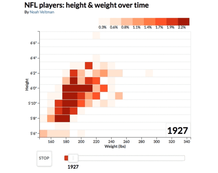
Animation: How NFL Players Have Gotten Bigger (And Fatter), Year By Year
We know that NFL players have gotten bigger, and that it's a relatively recent phenomenon. But this animated tool by Noah Veltman (GIF above) is the coolest way we've seen to watch how it happened over the years. ...
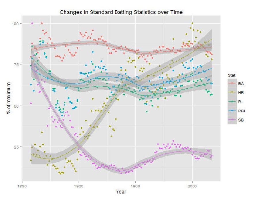
How Baseball Batting Stats Have Changed In Every Era, In One Chart
Baseball loves to talk about itself in reference to specific eras, so it's probably useful to have a way to look at how offense has changed, all in one place. Analyze1.com mapped runs, home runs, RBI, batting average, and stolen bases in Major League Baseball dating back to 1880. ...

Watch Famous World Cup Goals In Gorgeous Painted Animation
Just by its nature, each World Cup is more certain to produce indelible moments than just about any other sporting event we have. Here are a bunch of the best, animated beautifully by Richard Swarbrick....
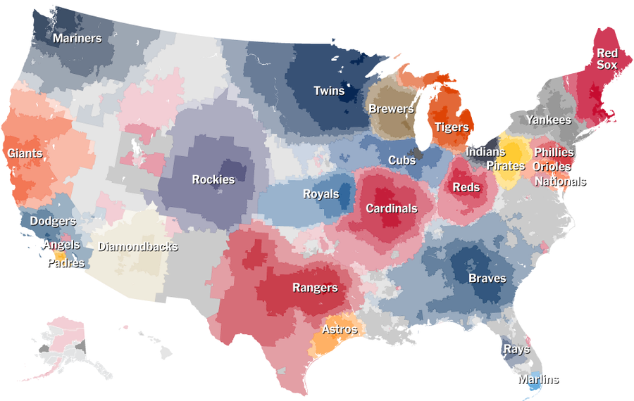
Which MLB Teams Does Your Town Root For? NYT Interactive Has Answers
Last month, when we showed you the most accurate map of MLB fandom, it was the most accurate in that it was based on the most accurate data. In the time since, the New York Times has gotten its hands on that data and made this interactive, which is awesome. ...
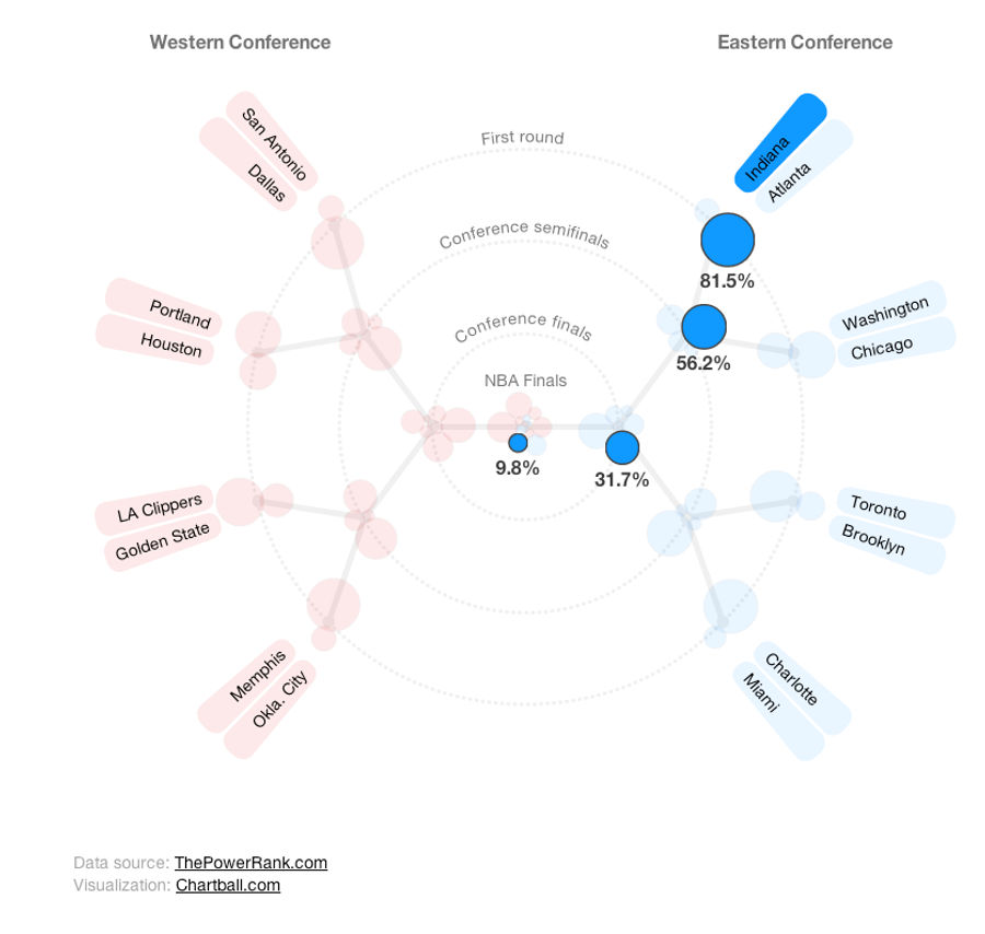
NBA Playoff Interactive Shows Who's Most Likely To Win Every Round
Our friend Ed Feng at The Power Rank, along with Andrew Phillips from Chartball, put together an interactive that shows win probabilities for the NBA playoffs, all the way through to the finals, weighted heavily by adjusted strength of schedule. ...
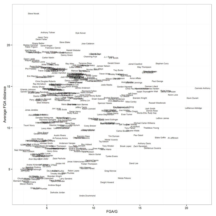
Who Takes The Longest (And Shortest) Shots In The NBA, On Average?
Our friend Ed Kupfer from the Houston Rockets made another fun chart, this time plotting the average distance of field goal attempts (based on play-by-play data) against shots taken (min. 100 FGA). So, who shoots from the deepest?...
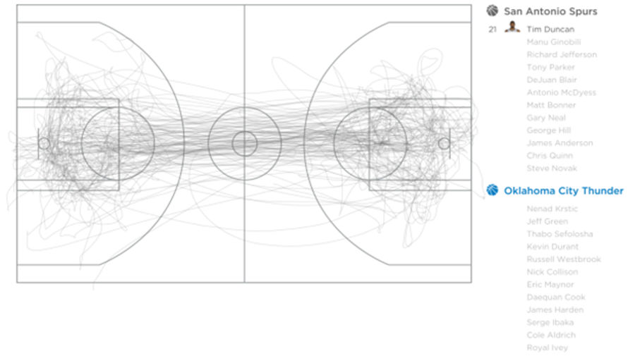
Some Gorgeous Visualizations Of All Movement In An NBA Game
SportVU data is the key to the next wave of useful, incisive analytics the NBA, and also some of the most stupid and pointless. This probably splits the difference. Here's what it would look like if every player on an NBA court had an Etch A Sketch pixel taped to his back. ...
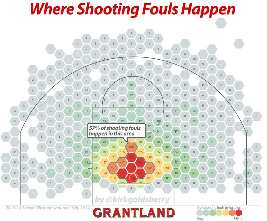
Where Do NBA Shooting Fouls Actually Take Place?
Yesterday, Grantland's Kirk Goldsberry wrote a piece about how James Harden gets fouled like a Super Mario coin brick. But buried in the piece was this fascinating map of every single shooting foul so far in this NBA season, so we thought we'd take a closer look. (Do yourself a favor and click "Expa...
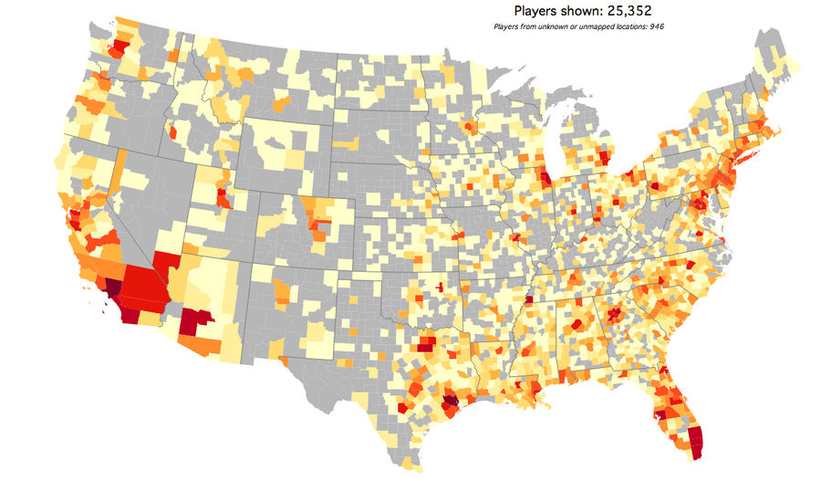
This Map Shows Exactly Where College Football Players Come From
Mode Analytics put together a fun set of interactive maps that show exactly which counties in the U.S. produce the most college football players. Did you know that Mecklenburg County, North Carolina, is a hotbed of punter and kicker recruiting? ...
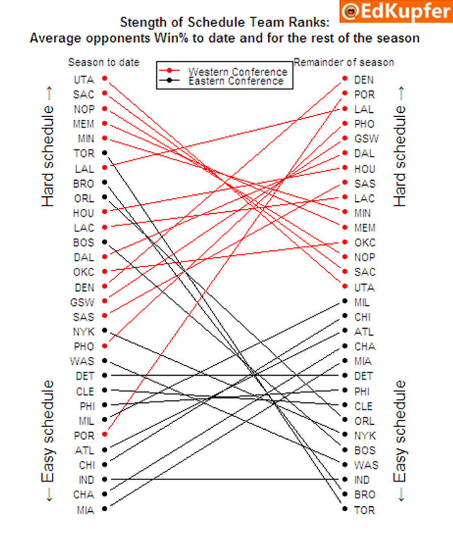
Every NBA Team's Remaining Strength Of Schedule, In One Chart
Ed Kupfer, who's an analyst for the Rockets, which kind of makes him one of the smart guys who does homework for the other smart guys, put together a simple visualization of the strength of schedule teams have faced so far (on the left), and the strength of schedule of their remaining games (on the ...
Infographics: Where Does Your NFL Team's Offense Come From? (Week 14)
There are just four more weeks in the NFL season, so let's take a look in on how the offenses in the league are doing, and which positions have been most productive for them. ...