
The American Athletic Conference Reveals Its Logo

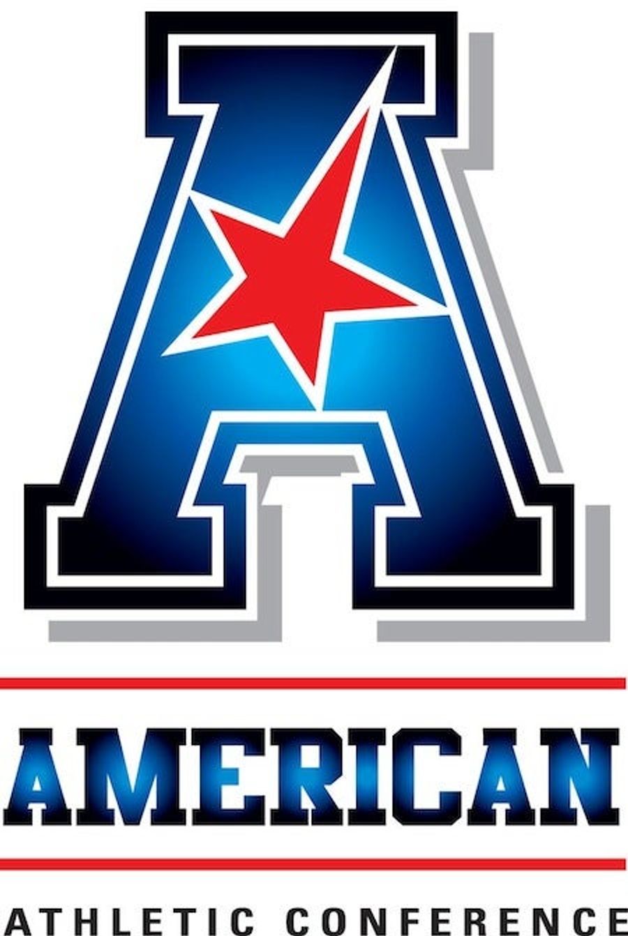
The American Athletic Conference (or "the American," as the cool kids say) unveiled its new logo this morning. The member schools are said to be thrilled, at least after their first choice of logos was turned down.
"It's a bold look," commissioner Mike Aresco said. "Obviously this is a media world we live in, and we wanted to make sure we had the kind of mark that would be distinctive and would make an impact when people saw it. We wanted it to be something people would like and remember, but the notion really was to make it as simple as possible but also strong."
Well, it's got an "A" for American, and a star, like in the American flag, and it's red, white, and blue, also like the American flag. So that's good. But:
The American will officially launch on July 1, but their bare-bones website already makes a bold statement. "Strong. Stable. United. Competitive." Maybe one of those descriptors is accurate, and even that's debatable.
Related


- Best NBA Betting Picks and Predictions for Monday April 6th
- National Championship Bet Pick: Why Michigan Has the Edge Over UConn
- UFC Vegas 115 Betting Picks: Moicano vs. Duncan Headlines April 4th Card
- NBA Betting Picks April 4th: Three Best Bets for Saturday's Slate
- Michigan vs. Arizona Bets: Wolverines Hold Edge in Final Four Showdown
- Best NBA Betting Picks Today: Friday April 3rd Expert Predictions
- MLB Pitcher Props Today: Best Baseball Bets for April 3rd
