
The American Athletic Conference Reveals Its Logo

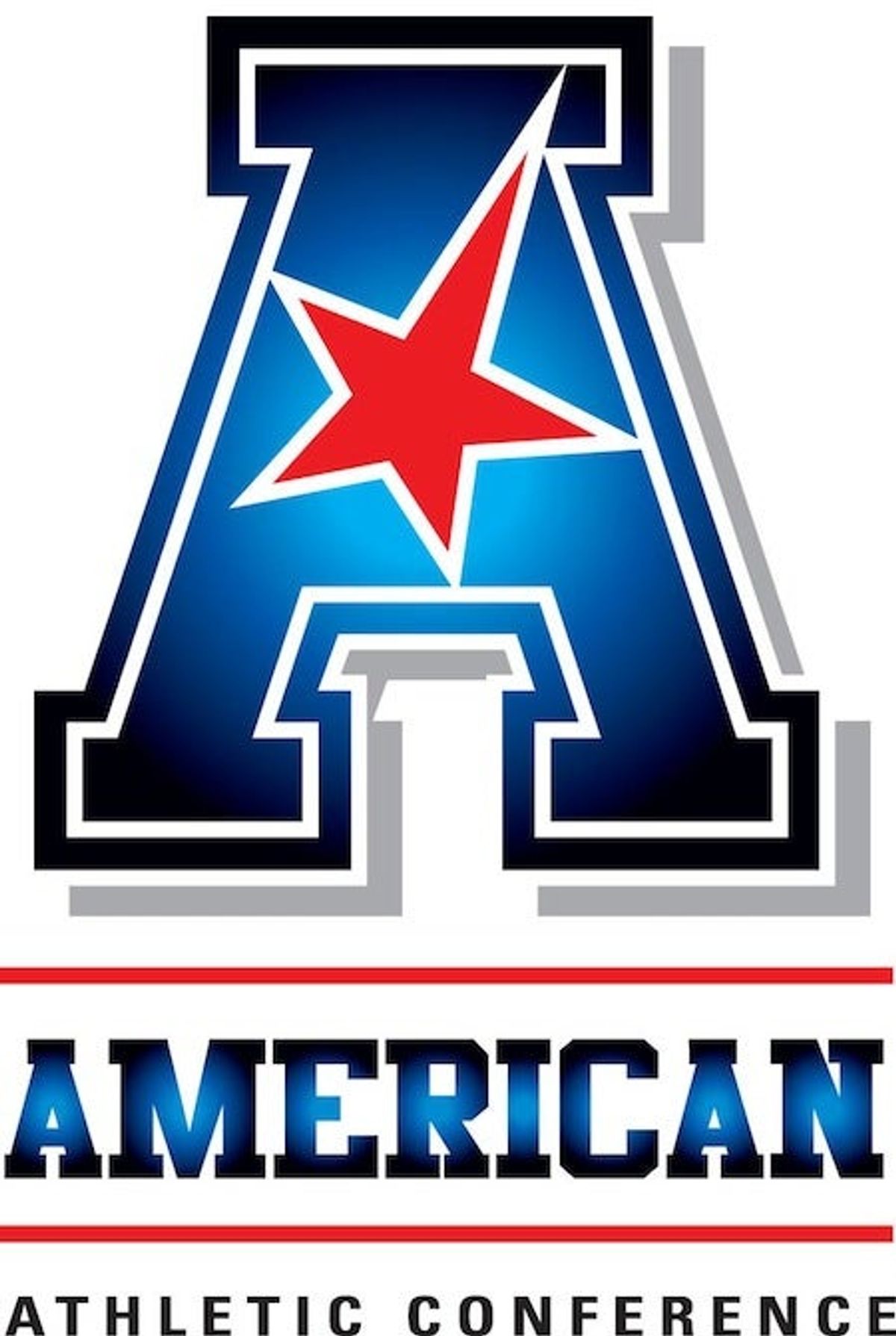
The American Athletic Conference (or "the American," as the cool kids say) unveiled its new logo this morning. The member schools are said to be thrilled, at least after their first choice of logos was turned down.
"It's a bold look," commissioner Mike Aresco said. "Obviously this is a media world we live in, and we wanted to make sure we had the kind of mark that would be distinctive and would make an impact when people saw it. We wanted it to be something people would like and remember, but the notion really was to make it as simple as possible but also strong."
Well, it's got an "A" for American, and a star, like in the American flag, and it's red, white, and blue, also like the American flag. So that's good. But:
The American will officially launch on July 1, but their bare-bones website already makes a bold statement. "Strong. Stable. United. Competitive." Maybe one of those descriptors is accurate, and even that's debatable.
Related

What Prediction Markets Are Telling Us About NFL 2026 MVP

The Sacramento Kings Need to Blow It Up Before It's Too Late


Ben Askren Didn't Win the Match—But He Won the Weekend


- France vs. England Best Bets: Three Picks for the World Cup Third-Place Match
- Dodgers vs. Yankees Friday July 17 Best Betting Picks and Props
- July 17 White Sox vs. Blue Jays Prediction, Odds and Best Bets
- Three MLB Futures Bets to Make After the All-Star Break
- Three Heisman Trophy Sleepers Worth Betting Before the 2026 Season
- England vs. Argentina Best Bets: Three Picks for the World Cup Semifinal
- MLB All-Star Game Best Bets: Picks, Odds and Predictions for AL vs. NL
