
The Maple Leafs Have A New Logo

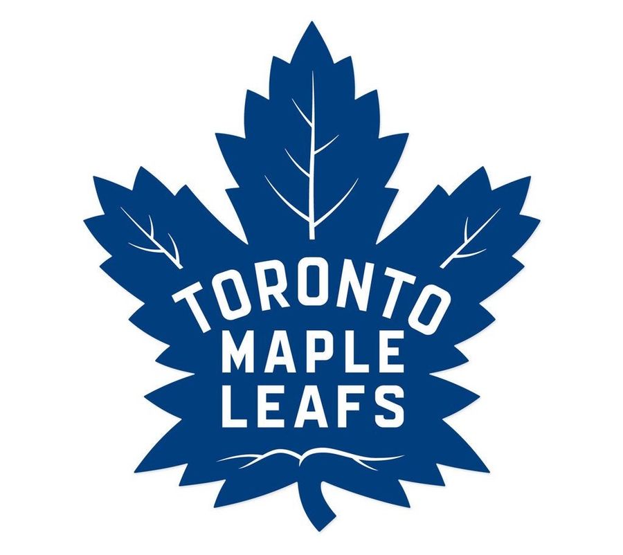
When the present is grim and the future dim, there’s not much choice but to sell the past. That’s exactly what the Maple Leafs are going with their new logo, unveiled last night: in multiple ways it hearkens back to the glory days when the team, you know, won stuff.
It’s still a leaf, but it’s closer in spirit to the more complex leaves the team throughout the Original Six era. Here’s a timeline from Sportslogos.net, which has a comprehensive writeup on the new logo.
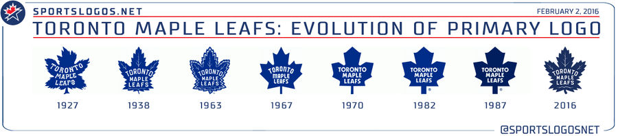
It ends the more simplistic leaf adopted in 1967, following the team’s most recent Stanley Cup. Retro is in (retro is always in), and the new logo is filled with callbacks to the team’s history:
The leaf has 31 points, representing 1931, the year Maple Leaf Gardens opened and the season the franchise won its first Cup as the Maple Leafs.
The leaf has 17 veins, representing 1917, the franchise’s first year of existence.
The 13 veins atop the wordmark represent the 13 Stanley Cups the franchise has won.
Good to know that the Leafs probably won’t have to spring for a redesign anytime soon, then.
Anyway, I like the logo fine. Toronto has some of the best uniforms in hockey, but now fans will be forced to buy new ones. Big win for the Leafs.


- Best NBA Betting Picks and Predictions for Monday April 6th
- National Championship Bet Pick: Why Michigan Has the Edge Over UConn
- UFC Vegas 115 Betting Picks: Moicano vs. Duncan Headlines April 4th Card
- NBA Betting Picks April 4th: Three Best Bets for Saturday's Slate
- Michigan vs. Arizona Bets: Wolverines Hold Edge in Final Four Showdown
- Best NBA Betting Picks Today: Friday April 3rd Expert Predictions
- MLB Pitcher Props Today: Best Baseball Bets for April 3rd
