
graphics Page 4 - Sports News, Headlines & Highlights
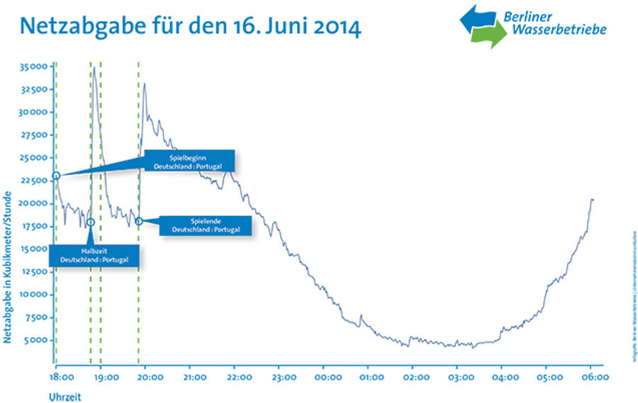
Berlin Residents Synchronized Their Pee Breaks During Germany-Portugal
Germany stomped Portugal 4-0 on Monday, and it seems as if the whole city of Berlin was watching intently. The chart above—from the city's public water utility—shows water usage from 6 p.m. on the day of the game to 6 a.m. In two dramatic spikes, coming at halftime and at the close of the game, wate...

How Many Teams Could Your Favorite World Cup Star Have Played For?
Diego Costa's decision to play for Spain—even though he was born and raised in Brazil—didn't seem to help La Roja all that much on Friday, but FIFA's wisely broad nationality rules still piss off a lot of people. Those rules stipulate that players who haven't collected a senior-level international c...

This Local News Story Is No Laughing Matter
Send stories, photos, and anything else you might have to [email protected]....

Which Hockey Leagues Have The Most Fights?
The NHL has a lot more fights than, say, the NFL, but how does it stack up against other levels of hockey competition? To find out, Simon Garnier of Graph Zoo pulled data from the (hilariously '90s) site dropyourgloves.com and put together a neat graphic on "fights per game" across almost 100 active...
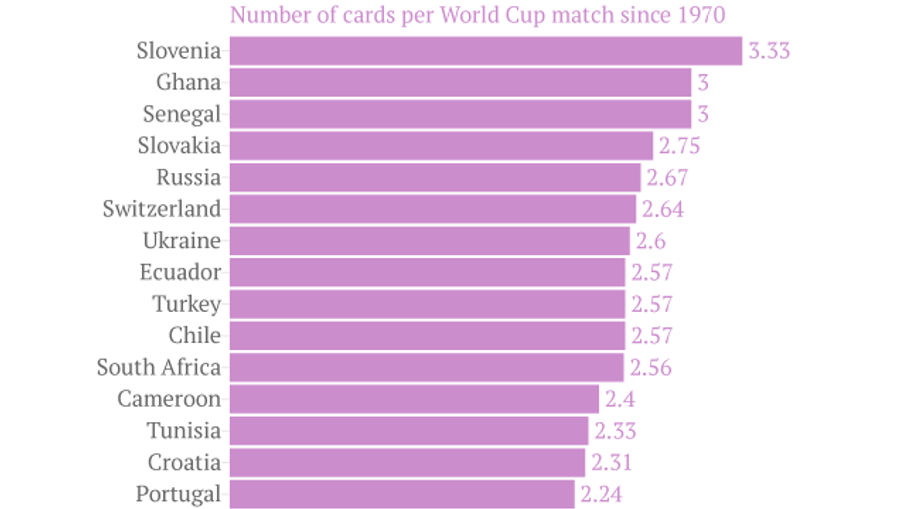
Which Countries Get Carded The Most At The World Cup?
Quartz has crunched the numbers on World Cup penalties, counting all the yellow and red cards for every squad back to 1970. Slovenia comes in number one, racking up 20 cards in their six World Cup games (3.33 per game). Peru was the least penalized, with nine cards in 13 games (0.69 per game)....
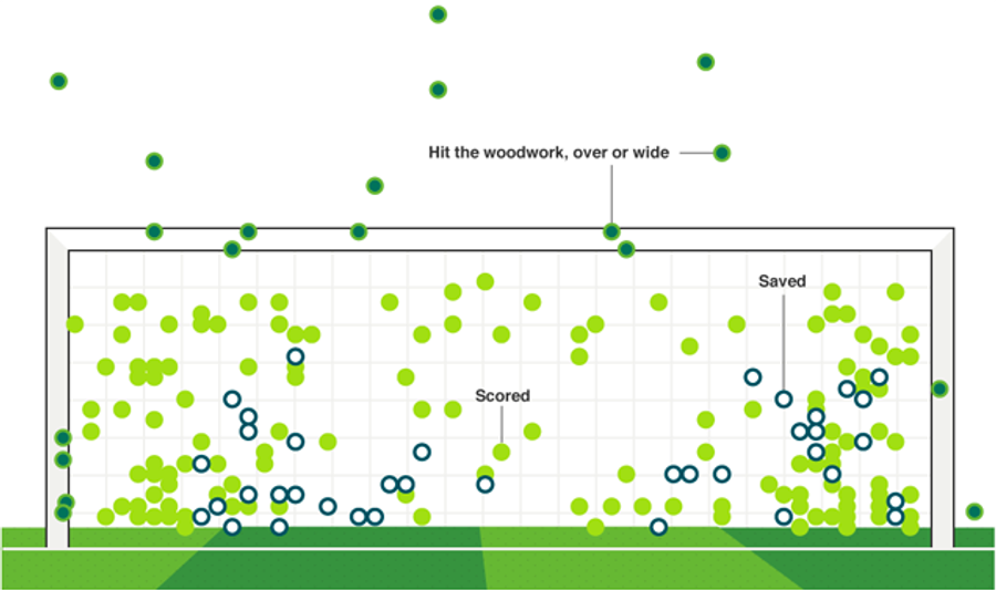
All 204 World Cup Shootout Attempts, In One Chart
With the tournament starting next week, the BBC has put together a neat little guide on "what makes the perfect World Cup shootout penalty." The graphic above—showing the location and result of all 204 World Cup shootout attempts—is just one of several neat visuals; go check them all out....
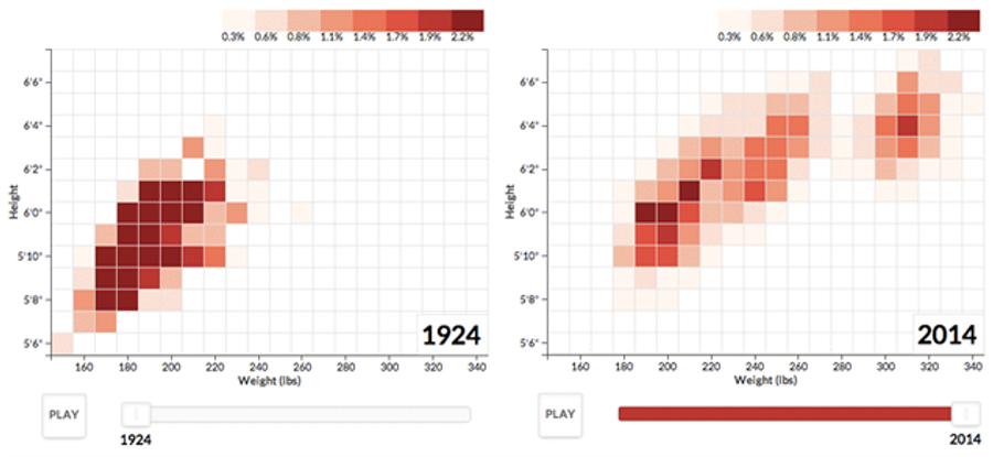
Watch Football Players Get Taller And Heavier Over 90 Years Of The NFL
NFL height/weight data has been visualized before, but a new animation by WYNC's Noah Veltman may be the snappiest version yet. Over on his site you can watch the size of NFL players steadily expand through the early '70s, stagnate, and then spike again—mostly in terms of weight—in the late '80s....

Screencap Classix: You Are Not The Father
Send stories, photos, and anything else you might have to [email protected]....
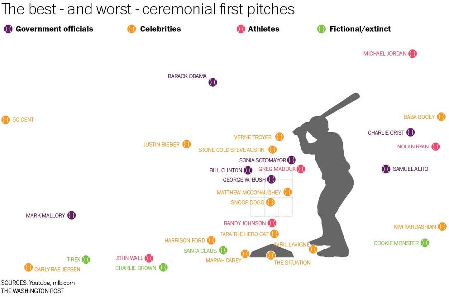
How Did 50 Cent's Attempt Compare With Other Famous First Pitches?
Was 50 Cent's terrible first pitch the worst of all time? To find out, the Washington Post Wonkblog went to the tape on 30 notable first pitches, and plotted their location on the chart above....

Have Spelling Bee "Winning Words" Always Been So Obscure?
Arvind Mahankali won the 2013 National Spelling Bee on "knaidel," a type of dumpling. The winning word the year prior was "guetapens," before that "cymotrichous," and before that "stromuhr." Have bee-winning words always been this insane, or is this a recent development? ...

Which Sports Network Wastes The Most Space With Its Scores Ticker?
When ESPN introduced the "BottomLine" as an experiment on its new ESPN2 channel nearly 20 years ago, few expected the feature to become as ubiquitous in sports broadcasting as it has. Today, nearly every cable sports net has its own version of the scores ticker, and in an industry that clings to con...

No, Really? You Think So?
Send stories, photos, and anything else you might have to [email protected]....

Congratulations To Dan Patrick, GOP Nominee For Lieutenant Governor
Send stories, photos, and anything else you might have to [email protected]....
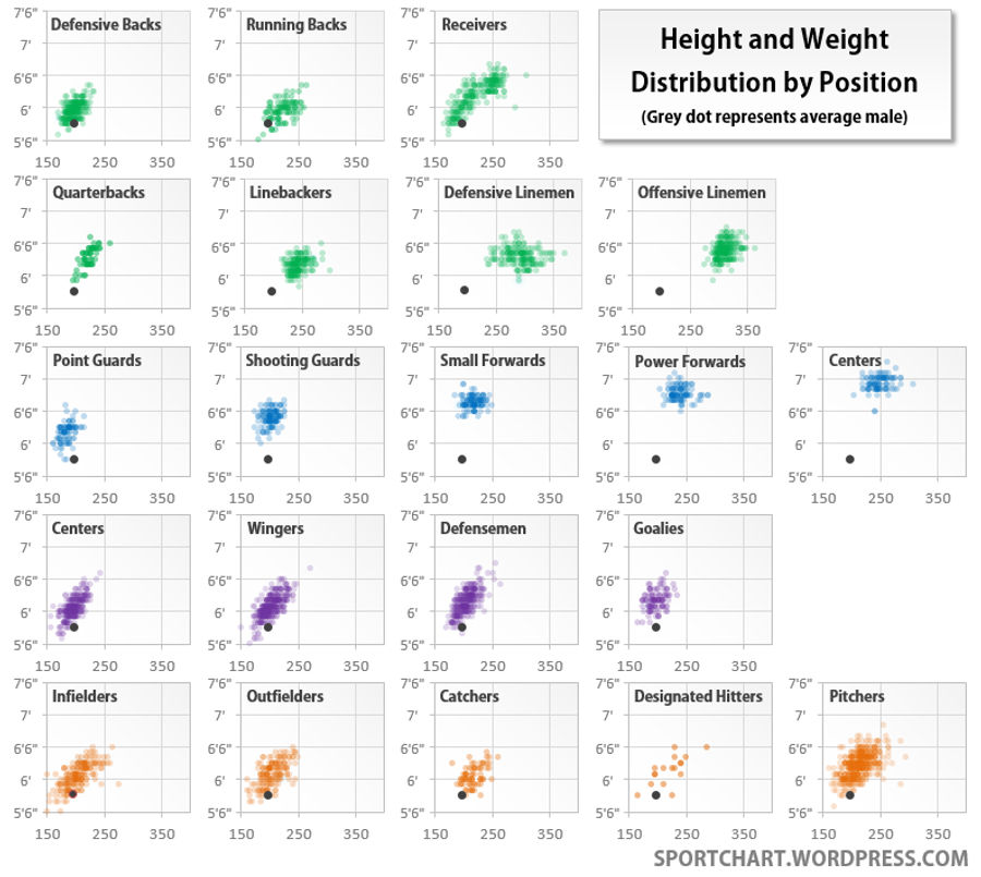
Heights And Weights Of Athletes, By Position, In The "Big Four" Sports
Last fall, Craig Booth put together an excellent series of charts on the heights and weights of current NFL players, by position. Now Sportchart—who created that NHL map from a few weeks ago—has taken the analysis a step further, comparing the height and weight distributions of major positions acros...
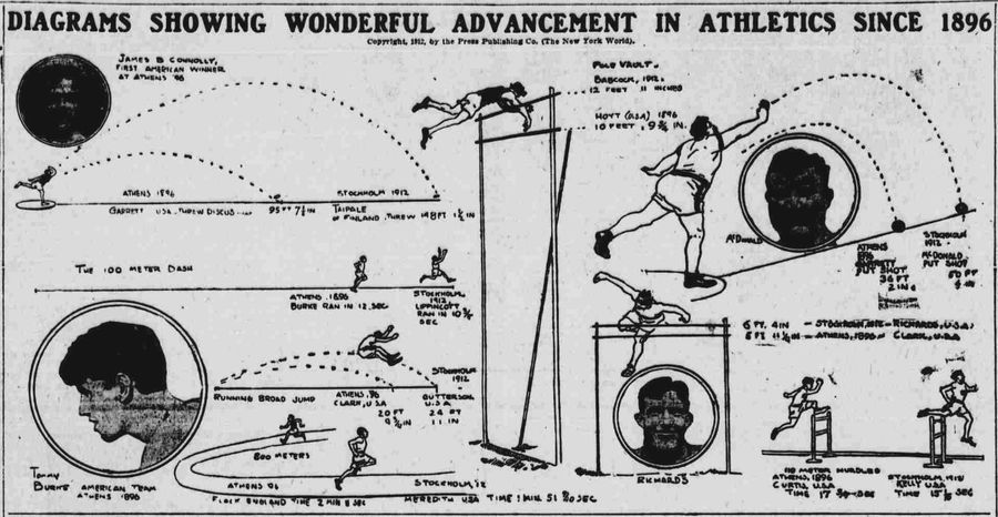
Graphic: Smug 1913 Looks Back On The Crappy Athletes Of The 1890s
One of the many joys of the Olympics is the opportunity they give us to point and laugh at the slower, lower, and weaker athletes of yesteryear. As it turns out, this exercise in smugness is nearly as old as the games themselves. The diagrams above—from a 1913 edition of the Evening World—showcase s...
Hey, The Bills Won A Game!
Send stories, photos, and anything else you might have to [email protected]....

The Time Travel Of <em>Bill And Ted's Excellent Adventure</em>, Visualized
Over on FlipFlopFlyin', Craig Robinson has put together a graphic summarizing all the time travel in Bill and Ted's Excellent Adventure. The film leaves some of the exact dates open to interpretation—did they hang out with Genghis Khan in 1209 or 1269?—but these details are well handled here, and we...
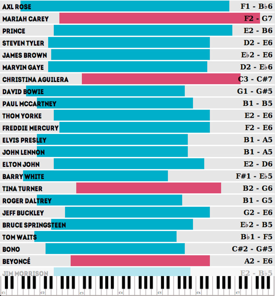
Which Famous Singers Have The Widest Vocal Ranges?
Concerthotels.com has put together a neat interactive showcasing the (in-studio) vocal ranges of over 7o famous figures. The top of the list is above. Axl Rose is your surprising victor, but the high notes are the crowd-pleasers, and here, Mariah Carey—with her insane G7—stands alone....
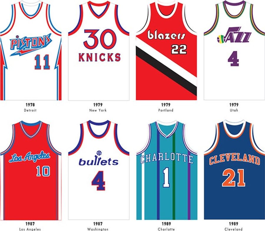
165 Sweet Basketball Jerseys On One Gorgeous Poster
With the basketball season winding down, Pop Chart Lab has put together a great new poster showcasing 165 notable jersey designs, from the 1921 New York Celtics through the "Latin Night" alternates of the 2014 Suns. Most of the offerings come from the NBA, but there's a smattering of Globetrotter, A...
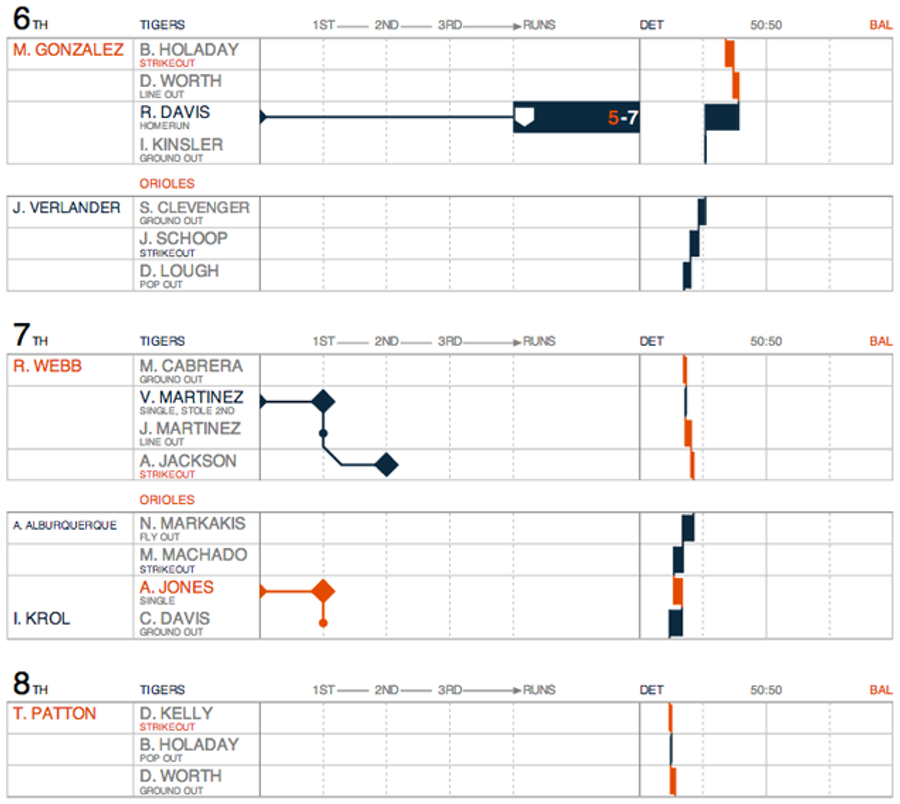
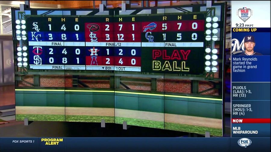
The Prettiest MLB Box Scores You Can Find Online Are Now Updated Live
You might remember Statlas's baseball graphics from the end of last season, which aimed to provide a more contextual, visually-appealing update to traditional MLB box scores....