Did The Raptors Screw Up The Launch Of Their New Logo?

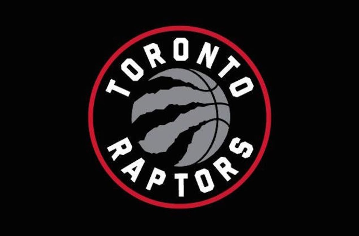
Everything was odd about the Raptors' unveiling of their new logo, which arrived without warning or hype, and was revealed on Friday afternoon, to be swiftly forgotten with the weekend. But the weirdest part is that it's nearly Christmas, and you can't buy this new Raptors gear anywhere.
"Why on earth would you do that? Not to have the merchandise available is just completely amateur," said [Alan] Middleton, a marketing professor at York University's Schulich School of Business.
"[Apparel sales] are hugely important. In some cases, it's up to the level of the TV revenues," said Middleton, who had harsh words to describe the seemingly-haphazard launch of the new logo.
"Mickey Mouse. Really bad. It's terrible," Middleton said of the launch.
The , all of whom have functional criticisms of the logo and its launch that go beyond the obvious "if you claw a basketball it will deflate." (Though Uni Watch's Paul Lukas makes precisely that point.) For example—the logo's odd "leak."
A color version of the logo was posted to the team's Facebook page that morning, then quickly taken down to be replaced with a black-and-white version. Then the team released a new ad featuring a glimpse of a different black-and-white version. Finally, the team announced that there would not actually be a black-and-white logo— only the primary red, black and silver, and the secondary gold and black.
"The fans made the connection to Brooklyn (because of the black and white version), and they won't let it go. The Raptors botched this launch," said [ SportsLogos.net's Chris] Creamer, who said he was underwhelmed at the redesigned logo when he saw it.
It wasn't just the fans that saw the Raptors' monochrome basketball as derivative.
(Not that you can compare the buildup for an out-of-nowhere redesign with the heavily hyped rebranding of an entire franchise, but the Nets did their soft launch much better—it felt like an actual, inadvertent leak.)
Back to the merchandising. This all moved very quickly, with the Raptors' ownership only receiving the American trademark four days before the reveal. And there are hurdles to jump with supplies and licensers and stores. But, you're really going to get people psyched up over a new look the week before Christmas, and then tell them they can't actually buy it until next fall? We know gear exists—the Raptors have been giving it out in Twitter contests.
Then there's the logo itself. Fans were generally "meh" on it. Even Drake, who had been announced as "inspiring" the Raptors' rebranding, appeared to distance himself from it:
The fact is, this isn't a big enough change. To escape from the 1990s, you need to do more than go minimalist, or rejigger the color scheme (though losing the purple is welcome). You have to shed the era-specific stigma of the name "Raptors." And if you don't want to change names—it's expensive—at least brand yourselves as birds of prey instead of remaining 1993's most popular dinosaur.
Oh well. It could have been worse. These are reportedly logo concepts MLSE floated before settling on the clawed basketball:
Guardians vs. Rays Prediction: Picks, Odds for ALCS Game 1


Brendan Allen Has Earned the Right to Fight for UFC Gold
Bills vs. Rams Odds, Prediction and Best Bet for MNF
Three Longshot NFL Futures Worth Betting in Week 5
- White Sox vs. Guardians ALDS Game 5 Betting Pick
- UFC Vegas 122 Betting Odds: The Biggest Line Moves Before Allen vs. Duncan
- UFC Vegas 122 Picks and Predictions: Three Bets for Allen vs. Duncan
- College Football Week 6 Bets: Three Picks for Saturday’s Biggest Games
- UFC Fight Night Underdog Pick: Why Kai Kamaka III Is Worth a Bet
- WNBA Playoff Picks: Best Bets for Liberty-Dream and Aces-Valkyries
- Friday College Football Best Bets: Iowa-Washington and BYU-Iowa State