
maps Page 2 - Sports News, Headlines & Highlights
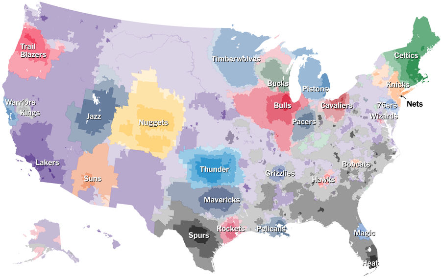
Which NBA Teams Does Your Town Root For?
Like they did for baseball fandoms, The Upshot has put together a map of which zip codes root for which NBA teams, based on Facebook data. It's pretty cool....
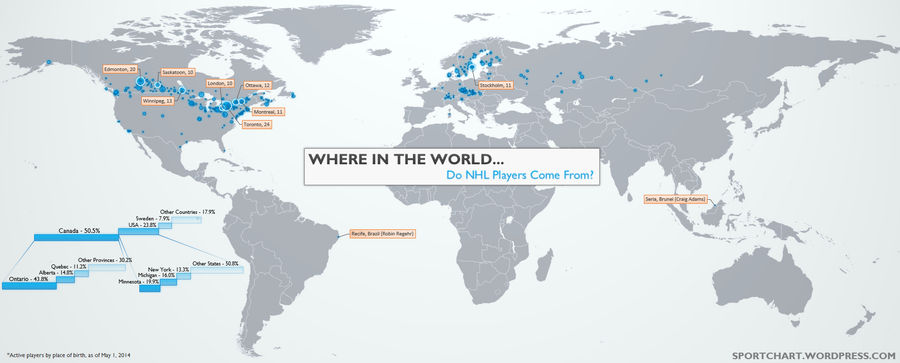
Where Do NHL Players Come From?
Sportchart has put together a neat series of maps on the birthplaces of active NHL, NBA, and MLB players. For most graphics like these the players are divvied up by country of origin, but—as you can see from the NHL dots above—this misses a lot of the nuance in the data. Specifically, U.S. players a...
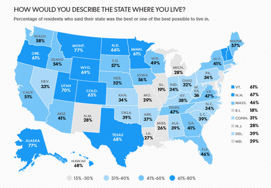
Which States Hate Themselves The Most?
A new Gallup poll, covered in USA Today, poses a goofy but fascinating question: Do you consider your home state to be the best, or one of the best, to live in?...
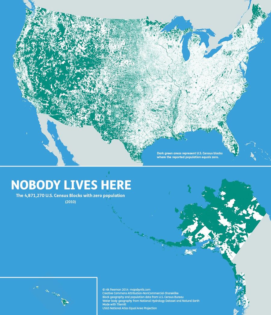
"Nobody Lives Here": A Beautiful Map Of Uninhabited America
The map above, by Nik Freeman of Mapsbynik, shows the 4.9 million census blocks in the U.S. (out of 11.1 million in total) with a recorded population of zero. It's a pretty gorgeous creation, and it pairs nicely with an older favorite of mine, from the US GSA:...

Facebook Fandom Map Shows Who We're Rooting For In The NHL Playoffs
Just in time for the postseason, Facebook has put together this map showing which of the remaining 16 NHL teams are favored in each American state and Canadian province and territory. ...
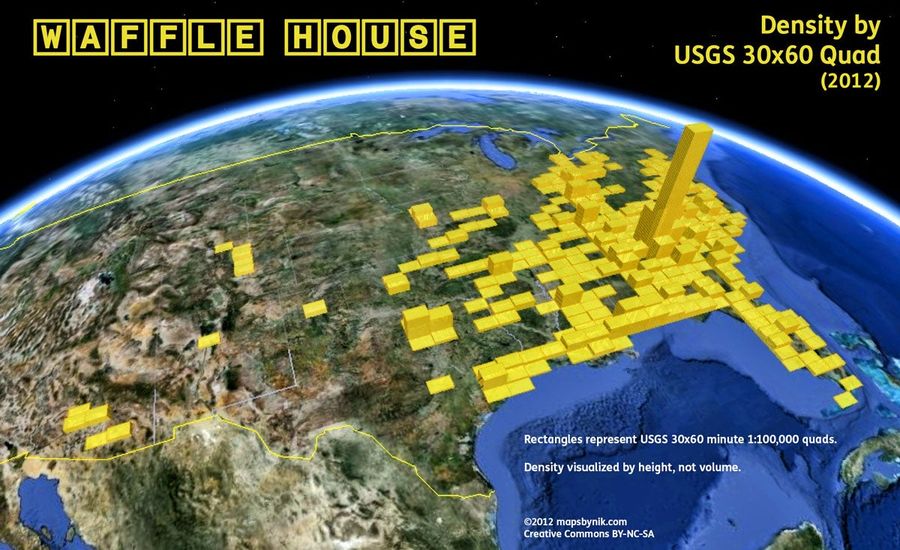
Map: Atlanta Has Too Many Waffle Houses
In the mood for extraordinarily cheap, generally tasty breakfast food? The map above—by mapsbynik—shows the density of Waffle Houses across the U.S. circa 2012, with the height of each bar representing the number of locations in each USGS 30x60 quadrangle.* ...
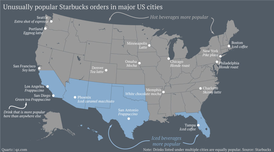
What Is Your City's Most Distinctive Starbucks Order?
Over on Quartz, Roberto A. Ferdman and David Yanofsky have mapped out a great dataset from Starbucks (above), showing which sorts of drinks are ordered in different parts of the country....
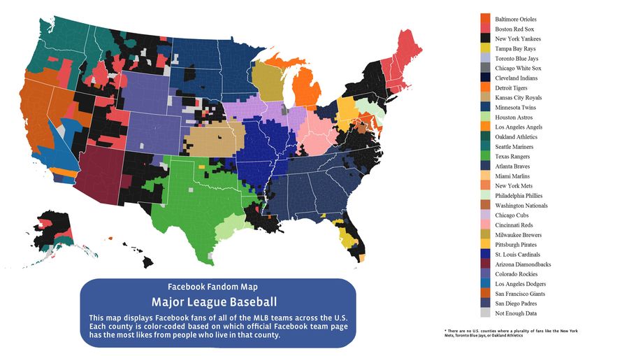
Facebook Data Provide The Most Accurate MLB Fandom Map Ever Created
Just in time for Opening Day, the Facebook data team has released a map showing which MLB teams have the most Facebook fans, by county....
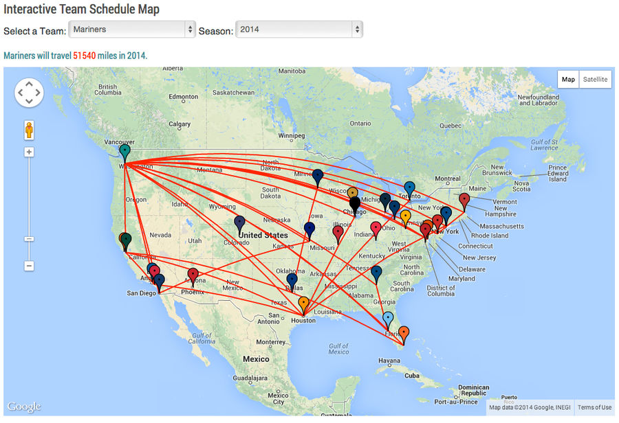
Mariners Will Travel 51,540 Miles In 2014, Circle Earth Twice
Over at Baseball Savant, Daren Willman has put together a neat interactive chart that lets you explore how far each team will travel on the road in 2014. The Mariners—who are around 700 miles away from any other baseball team—will travel the farthest total distance at 51,540 miles. That's more than ...
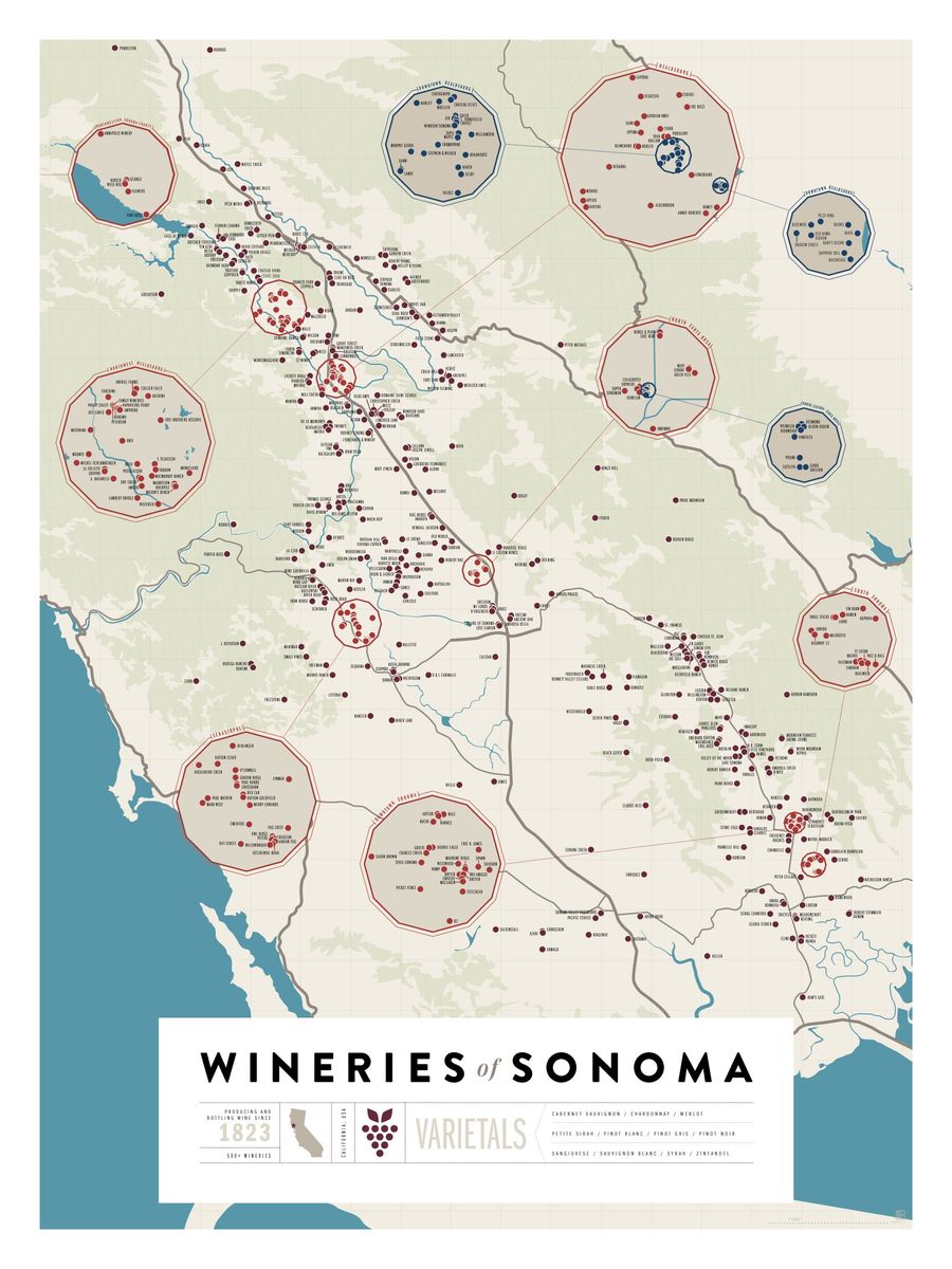
Over 1,200 California Wineries On Two Beautiful Maps
Following up their poster of 2,500+ American breweries, Pop Chart Lab has put together two lovely maps featuring 1,200+ California wineries. If you're real hardcore, you can go compare them to some soil maps and impress people with your intimate knowledge of terroir. If you're less hardcore, take a ...
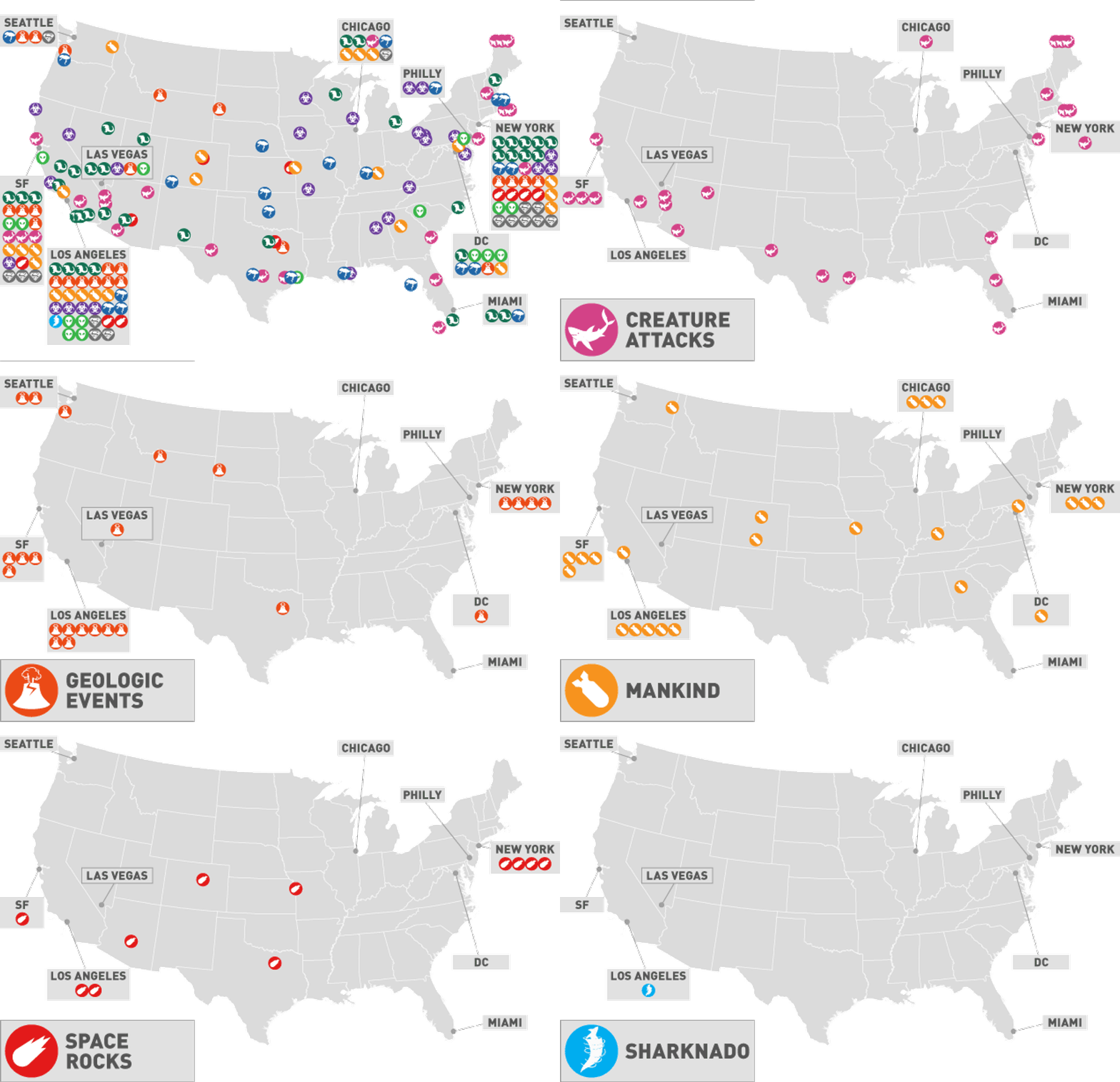
Map: How Hollywood Has Destroyed America
How many times have you seen New York City destroyed onscreen? Los Angeles? Kansas? For nearly as long as there have been movies, there have been disaster movies. The map above shows 189+ such cinematic attacks—using a very broad definition of the "disaster" genre—that have afflicted various parts o...
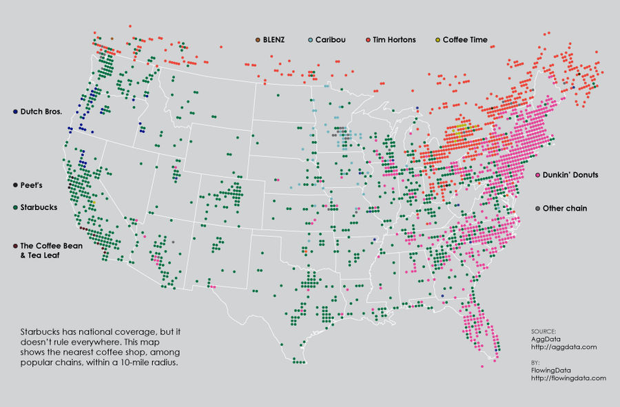
Map: What's The Nearest Coffee Chain?
Last fall, Nathan Yau took an interesting look at which pizza joints dominated which parts of the country. But what about coffee chains?...
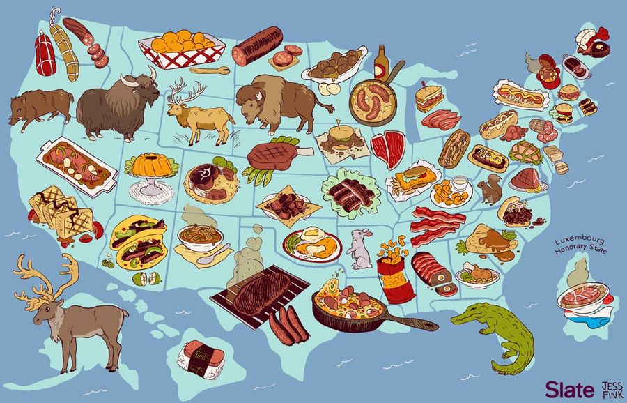
Map: The United States Of America, By Meat
This is fun. L.V. Anderson and Jess Fink of Slate started with a simple observation—Americans consume more meat per person than any other nation on earth (except Luxembourg, those gluttons), yet most of our official state foods are not meat—and have created a map that assigns a unique meat or meat-...
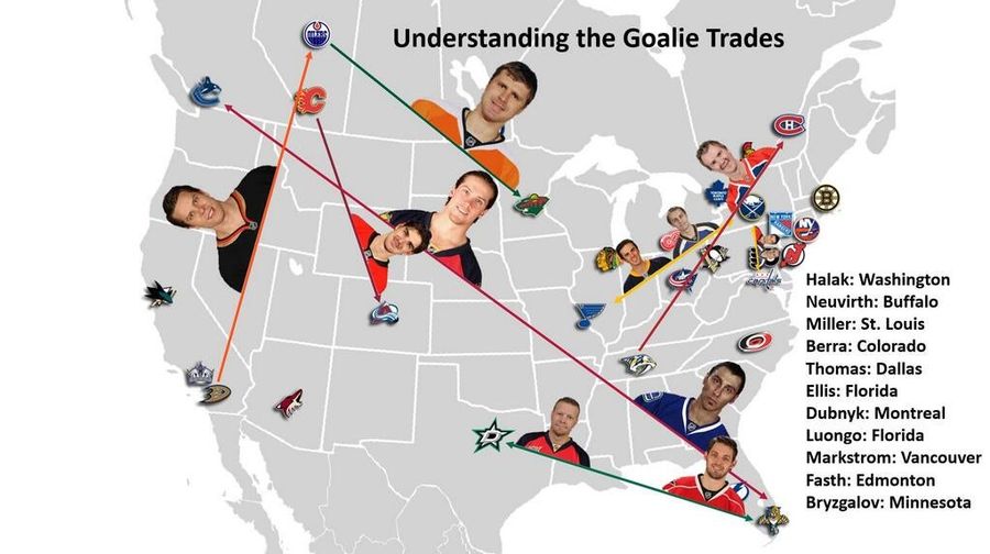
Where Did The Goalies Go?
Andrew Lickenbrock has created this handy-dandy map to show movement in the days leading up to an especially goalie-heavy trade deadline. Eleven netminders were dealt—one of them, Jaroslav Halak, moved twice—and there were four separate goalie-for-goalie trades. A crazy few days for the NHL's weirdo...
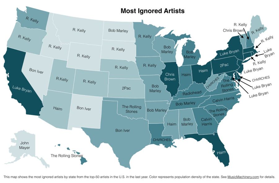
A Map Of Each State's Most-Ignored Musical Artist
Whereas music blogger Paul Lamere's "most distinctive" map that one showed which bands and singers were disproportionately popular in certain states when compared to national numbers, this is the exact opposite. ...
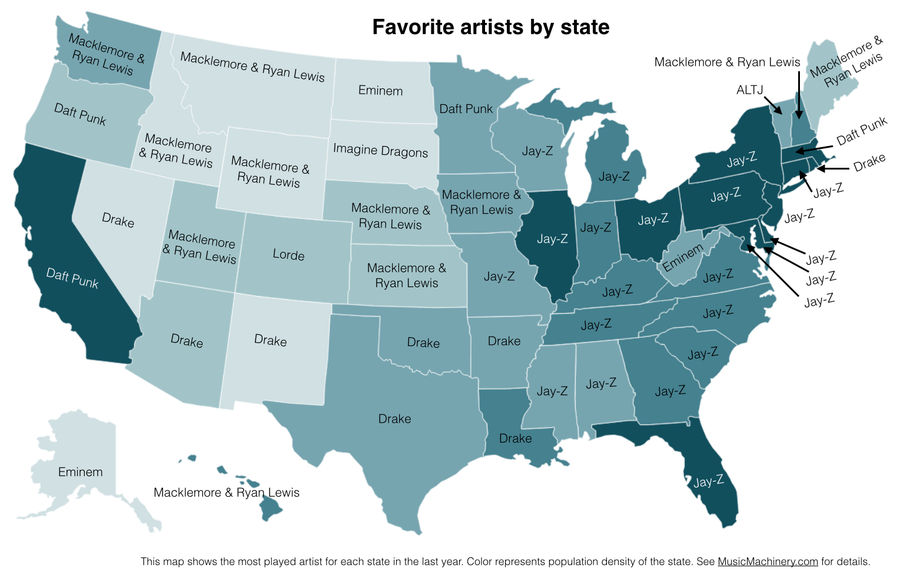
Here Is An <em>Actual</em> Map Of Each State's Favorite Musical Artist
A lot of folks were confused by the map of the most distinctive bands and singers by state. (Not you, though, because you know how to read.) So here's another one, which actually shows the most-streamed artist in each state over the last year....
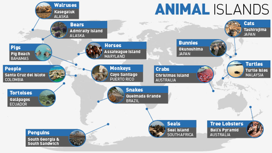
Beyond Bunnies: 14 Other Islands Packed With Your Favorite Animals
If you've spent time on the internet, you've probably heard of Snake Island, Rabbit Island, and Cat Island, all great examples of how the size and isolation of islands can occasionally cause some wacky/horrifying ecosystems to develop. (It helps if said island was home to a secret chemical weapons f...
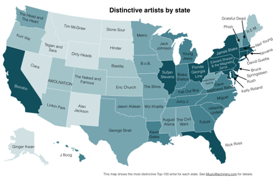
Who's Your State's Distinctive Musical Artist?
Over on his blog Music Machinery, Paul Lamere has taken an interesting look at the geography of American musical tastes, based on zip code data from a quarter million U.S. music listeners who use a variety of streaming services (online music listeners might not be a perfectly representative sample, ...
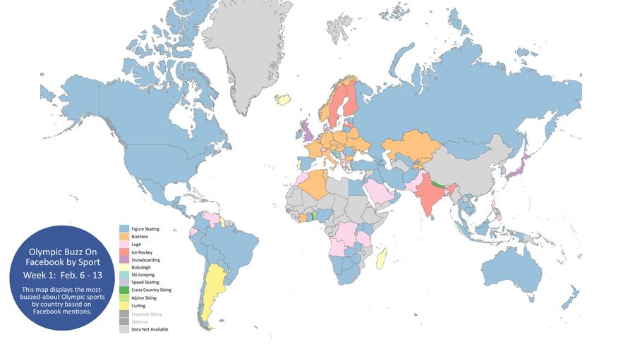
What Olympic Sport Is Your Country Most Excited About?
The data people over at Facebook have put together the map above—based on Facebook mentions—showing which Olympic sports different countries are talking about the most. Data are through the 13th; click here for a much larger version. There are tons of interesting tidbits in here, with usual caveats ...

Beautiful Maps Reveal Where People Run In 22 Major Cities
Over on FlowingData, Nathan Yau pulled public data from the tracking site RunKeeper.com to map out the common running routes of twenty major cities. The results are neat to look at, but it's also interesting to see the park systems, waterways, and urban grids of these cities come to come life....