The Beautiful Infographics Of Ted Williams's The Science Of Hitting

In 1971, Ted Williams and John Underwood released The Science of Hitting, the definitive treatment of the subject. Few great athletes have ever been so articulate about the mechanics of their greatness, which is one reason the book holds up even today, well into the analytics era. (A decade ago, Science was required reading for players in the Red Sox system.)
Another reason: The book is a work of baseball analytics, modern in many ways, and the visualizations are beautiful:
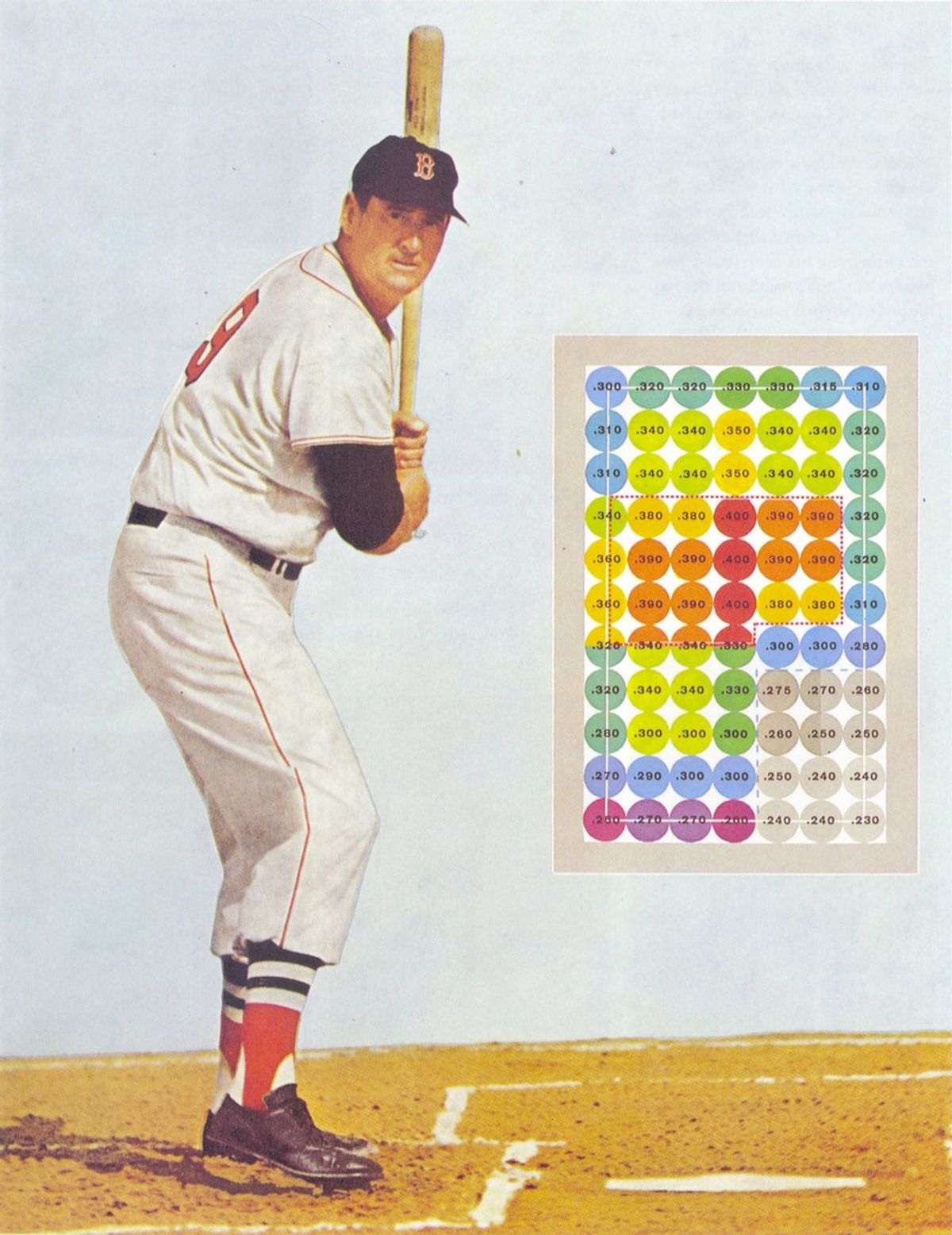
The proto-heat map above—based on Ted Williams's own estimates of how well he hit the ball in various parts of the zone—graced Science's cover for several releases. Even with all its subjectivity this is very effective mapping; at the time it was drawn, it must have been difficult to imagine that we would one day be able to pinpoint the location of all the pitches a batter faced and plot averages accordingly. Thanks to the development of PITCHF/x, these sorts of heat maps are now very common, if often ugly.
This chart is fairly famous among baseball nerds, but it's just one of many great infographics strewn throughout the book, all credited to Robert E. Cupp. Here are a couple more of our favorites:
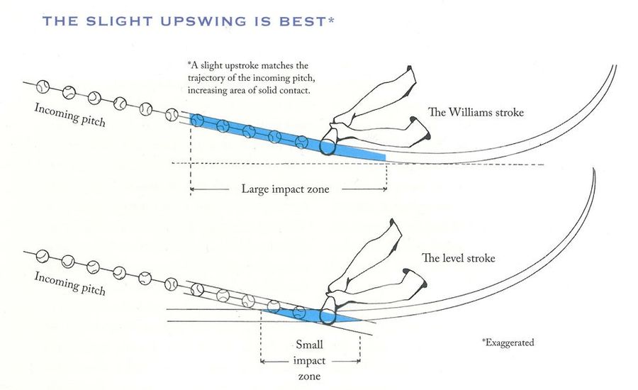
Ted Williams's "upswing" is represented in this (exaggerated) mechanical graphic, which is also a fairly early example of this kind of analytic visualization ( here's a modern example). This sort of swing went out style for a while in favor a flatter stroke, but it's come back into the vogue. Check out this Wall Street Journal from October 2013 which illustrates Miguel Cabrera's mechanics, including his slightly upward stroke.
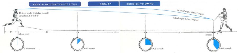
This visualization helps break down the batter reaction time and ball angle of a typical MLB pitch. If you want to see a modern, much goofier attempt to express this concept, go ahead and watch this 2007 episode of .
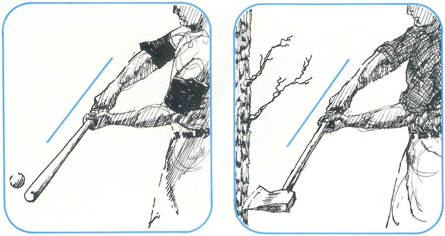
OK, I'm not sure this graphic is actually that helpful for learning how to hit a baseball, but it's still great. I could find no modern equivalent.
You won't find many other illustration credits for Cupp out there. In late 1970—a couple months before Science was released—the illustrator began working as a golf course designer for Jack Nicklaus. He began his own firm in 1984 and won Golf Digest's inaugural golf architect of the year award in 1992. He's gone on to design over 100 courses, including Crosswater and Pumpkin Ridge in Oregon, and Liberty National in New Jersey.
I reached out to Mr. Cupp, and here's what he had to say about the illustrations and his current career:
I never looked back going into golf architecture and last Saturday I was inducted into the Georgia Hall of Fame. I'm grateful, but never stopped drawing and painting — nothing to stop the clock, but nice to have.
I had lots of conversation with Ted [Williams], a fantastic experience ten years after playing baseball at Miami (before their big run in the NCAA). We could talk shop, but he knew I was an amateur. John [Underwood] made some suggestions and provided me with a lot of visual stuff that was helpful.
I look at it now and think, "It could be a lot better," but it was fun.
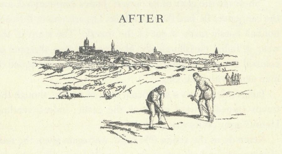
In 2007 Cupp broke into fiction with The Edict, a novel about the early history of golf published by Alfred A. Knopf. He provided the illustrations.
Related

Guardians vs. Rays Prediction: Picks, Odds for ALCS Game 1






Brendan Allen Has Earned the Right to Fight for UFC Gold

Bills vs. Rams Odds, Prediction and Best Bet for MNF

Three Longshot NFL Futures Worth Betting in Week 5

- White Sox vs. Guardians ALDS Game 5 Betting Pick
- UFC Vegas 122 Betting Odds: The Biggest Line Moves Before Allen vs. Duncan
- UFC Vegas 122 Picks and Predictions: Three Bets for Allen vs. Duncan
- College Football Week 6 Bets: Three Picks for Saturday’s Biggest Games
- UFC Fight Night Underdog Pick: Why Kai Kamaka III Is Worth a Bet
- WNBA Playoff Picks: Best Bets for Liberty-Dream and Aces-Valkyries
- Friday College Football Best Bets: Iowa-Washington and BYU-Iowa State