
data Page 2 - Sports News, Headlines & Highlights

Deadspin Police-Shooting Database Update: We're Still Going
Last Wednesday, we launched an impossibly ambitious project: cataloguing every police-involved shooting in America over the last three years. After one week, we're further along than we could have imagined. ...

Meta Analysis: How Many Licks To Reach The Center Of A Tootsie Pop?
The world may never know how many licks it takes to get to the center of a Tootsie Pop. But we can at least use data to make an educated guess....
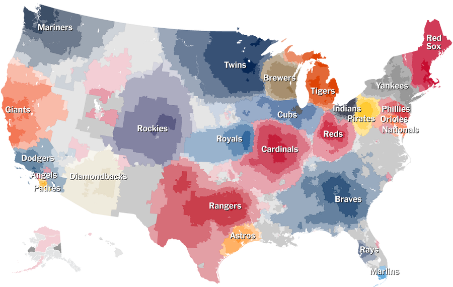
Which MLB Teams Does Your Town Root For? NYT Interactive Has Answers
Last month, when we showed you the most accurate map of MLB fandom, it was the most accurate in that it was based on the most accurate data. In the time since, the New York Times has gotten its hands on that data and made this interactive, which is awesome. ...
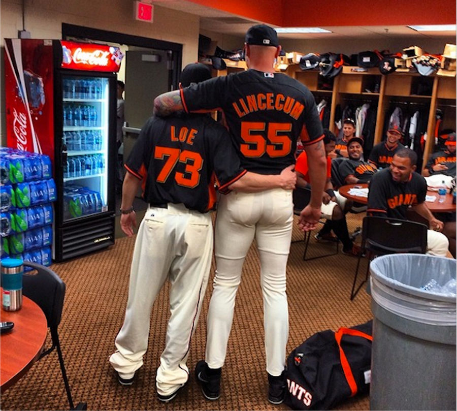
Tiny Person Tim Lincecum And Large Person Kameron Loe Traded Uniforms
Here's some fun spring training shenanigans courtesy of the San Francisco Giants, who understand that people wearing comically ill-fitting clothes is always funny. Tim Lincecum, who is just 5-foot-11, traded uniforms with Kameron Loe, who is 6-foot-8. Much fun was had....

What Horrible Things Did We Do To Our Penises Last Year?
While collecting insertions into various orifices for our annual feature, we stumbled across a good number of truly awful penis-related mishaps. Culled from the U.S. Consumer Product Safety Commission's database of emergency room visits, here's a year's worth of self-abuse....

What Did We Get Stuck In Our Rectums Last Year?
As in past years, the U.S. Consumer Product Safety Commission has created a searchable database of emergency room visits around the country. And as in past years, we have trolled the data for the finest examples of insertions showcasing extraordinarily bad luck and/or ingenuity. [Note: Headline has ...
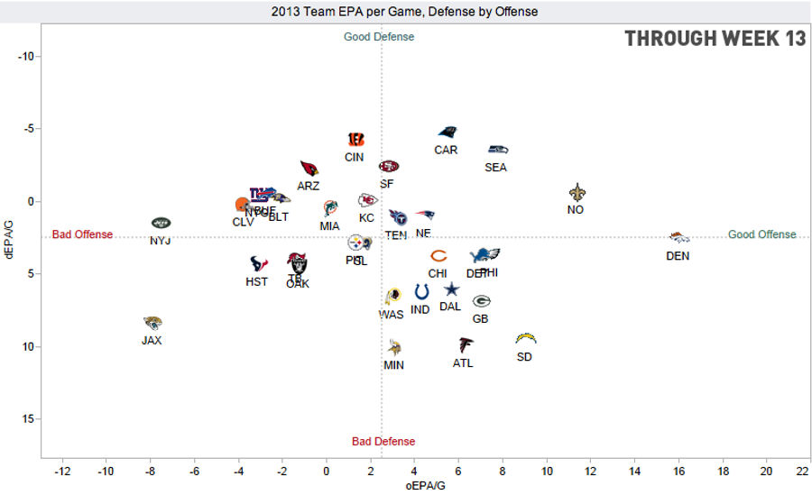
Home Stretch: How Does Your NFL Team Stack Up On Offense And Defense?
With four weeks to go in the NFL season—and just one playoff spot clinched—it's time to take a fresh look at which teams have established themselves as the best (and worst) offensive and defensive units in the league....

Video: The History Of International Football Transfers In Sixty Seconds
The video above, by EyeSeeData.com's Mac Bryla, jams 133 years of international football transfers into very cool-looking visual. If you're interested in digging into the data a bit more you can check out the interactive version he made on his site, which lets you break down the transfers by country...
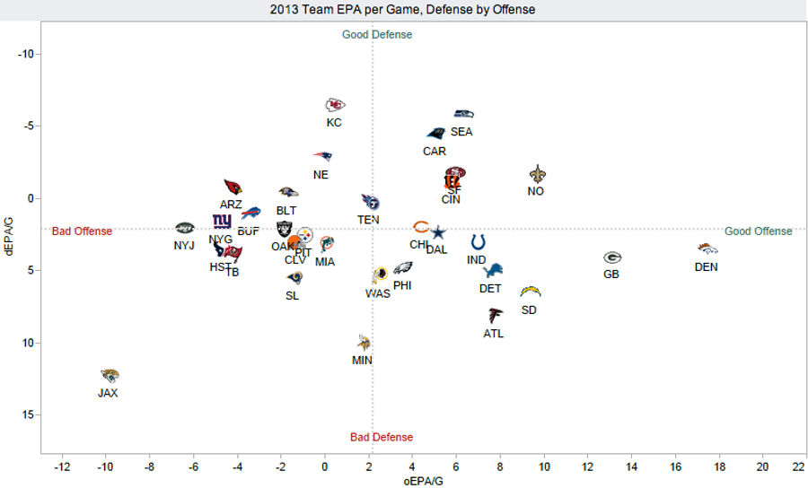
Midway Point: How Does Your NFL Team Stack Up On Offense and Defense?
After Week 5, we took a look at the excellent offensive/defensive visualizations that Brian Burke puts together on AdvancedNFLstats.com. A lot of weird shit can happen in the first five weeks of the season, so now that we're at the midway point, it's worth taking another look to see how teams have s...
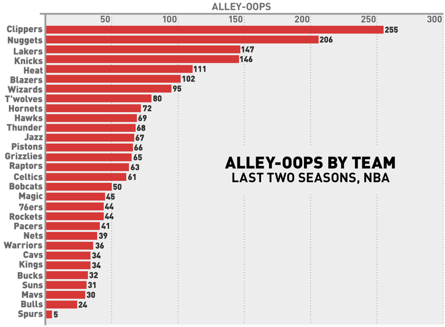
The Fun-Hating Spurs Threw Just One Alley-Oop Last Season
The chart above, based on data from NBA Stats, shows the number of alley-oops each team has thrown in the last two regular seasons. No surprises at the very top, although it's nice to see the mediocre/bad Blazers, Hornets, Timberwolves, and Wizards crack the top ten....
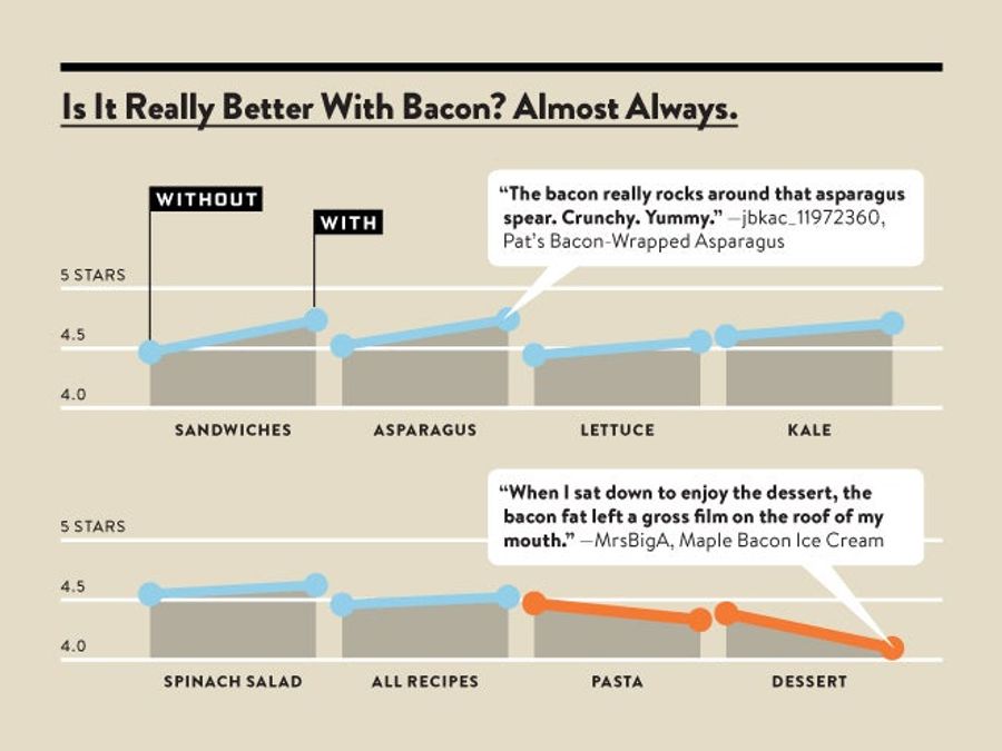
Science: Bacon Is The Ultimate Ingredient
While we always knew it within the thickening walls of our heaving hearts, Wired.com has managed to prove it empirically: Bacon does, in fact, make (nearly) everything better....
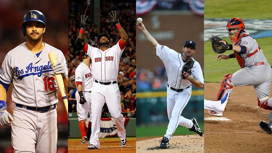
Charts: How Do You Build A Championship Baseball Team?
This season, the A's, Rays, and Pirates used front office wiles to build playoff-bound squads despite having minimal financial resources. Even with these feel-good stories eliminated, though, the four remaining teams still demonstrate that there are many good ways to build a competitive organization...
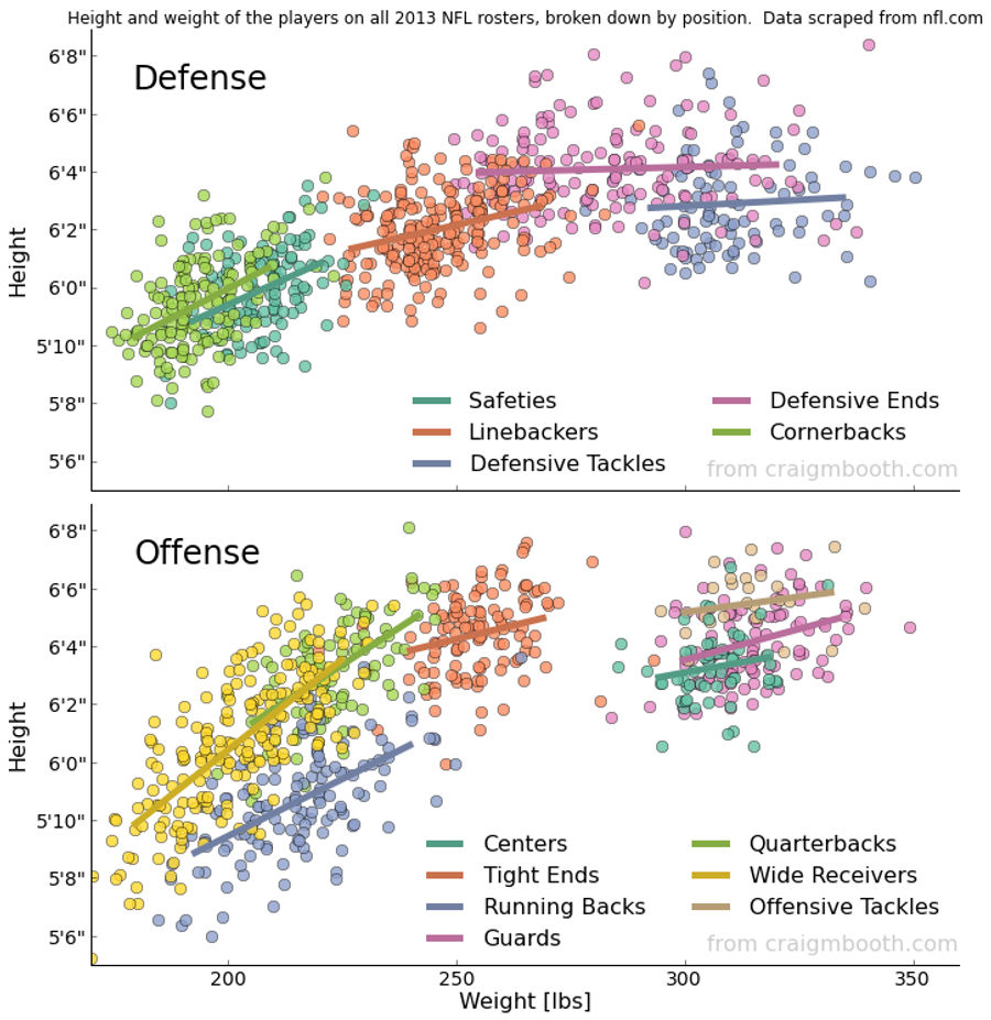
Chart: The Height And Weight Of Every NFL Player, By Position
Over on Reddit, user Craig Booth scraped the NFL's team roster websites for height and weight information and compiled it into the excellent graphic above....
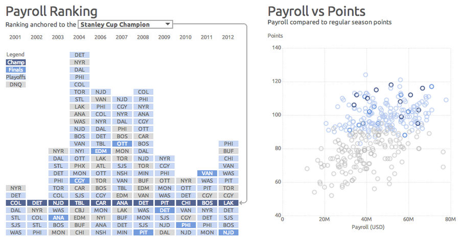
What Makes A Stanley Cup Champion? More Hockey Interactives To Explore
Continuing our industry-leading coverage of interactive hockey infographics, the charts above are a selection from an excellent piece of data viz by Dark Horse Analytics, which explore the relationship between payroll/attendance/offense/penalties and team performance....
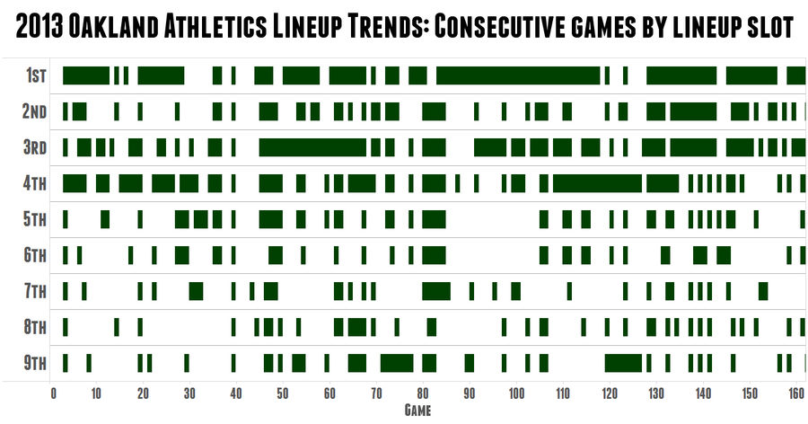
Cool Chart: A's Skipper Bob Melvin Is The King Of Platoons
Over at Sports on Earth, Jack Moore created this great graphic to demonstrate just how crazy A's manager Bob Melvin is about platoons. The green rectangles represent consecutive games in which the same hitter held the same spot in the batting order, with blanks showing a change from the previous gam...
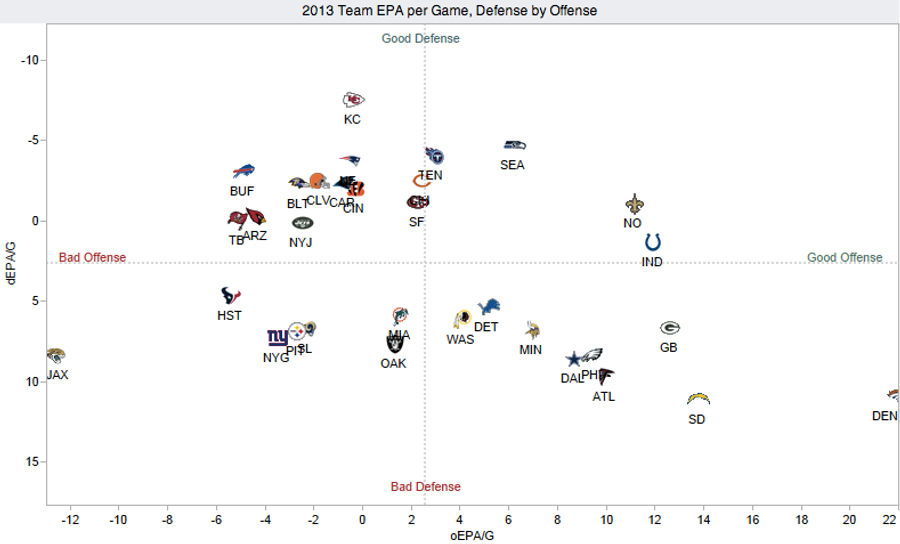
Chart: How Does Your NFL Team Stack Up On Offense and Defense?
Over at Advanced NFL Stats, Brian Burke has put together a great visualization plotting the offensive and defensive performance of the league's 32 teams. It's nothing too complicated—basically a NYMag Approval Matrix for football—but it reveals a lot about the state of the NFL through Week 5....
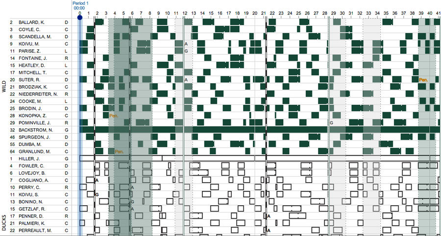
Who The Hell's On The Ice? Cool Interactive Explores Hockey Line Changes
It's hard enough to follow the puck in televised hockey, so forget about tracking the many, many on-the-fly line changes. Luckily ShiftChart, a sample of which you see above, is here to do the work for you. ...
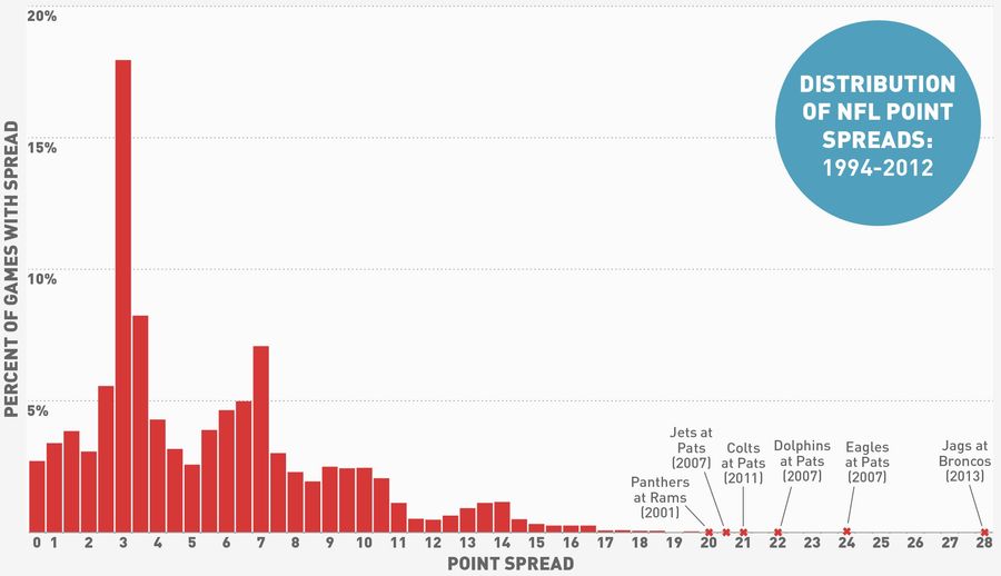
What's More Improbable: The Jaguars' +28 Line Or An 11-Inch Penis?
The murmurs began last week, before the Broncos put up 51 points against the Cowboys and the Jaguars lost second-overall pick Luke Joeckel to injury. And when the dust of Week 5 had settled, sure enough, the betting line for Jaguars at Broncos was set at 28 points, which is a lot....
What If The NBA And MLB Played An NFL-Style Season?
A big part of the NFL's appeal is all that "any given Sunday" stuff—a team like the Chiefs can come out of nowhere and look like world-beaters, while a team like the Giants can spend the first quarter of the season playing like the last reel of Horse Feathers. A lot of this uncertainty can be attri...