The London Olympic Medals Are Here, And They've Got That Weird Lisa Simpson Blowjob Logo

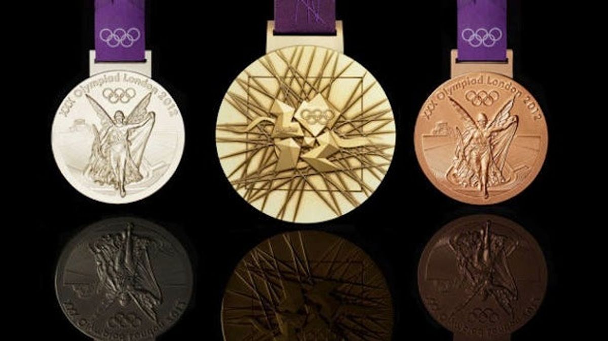
With a year to go before the London Games, they've been having all sorts of ceremonies to start the countdown. Today saw the unveiling of the designs for the medals, which will be the heaviest ( though not the largest) ever handed out.
They're also sort of ugly? Certainly the fruit of design-by-committee, there's a whole lot going on. The front features "Nike, the Greek Goddess of Victory, stepping out of the Parthenon to arrive in the host city. The front side also shows a bowl resembling an amphitheater, with the medal's overall circular shape a symbol of the world."
And the back has the much-maligned 2012 logo, over a representation of the Thames and a grid of lines that looks like a game of Kerplunk. Sum it up for us, grandiose press release!
"The core emblem is an architectural expression, a metaphor for the modern city, or … a geological metaphor as a tough crystalline growth which is deliberately jewel-like. The grid of lines, meanwhile, "brings both a pulling together and sense of outreach on the design – an image of radiating energy that represents the athletes' achievements and effort."
Whatever. It doesn't matter. The 2010 medals were ugly as sin, and the 2006 versions uglier still, and the athletes don't care. Pawn shops might: the gold medal is just 1.34 percent gold, and the bronze medal is made mostly of copper.



UFC 333 Underdog Pick: Why Dominick Reyes Is Worth a Bet



World Series Predictions: 3 Best Bets for Brewers vs. Rays






- Guardians vs. Rays ALCS Game 6 Best Betting Picks
- Commanders vs. 49ers Picks: Best Bet for Monday Night Football
- Rays vs. Guardians Game 5 Predictions: Best Bets for ALCS
- Cowboys vs. Packers Prediction: Best Bet for Sunday Night Football
- UFC Edmonton Best Bets, Predictions and Fight Picks
- Rays vs. Guardians Game 4 Best Player Props Betting Picks
- College Football Week 8 Best Bets: Ohio State, Alabama and More