
The Los Angeles Chargers Have Used Three Different Logos In Two Days

![Via [object Object]](https://images.deadspin.com/tr:w-1200,fo-auto/nhmduqc99e7qozgykgot.jpg) Via [object Object]
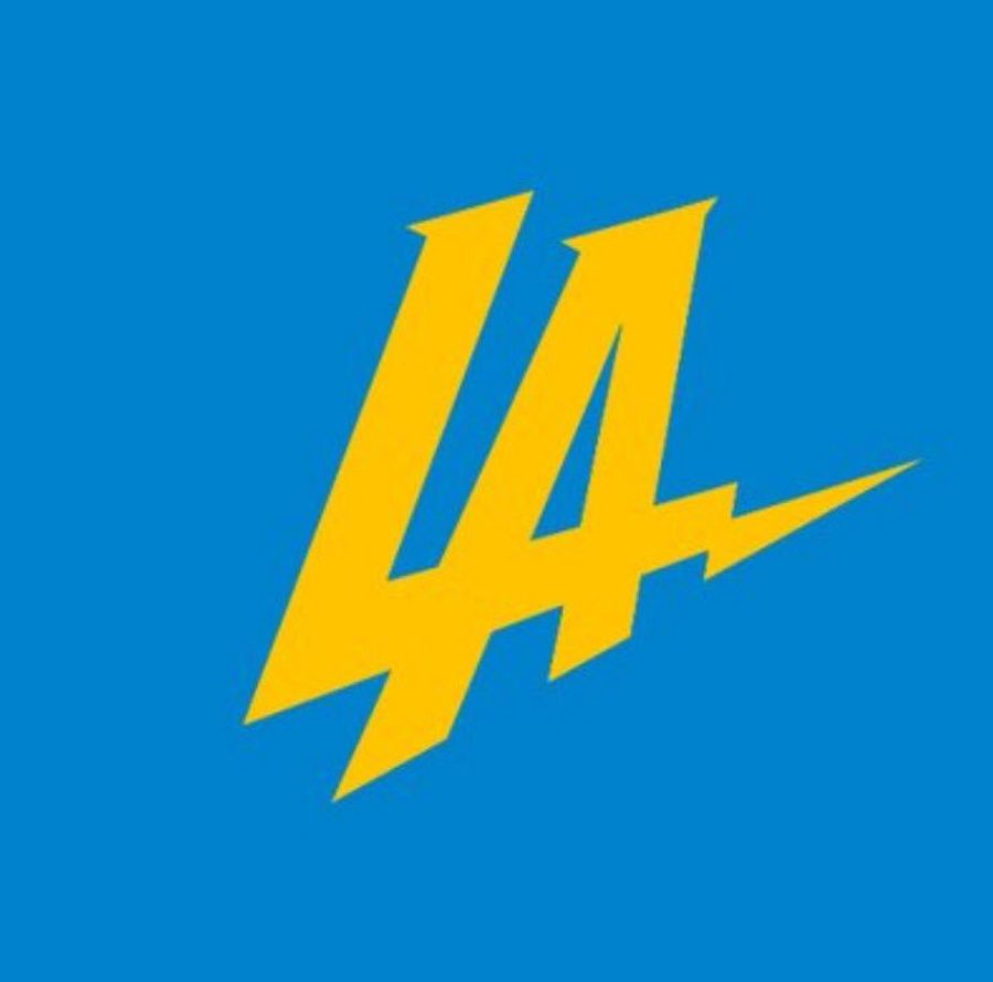
Via [object Object] The Chargers announced their move to Los Angeles all of three days ago, and they’ve apparently already changed their main logo three times.
The day after announcing the upcoming move, they debuted something that suspiciously looked like a blatant rip-off of the Dodgers’ logo. After being widely derided on social media—until the NFL deleted the original tweet showing off the logo—they changed the color scheme:
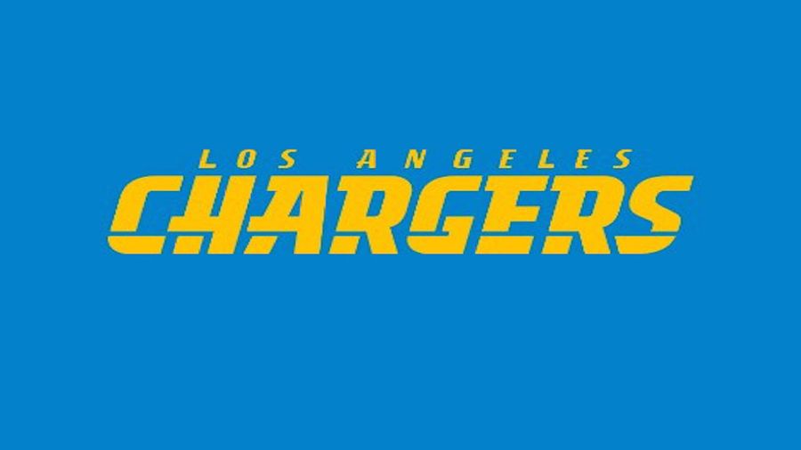
And now they’re apparently going in a different direction, with a Twitter avatar that now displays a stylized “Los Angeles Chargers” sans lightning bolt imagery:
Farewell, sweet little bolt.
[H/T Michael Gehlken)
Latest


What Prediction Markets Are Telling Us About NFL 2026 MVP
Mon Jul 20 2026

The Sacramento Kings Need to Blow It Up Before It's Too Late
Mon Jul 20 2026


Ben Askren Didn't Win the Match—But He Won the Weekend
Mon Jul 20 2026

Latest Betting
- UFC Fight Night Best Betting Picks for Du Plessis vs. Usman in OKC
- France vs. England Best Bets: Three Picks for the World Cup Third-Place Match
- Dodgers vs. Yankees Friday July 17 Best Betting Picks and Props
- July 17 White Sox vs. Blue Jays Prediction, Odds and Best Bets
- Three MLB Futures Bets to Make After the All-Star Break
- Three Heisman Trophy Sleepers Worth Betting Before the 2026 Season
- England vs. Argentina Best Bets: Three Picks for the World Cup Semifinal
