
These Beautiful Charts Show How Well Your NBA Team Spreads The Ball

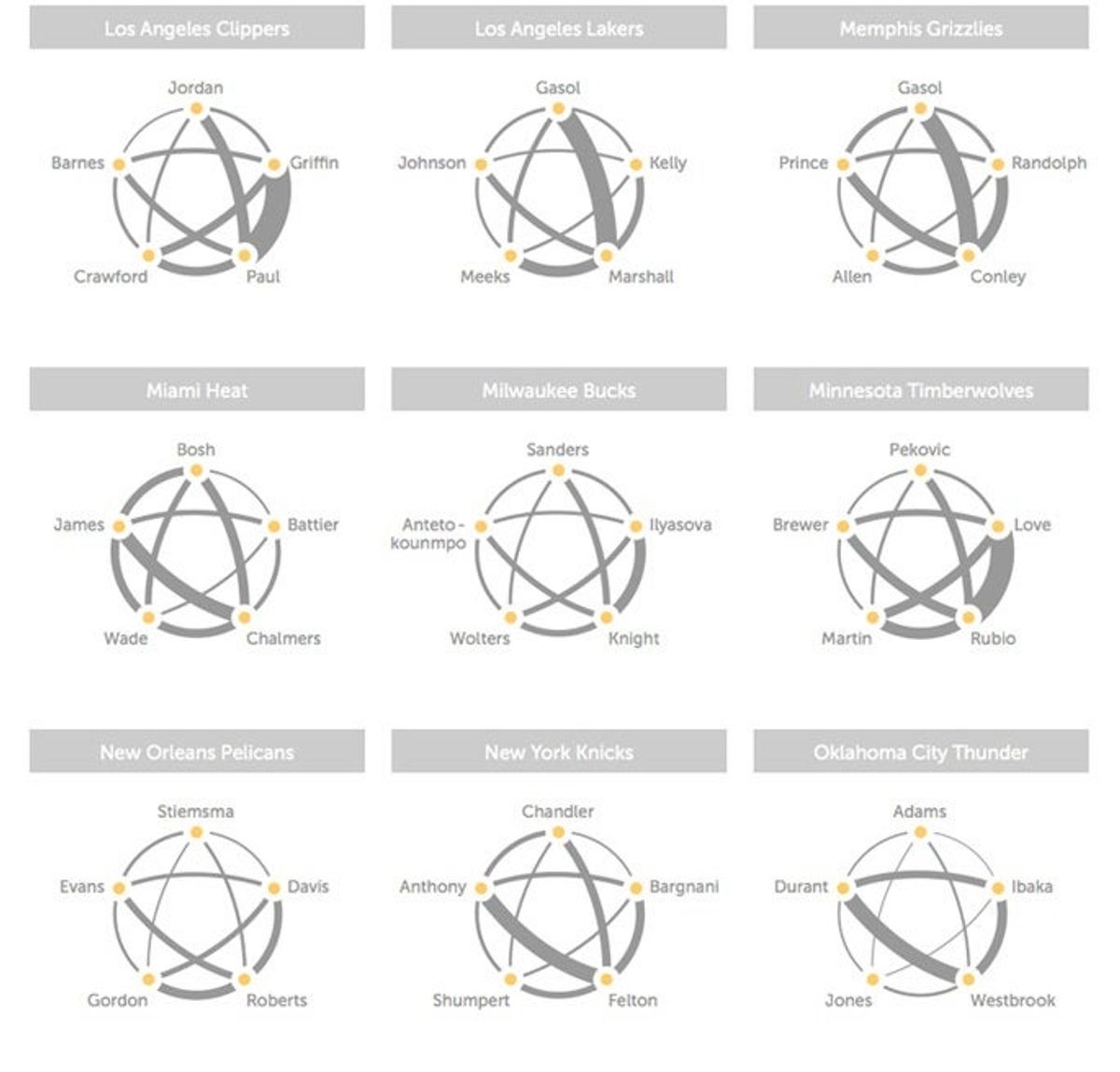
In another cool application of SportVU technology, Andrew Bergmann of the Hangtime blog on NBA.com has put together some beautiful charts showing how often different NBA starters pass to each other.
The line thicknesses above represent the relative number of passes between two players (in either direction; not all of these are two-way streets). They're impressively intuitive graphics, giving you an immediate sense of the NBA's biggest combos (Rubio-Love, Paul-Griffin), which teams spread the ball well (Indiana, Houston, Miami, and Orlando, among others), and which teams might be having some issues (Denver, Milwaukee, New Orleans, and Philadelphia—you'll also notice that the Trail Blazers continue to avoid Robin Lopez).
Go check out all the teams over on Hangtime; they're worth a look.
[ NBA.com | via Fast Company]

Why the WNBA Won't Monetize Sophie Cunningham's Viral Point


What Prediction Markets Are Telling Us About NFL 2026 MVP
The Sacramento Kings Need to Blow It Up Before It's Too Late


Ben Askren Didn't Win the Match—But He Won the Weekend
- UFC Fight Night Best Betting Picks for Du Plessis vs. Usman in OKC
- France vs. England Best Bets: Three Picks for the World Cup Third-Place Match
- Dodgers vs. Yankees Friday July 17 Best Betting Picks and Props
- July 17 White Sox vs. Blue Jays Prediction, Odds and Best Bets
- Three MLB Futures Bets to Make After the All-Star Break
- Three Heisman Trophy Sleepers Worth Betting Before the 2026 Season
- England vs. Argentina Best Bets: Three Picks for the World Cup Semifinal
