
WTF are these hideous pee-yellow Red Sox/Nike cash-grab alternate jerseys?

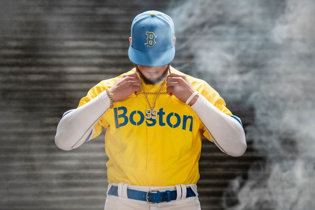 Yuck. credits: Red Sox/Nike City Connect
 It was bad enough when the Red Sox rolled out green alternate jerseys, but at least those had some meaning to them. The Sox have worn green to honor Red Auerbach after his death, again to celebrate the Celtics beating the Lakers in the NBA Finals, and then once more for Earth Day in 2009. They looked stupid, but there was specific reasoning, and each time was a special occasion — and they still were very clearly Red Sox jerseys, just… green.
Now, Nike is bringing an NBA concept to Fenway Park — and soon around the rest of the majors — and there’s no reason for it other than to sell merchandise, with the only connection to the team being that the players will be wearing them.
They’re calling it the “City Connect Series,” and the Red Sox, according to a press release on Tuesday, “will be the first of seven clubs to debut the uniforms being rolled out by Nike and Major League Baseball throughout the 2021 baseball season.”
That means there are 22 lucky teams that aren’t going to have to wear these uniforms, because they suck.
“The City Connect uniform adopts colors that honor the spirit of Patriots’ Day weekend, and features ‘Boston’ in a stencil font across the chest paying tribute to the Boylston Street finish line. The numbers ‘617’ are highlighted on the left sleeve as a nod to the area code for Boston and Fenway Park. The numbers appear within a racing bib, honoring one of the city’s most iconic annual sports traditions.”
It’s a Boston Marathon baseball jersey, in other words. It’s got the Boston Marathon colors, a font for the Boston Marathon, a racing bib homage… nothing to do with the Red Sox at all. The only Red Sox thing about the uniform is the hat, which is just a UCLA hat.
At least when NBA teams wear their “City Edition” uniforms, they play on custom courts designed to coordinate with the duds. Those uniforms also tend to have some kind of tie to franchise history, or fit into some kind of pattern that makes them identifiable for that team. The better versions of those uniforms do, anyway.
Maybe the other seven uniforms in the “City Connect Series” will be better, but that doesn’t seem very likely if Nike was going to go this far away from any concept of the team when designing a look for a club with as rich of a tradition as the Red Sox.
They’re not actively hideous uniforms. In fact, they look pretty good. But in the quest to make the Red Sox uniform connect with the city of Boston, Nike missed the most important part of the equation: the Red Sox. When Boston gets back the second team that it had until 1952, bring these uniforms back out, and give them to that club. These are not Red Sox uniforms. At least, they shouldn’t be.
What Prediction Markets Are Telling Us About NFL 2026 MVP
The Sacramento Kings Need to Blow It Up Before It's Too Late


Ben Askren Didn't Win the Match—But He Won the Weekend
- UFC Fight Night Best Betting Picks for Du Plessis vs. Usman in OKC
- France vs. England Best Bets: Three Picks for the World Cup Third-Place Match
- Dodgers vs. Yankees Friday July 17 Best Betting Picks and Props
- July 17 White Sox vs. Blue Jays Prediction, Odds and Best Bets
- Three MLB Futures Bets to Make After the All-Star Break
- Three Heisman Trophy Sleepers Worth Betting Before the 2026 Season
- England vs. Argentina Best Bets: Three Picks for the World Cup Semifinal
