
Atlanta Hawks Unveil Redesigned Pac-Man Logo

Did you know that the Atlanta Hawks used to have a secondary logo that was Pac-Man themed? Well, they did! And now they've reprised the logo and given it a fancy new design.
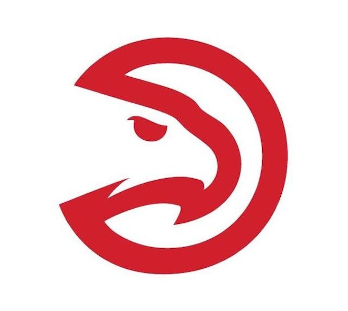
Above is the updated version of the Pac-Man logo, and here is what the old one looked like:
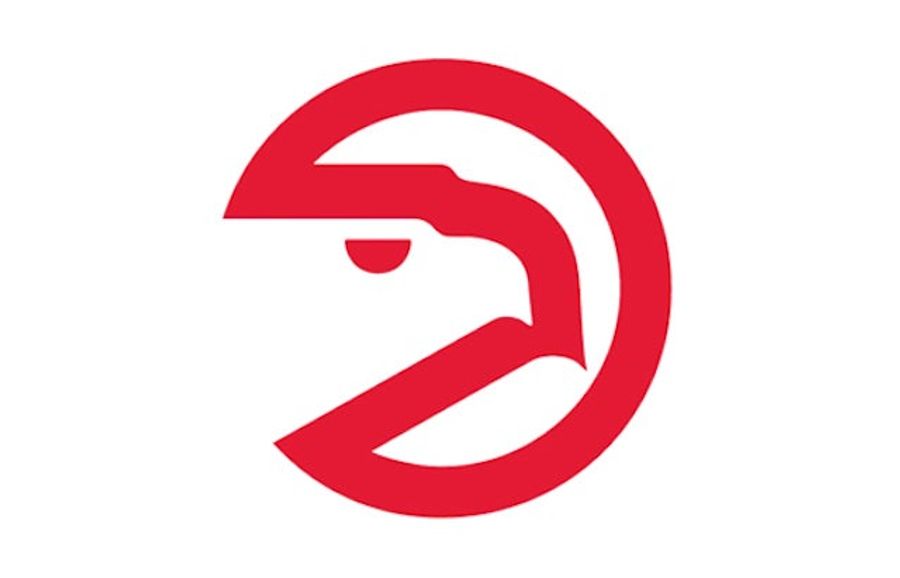
I don't really get it. I mean, yeah, it's the silouhette of a hawk that also looks like Pac-Man, but why? And as our own Albert Burneko put it, both kind of look like an emphysemic Pac-Man hocking up a blood loogie. The new one just looks like it also wants to kill someone.
[ AJC]
Latest

What Prediction Markets Are Telling Us About NFL 2026 MVP
Mon Jul 20 2026

The Sacramento Kings Need to Blow It Up Before It's Too Late
Mon Jul 20 2026


Ben Askren Didn't Win the Match—But He Won the Weekend
Mon Jul 20 2026


Latest Betting
- France vs. England Best Bets: Three Picks for the World Cup Third-Place Match
- Dodgers vs. Yankees Friday July 17 Best Betting Picks and Props
- July 17 White Sox vs. Blue Jays Prediction, Odds and Best Bets
- Three MLB Futures Bets to Make After the All-Star Break
- Three Heisman Trophy Sleepers Worth Betting Before the 2026 Season
- England vs. Argentina Best Bets: Three Picks for the World Cup Semifinal
- MLB All-Star Game Best Bets: Picks, Odds and Predictions for AL vs. NL
